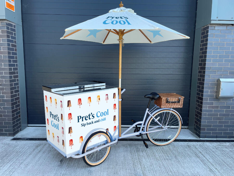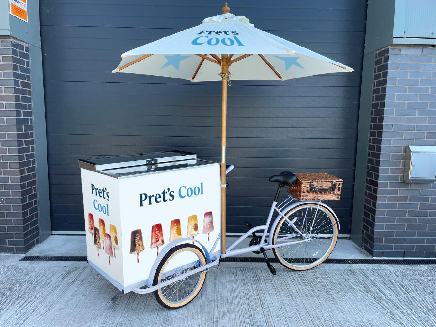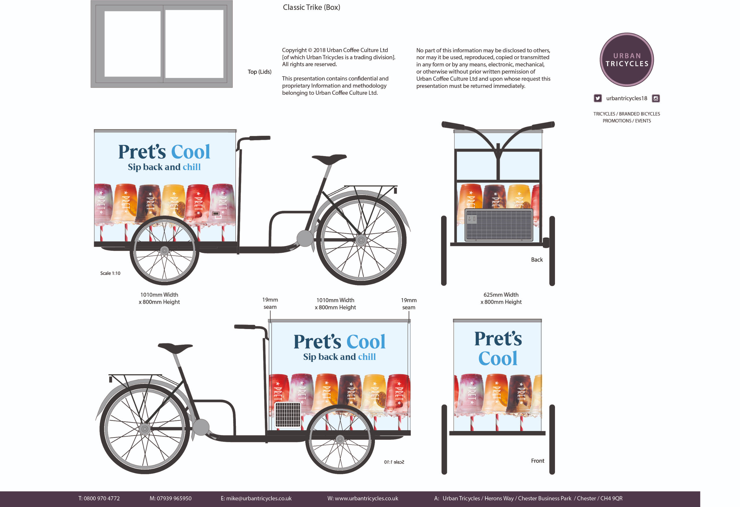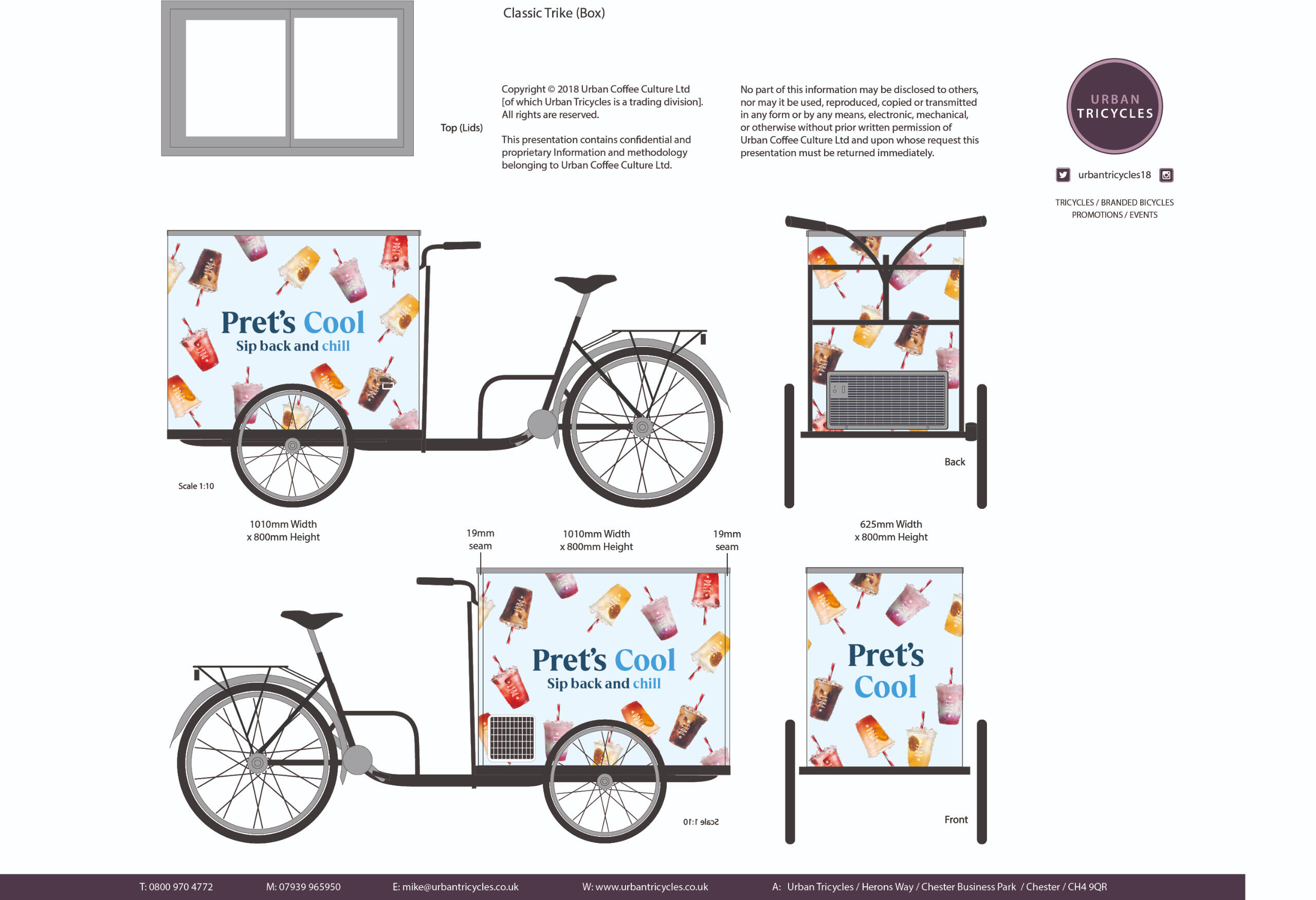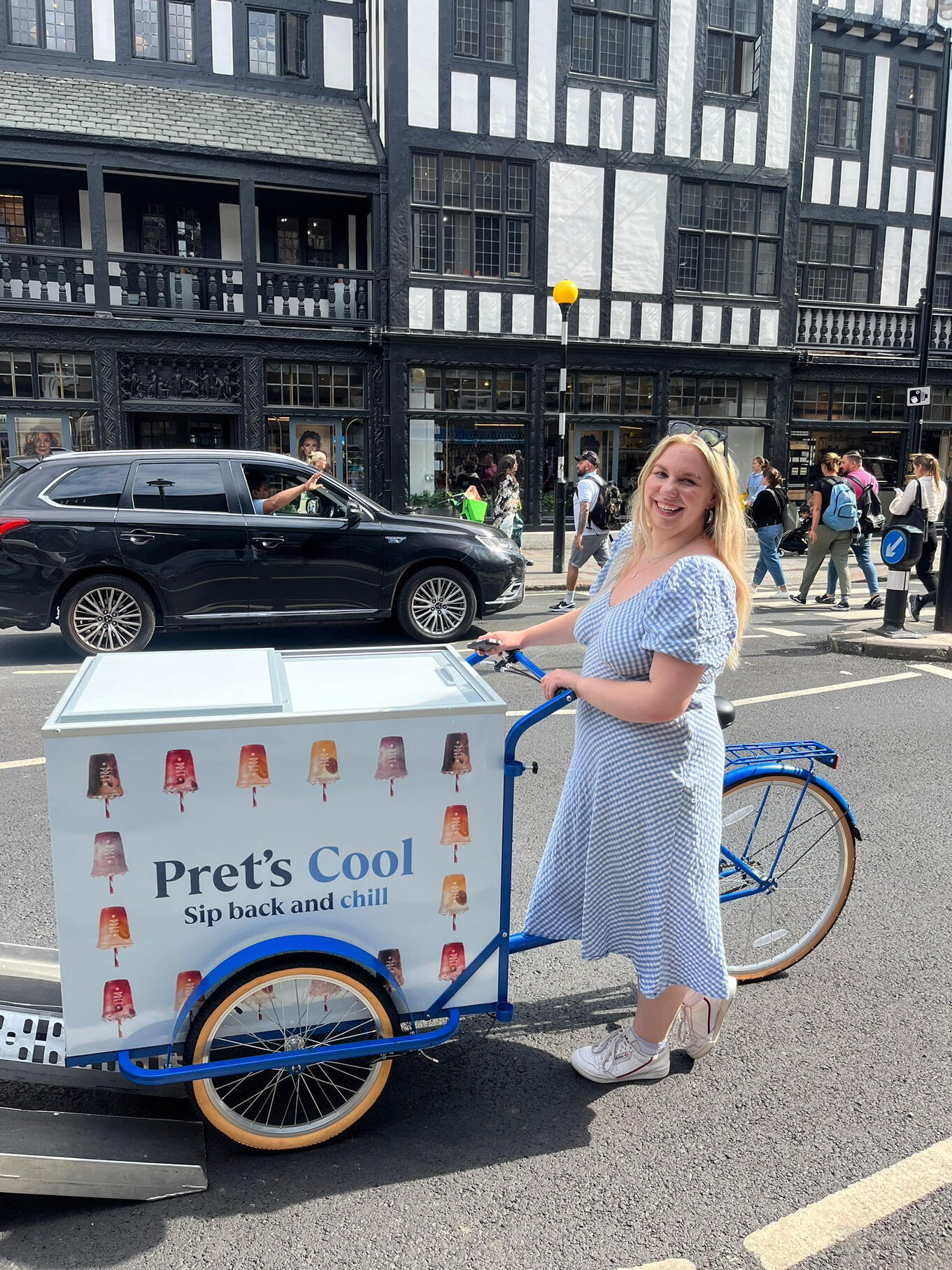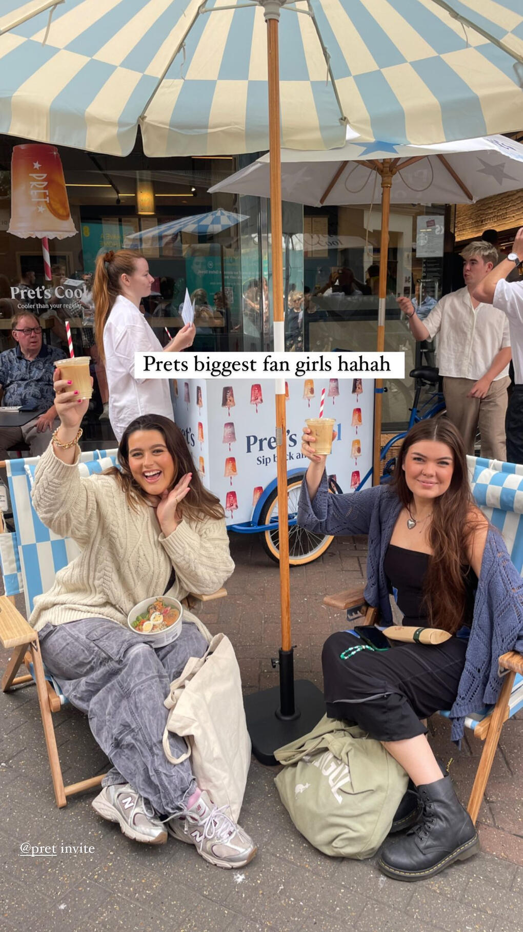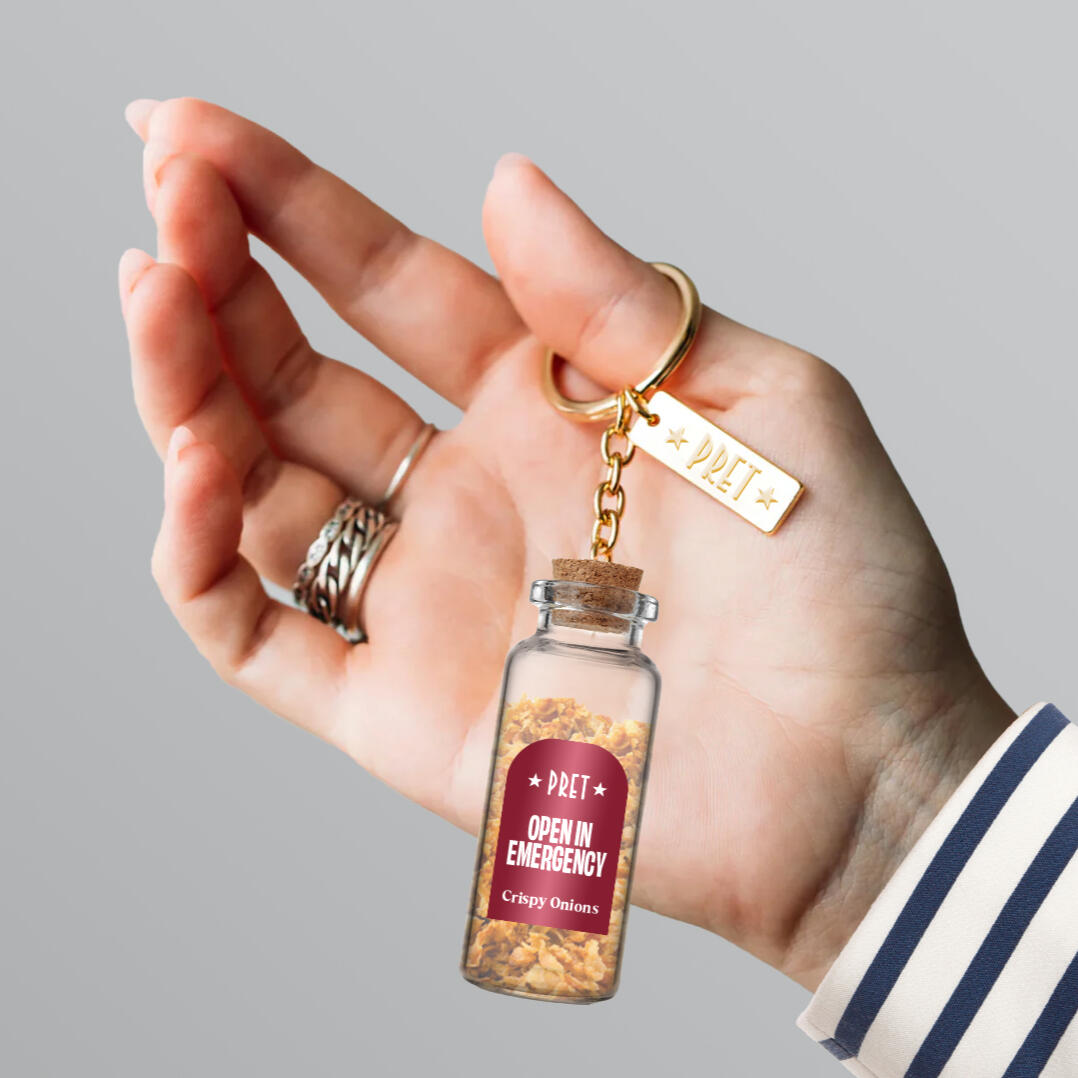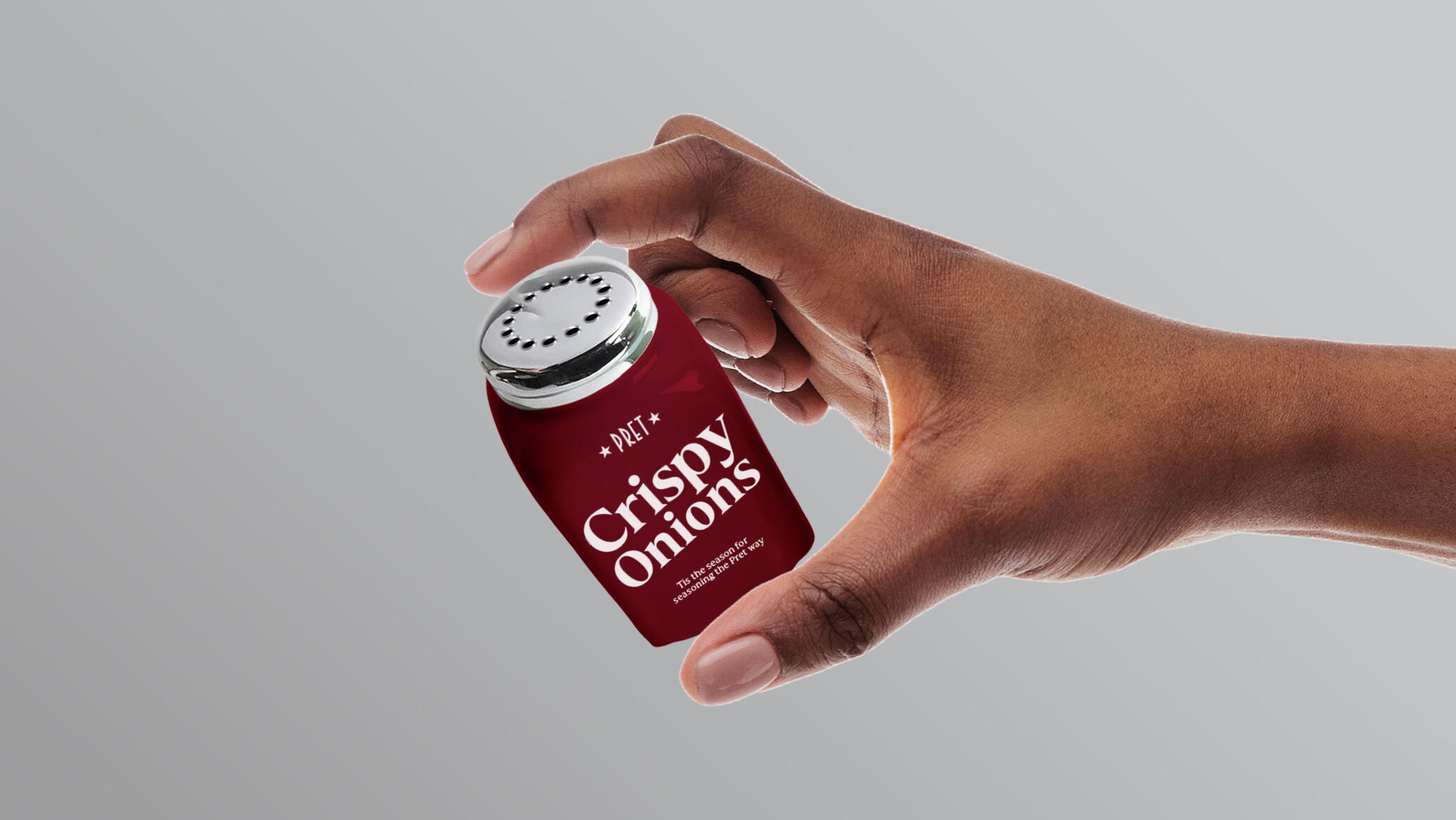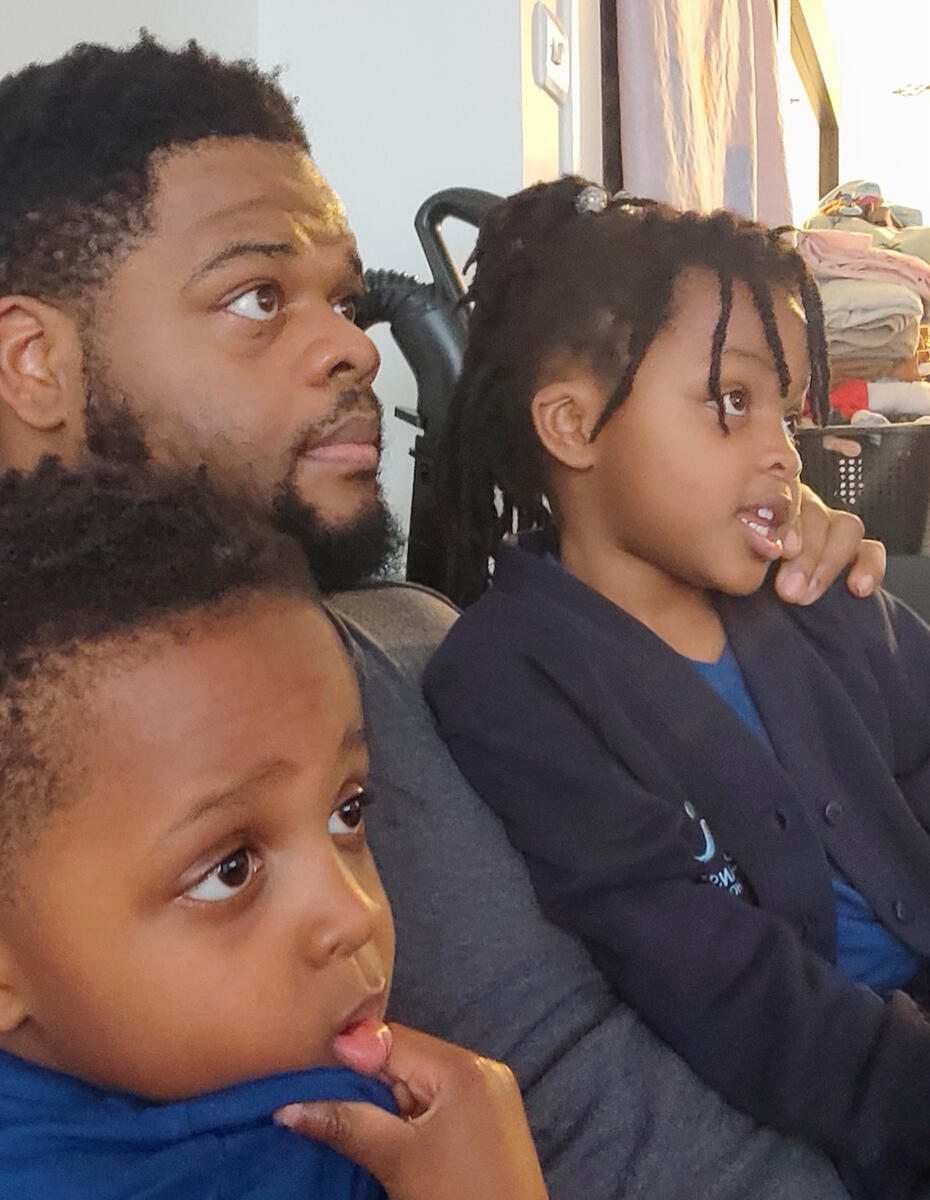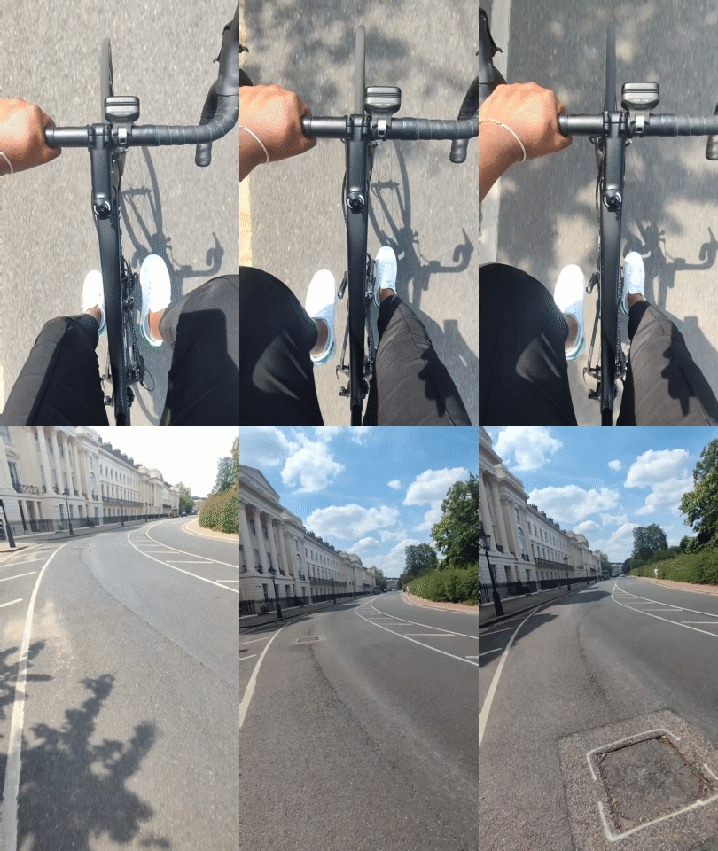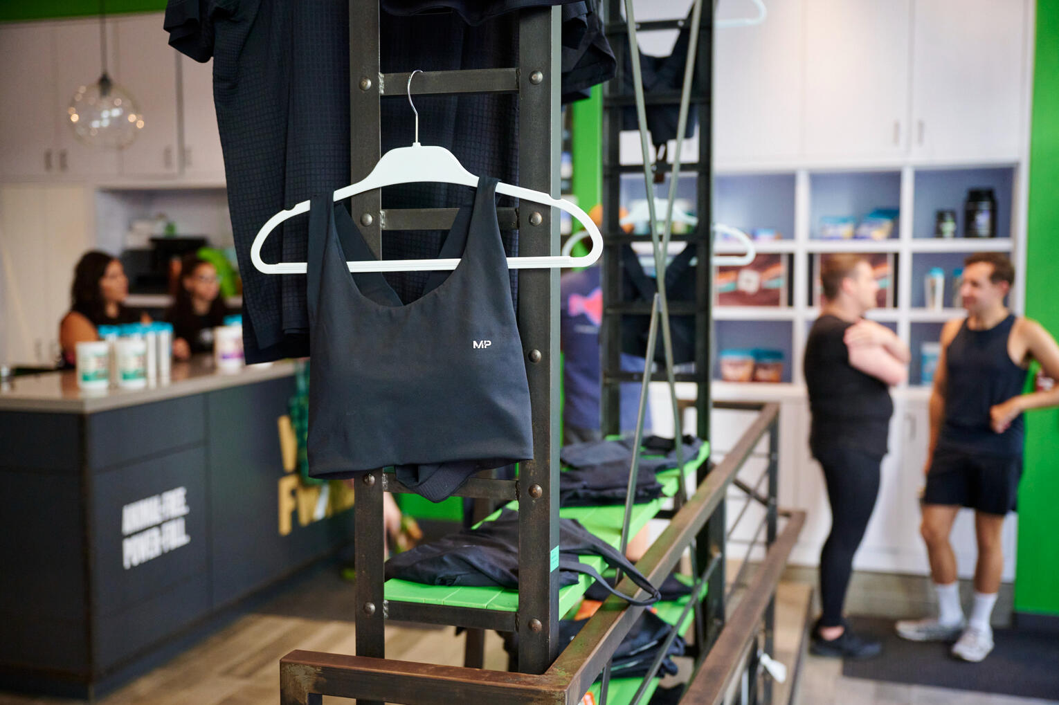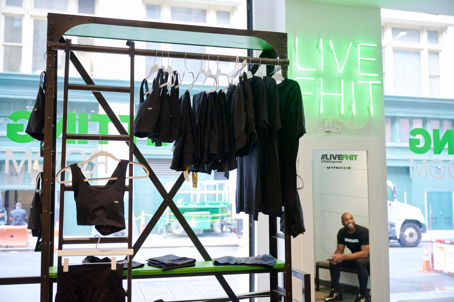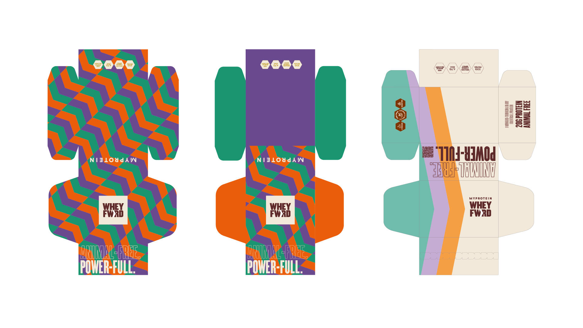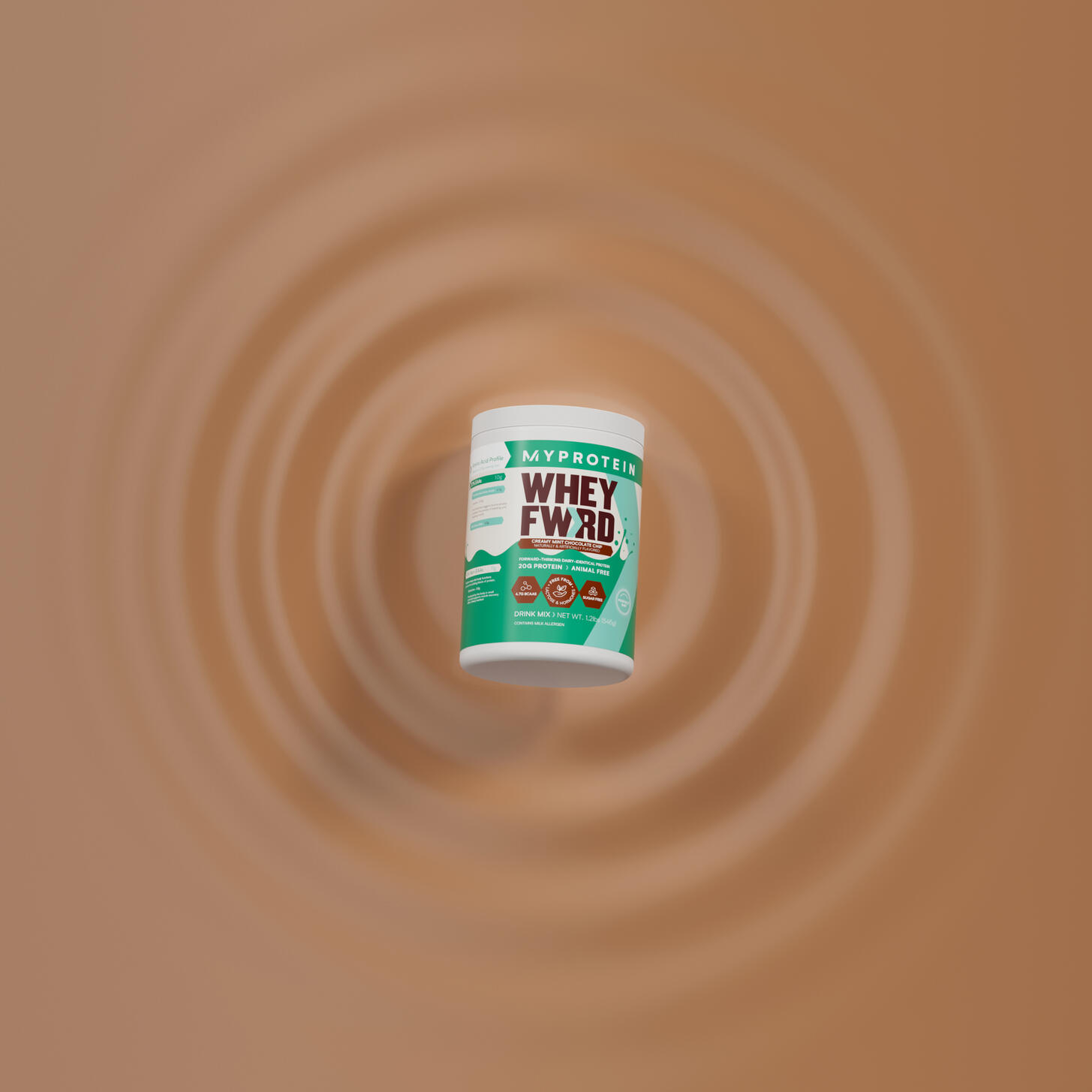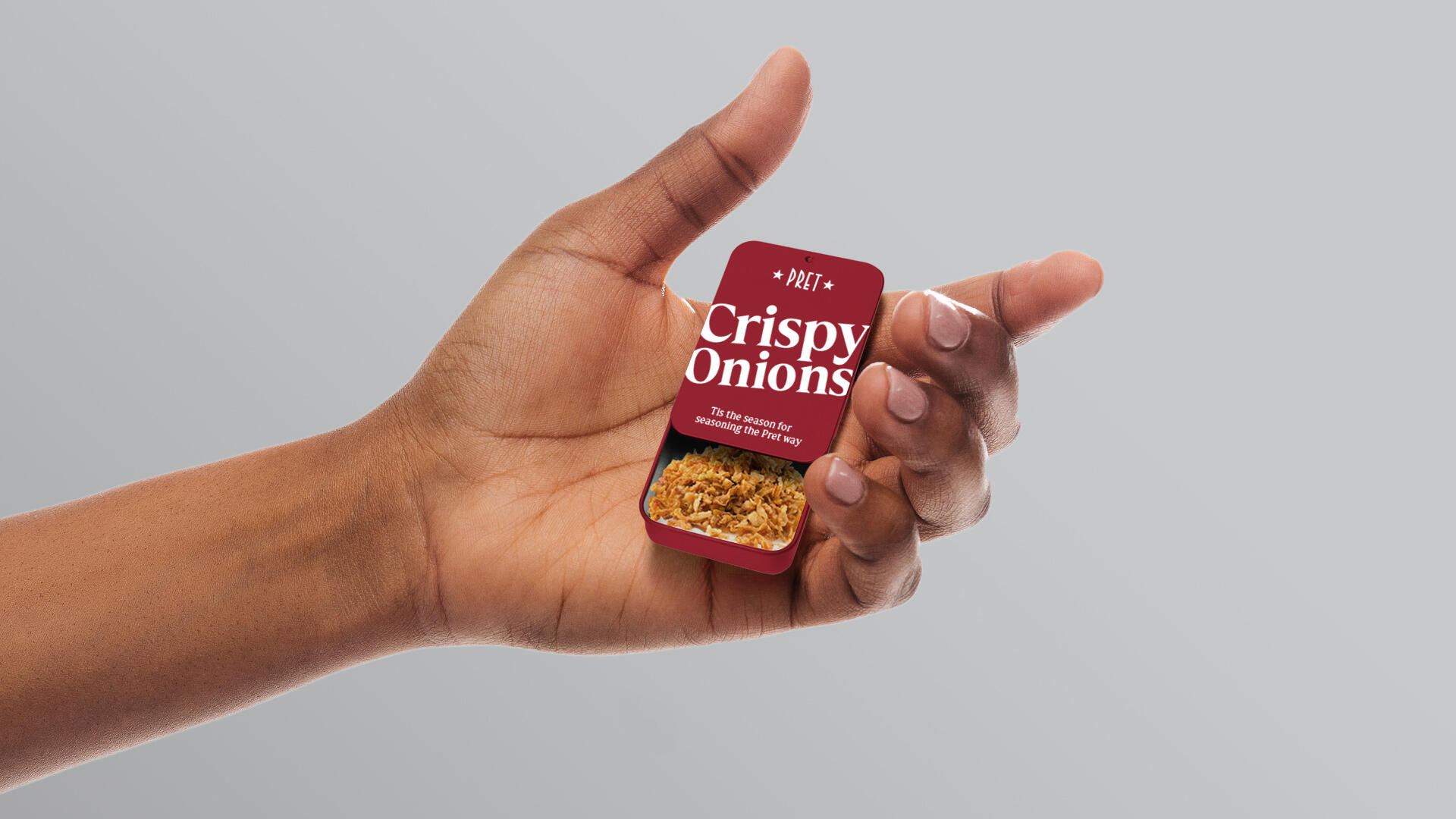
Pret Collection
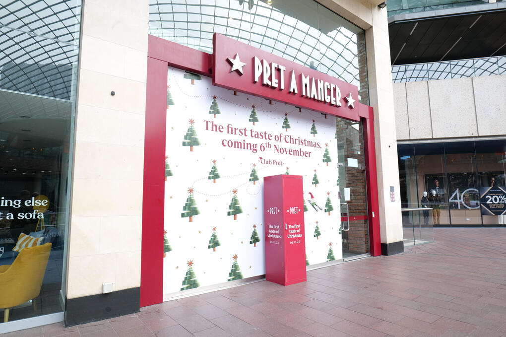
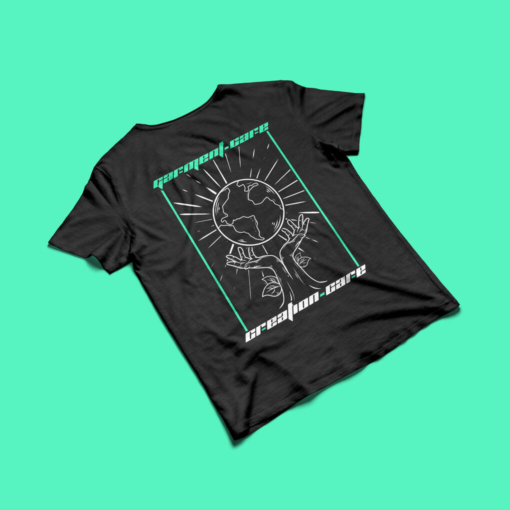
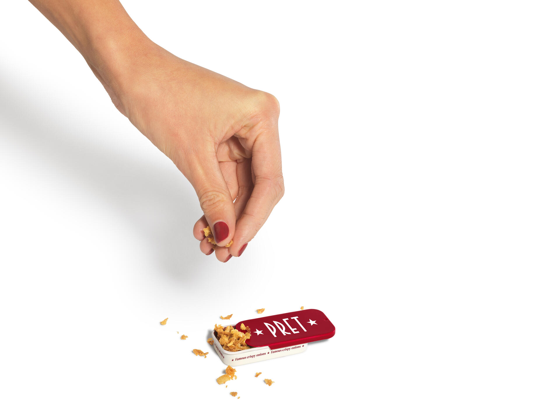
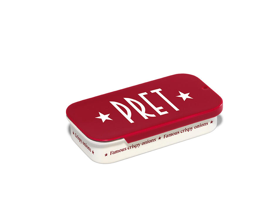
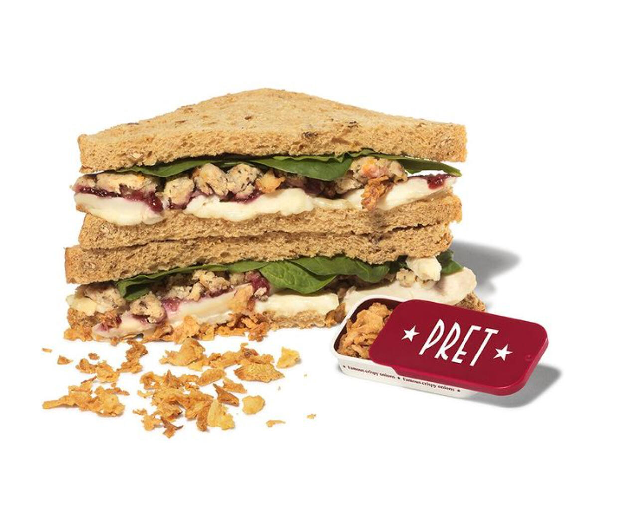
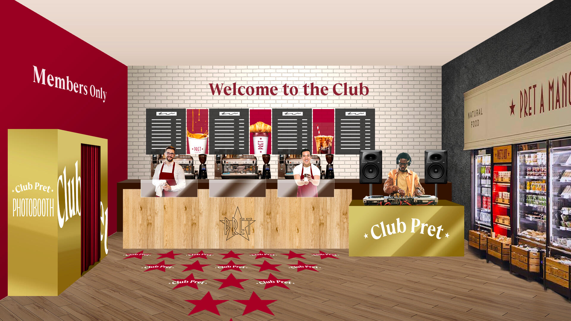
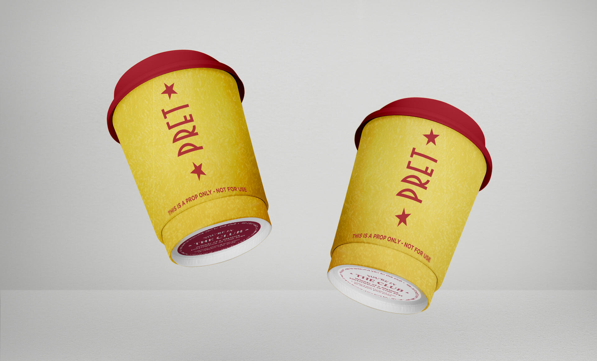
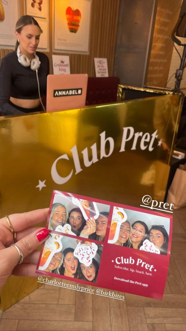
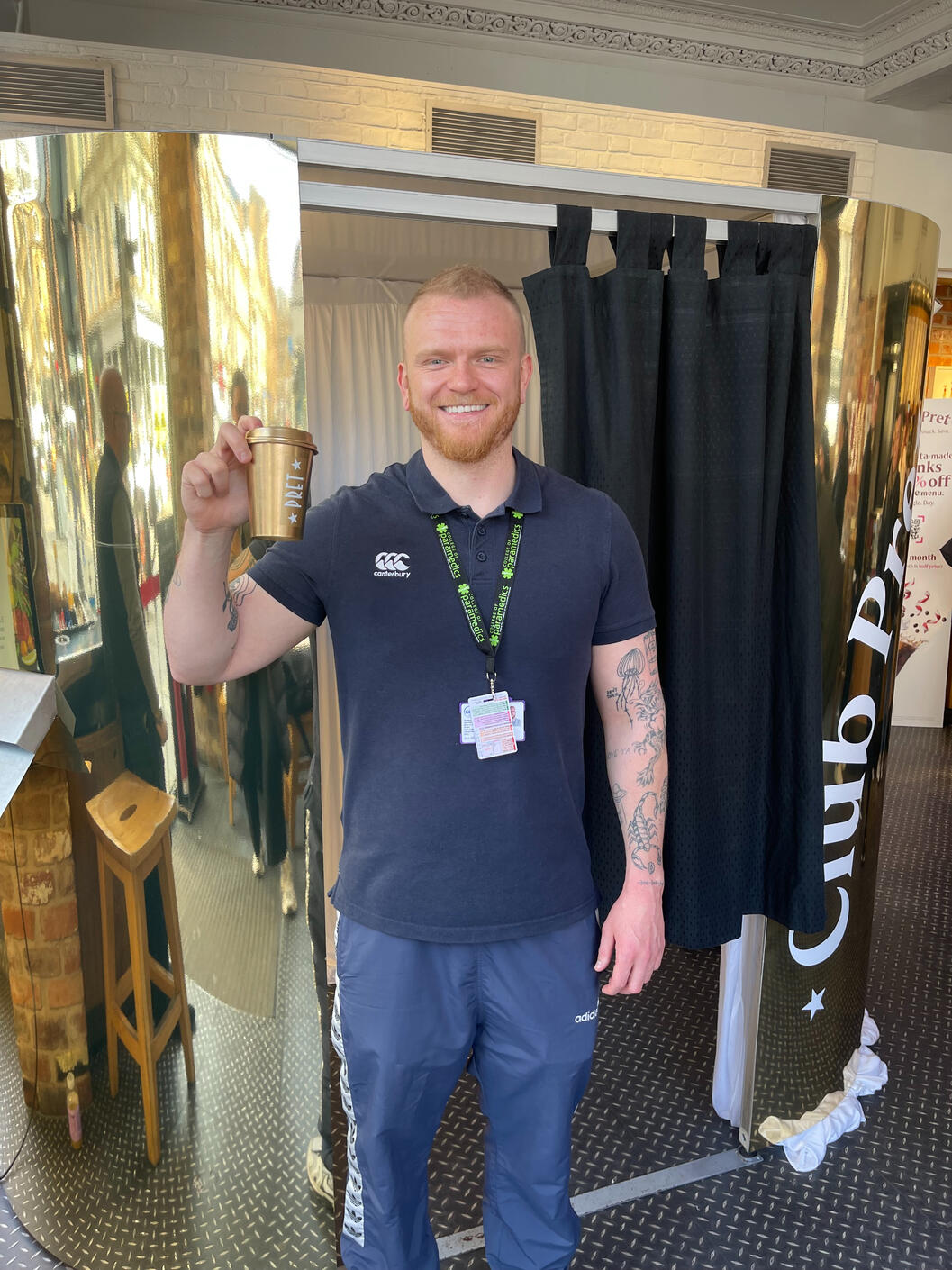
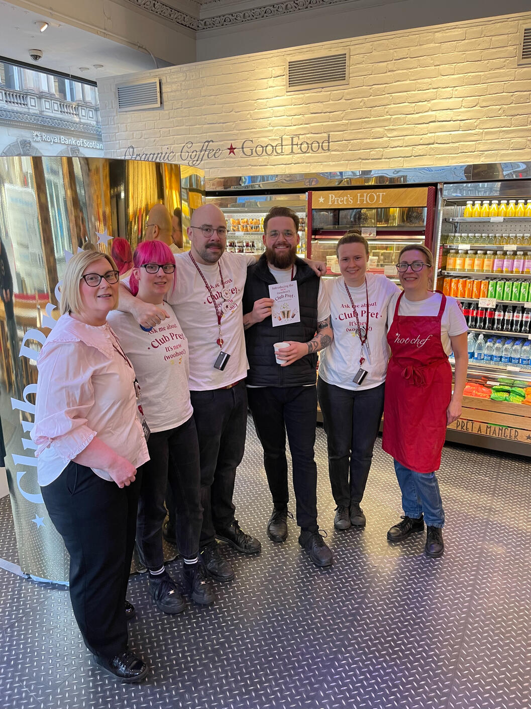
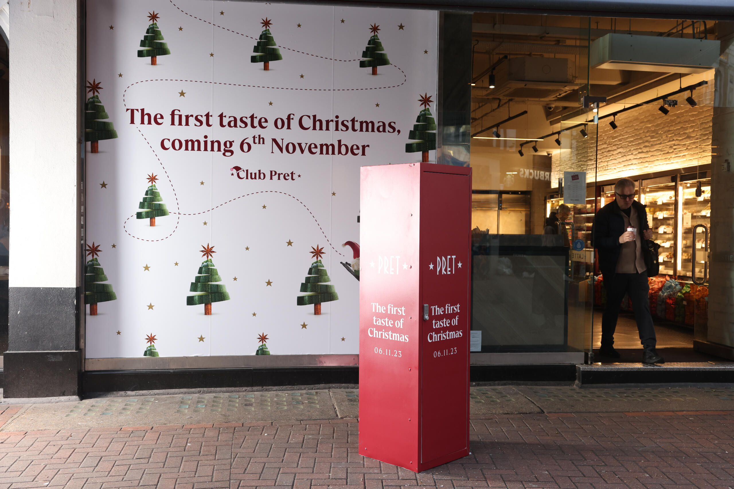
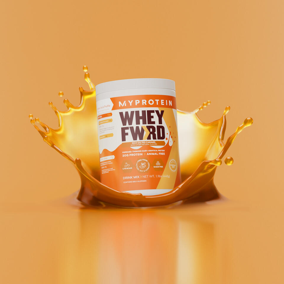
At Pret, I spearheaded end-to-end design projects, covering brand identity, packaging, print, and digital media. Serving as the design guardian, I meticulously signed off daily designs and championed brand guidelines.
You may also like:

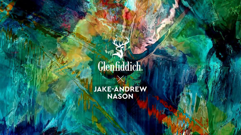
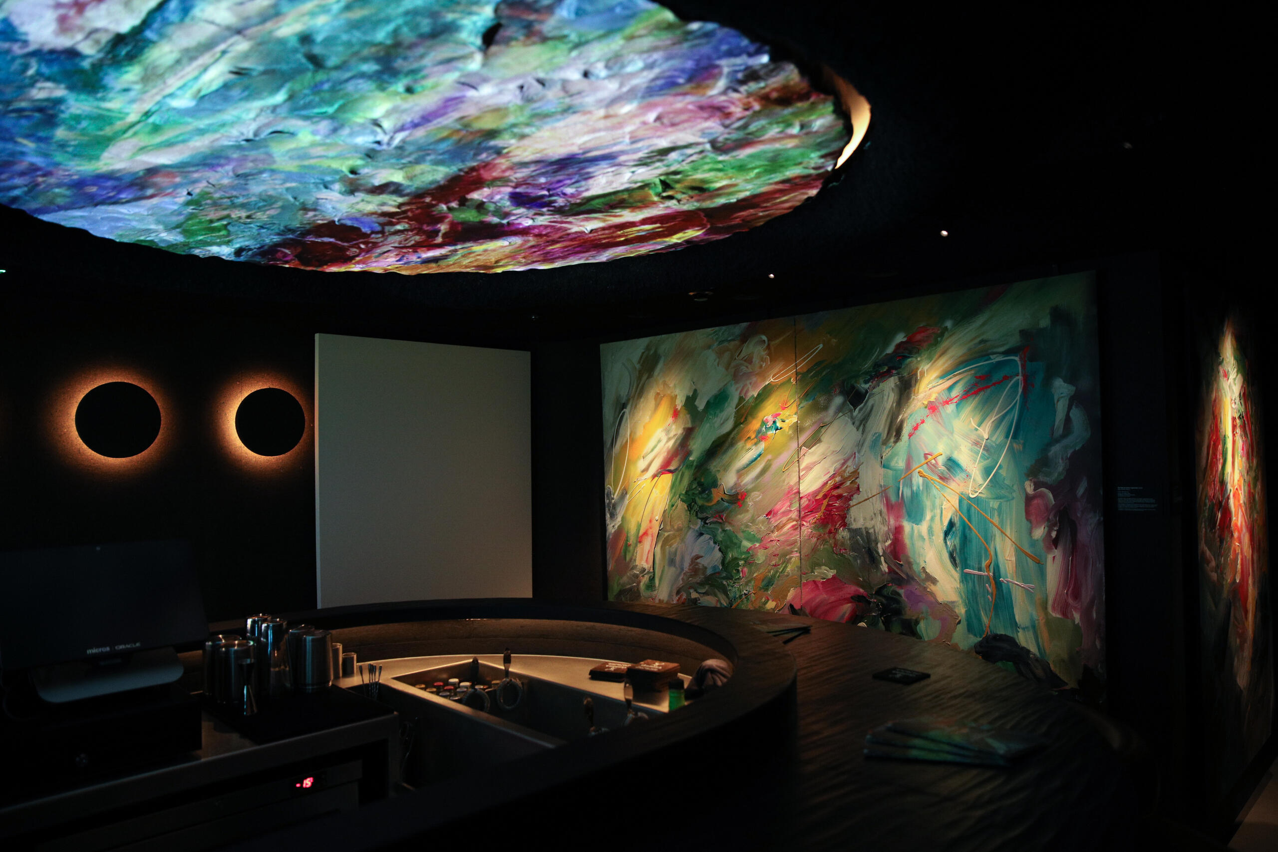
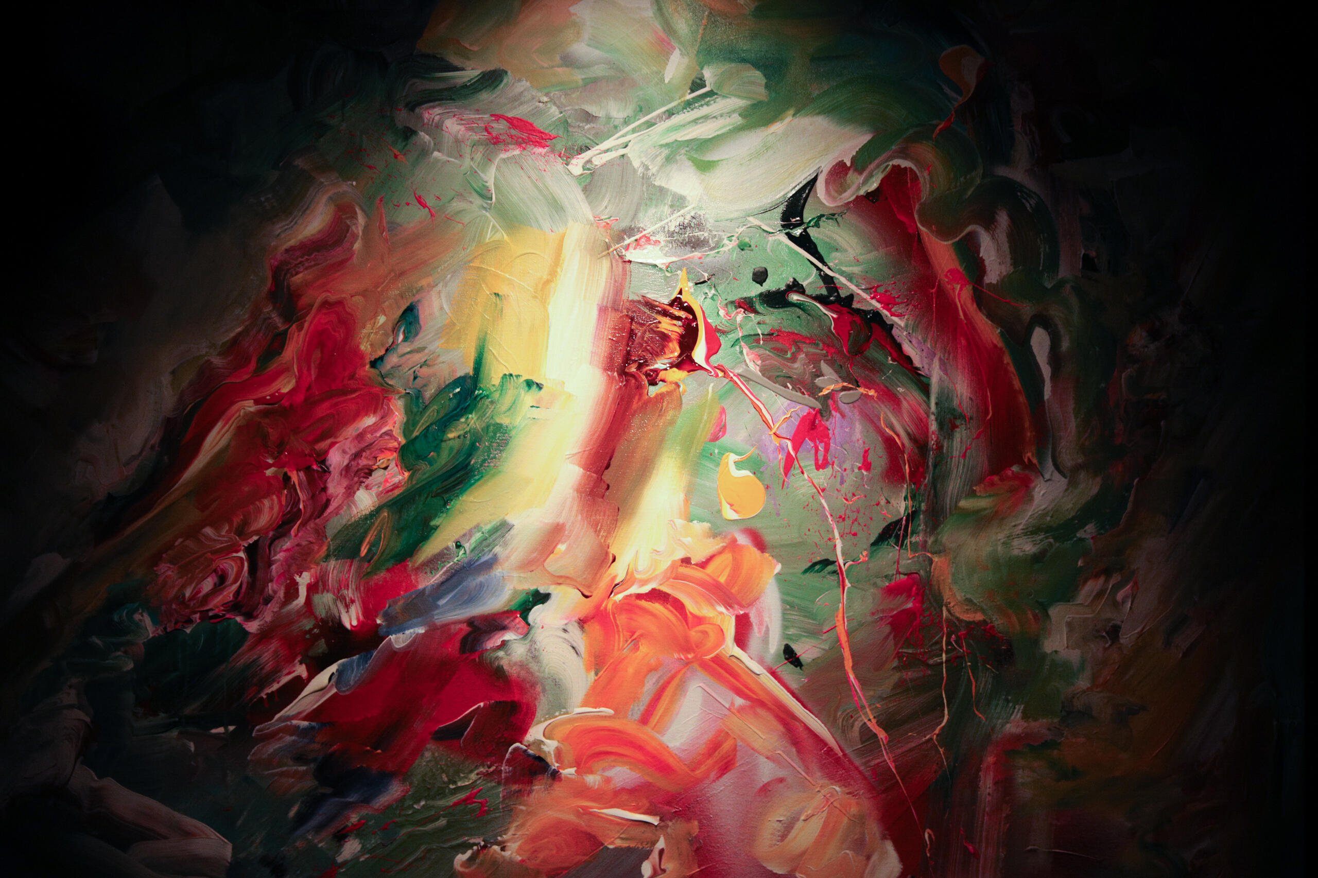
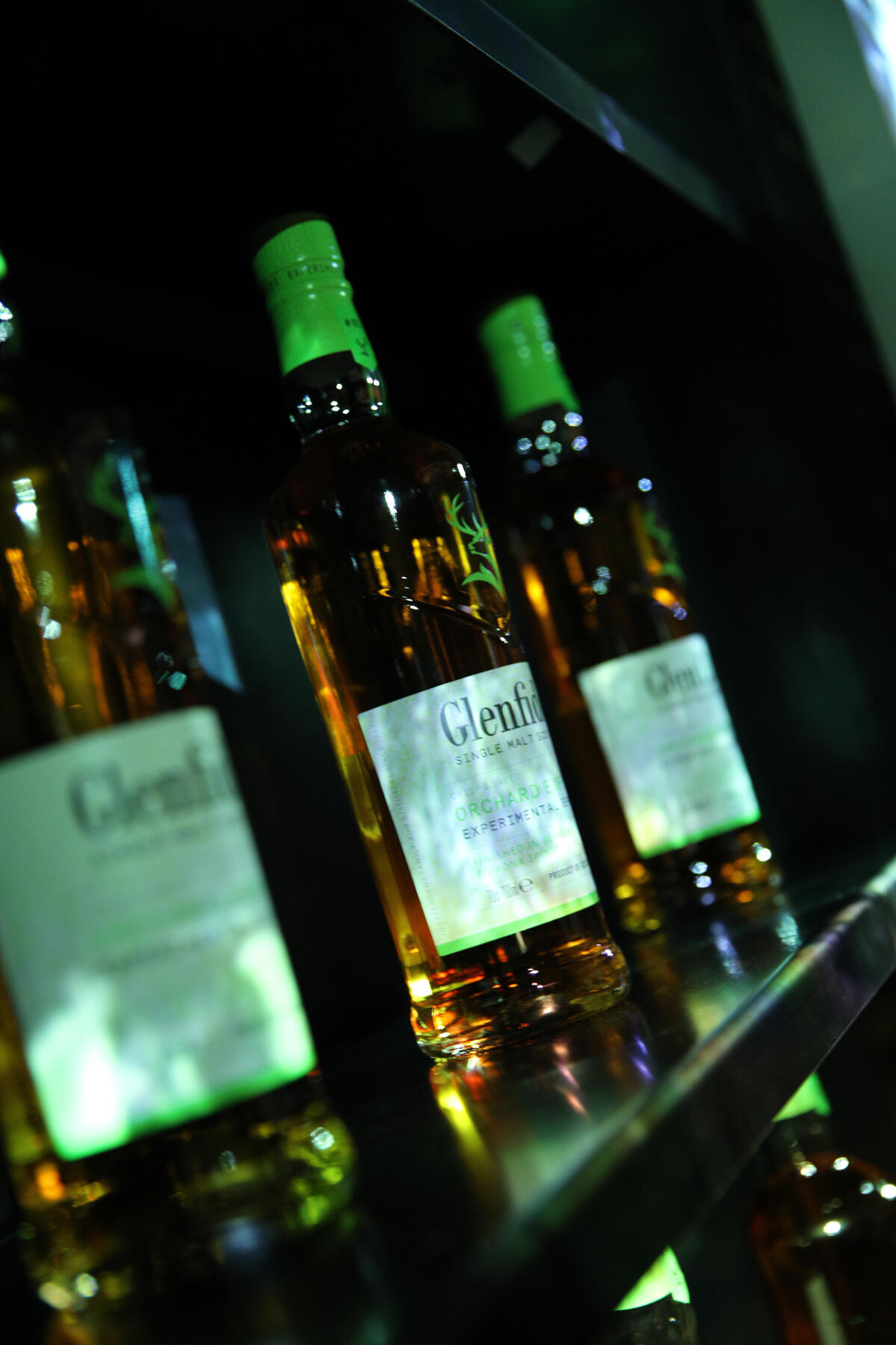
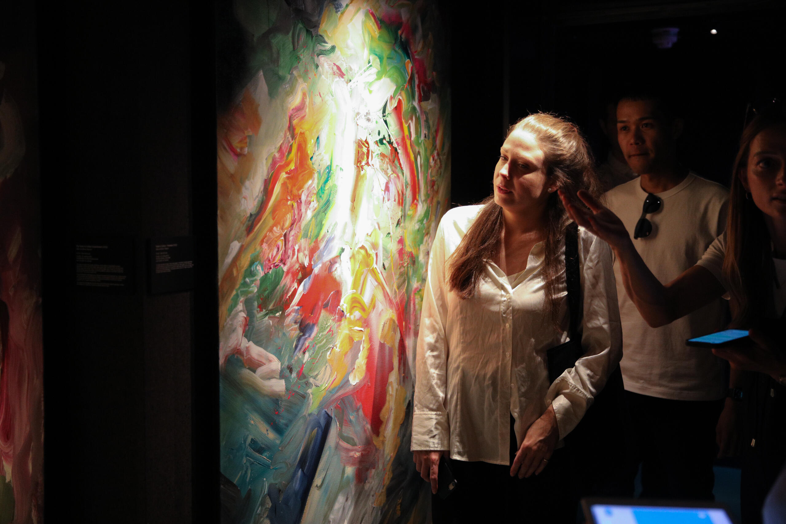
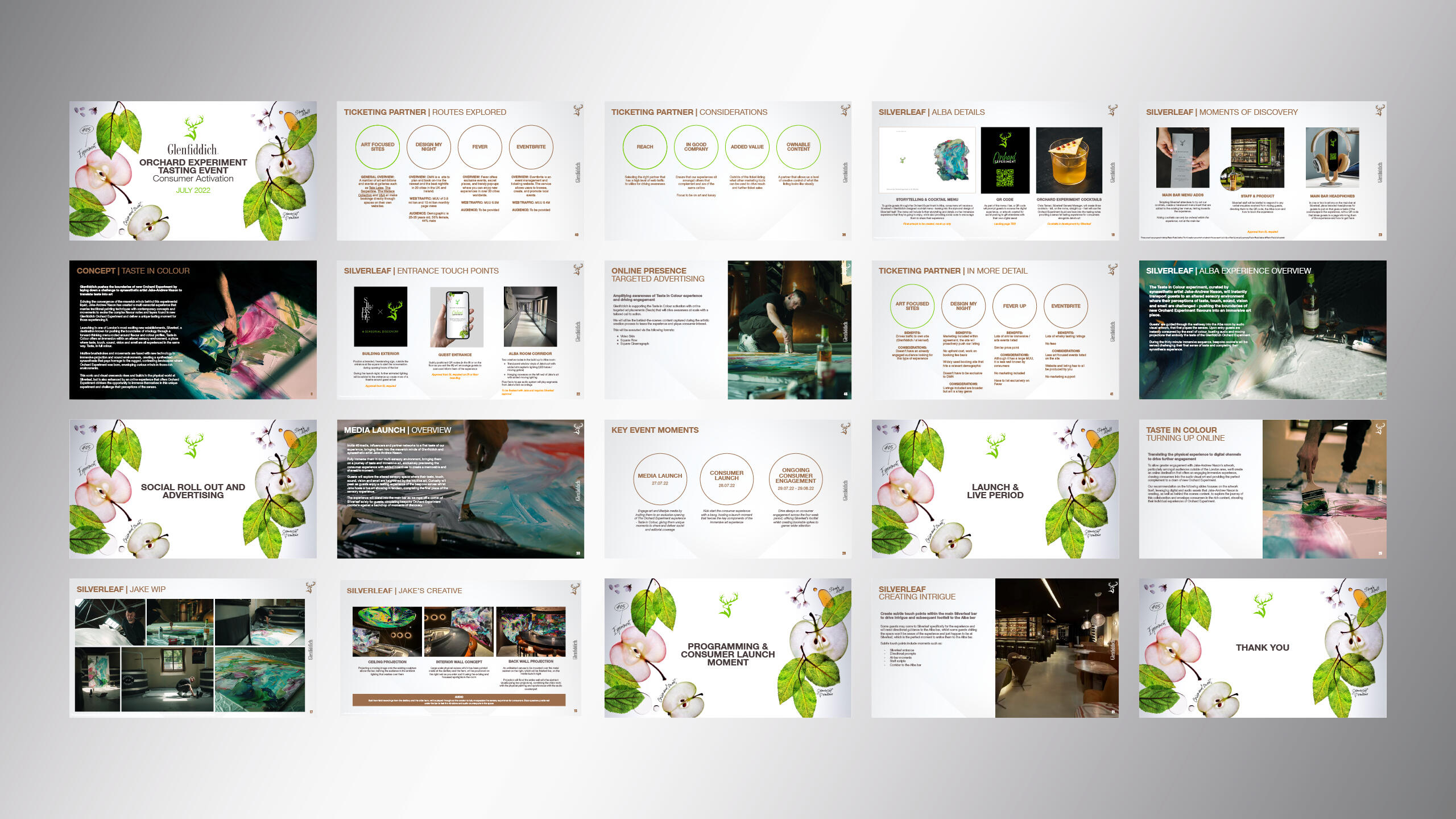
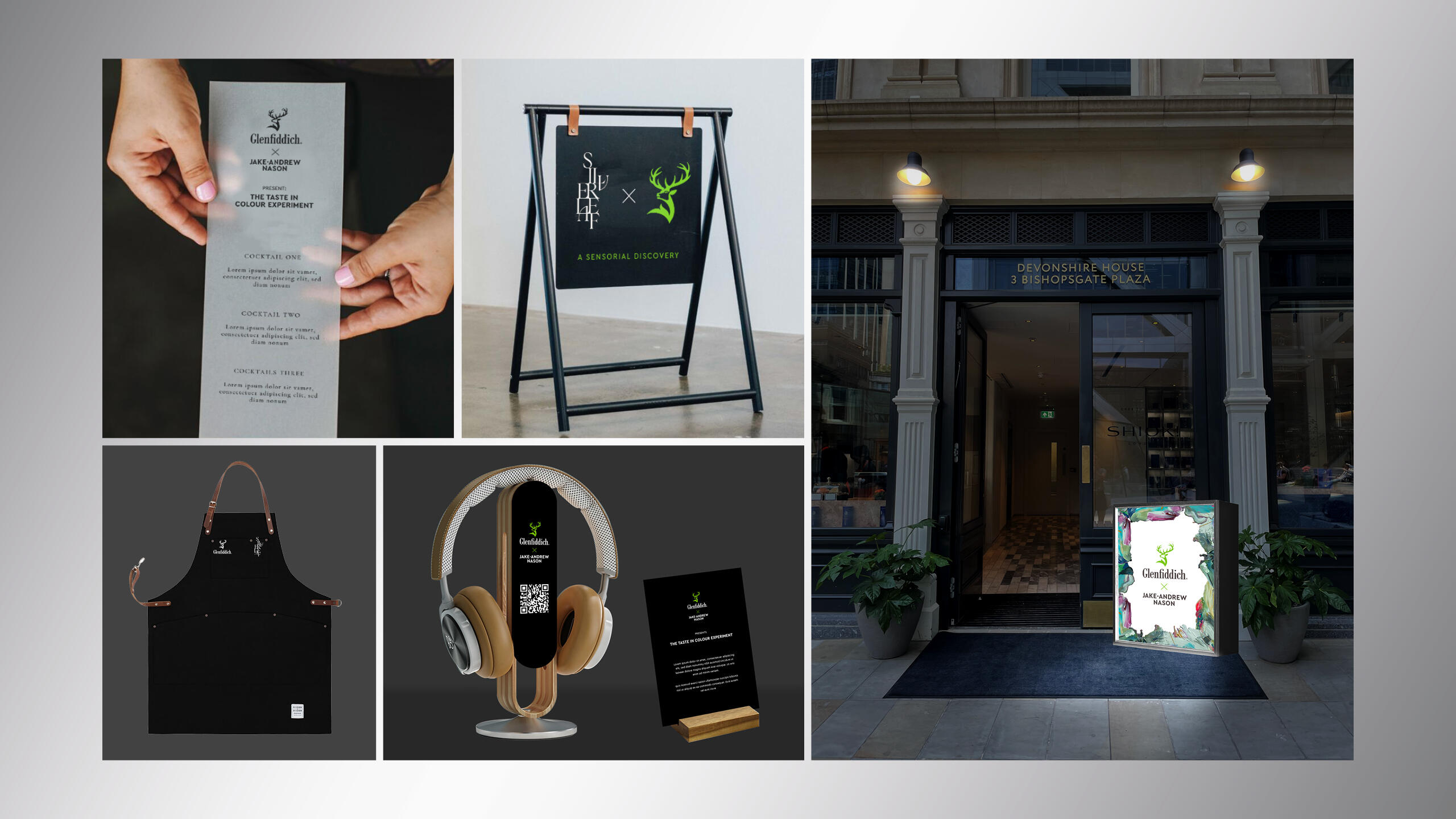
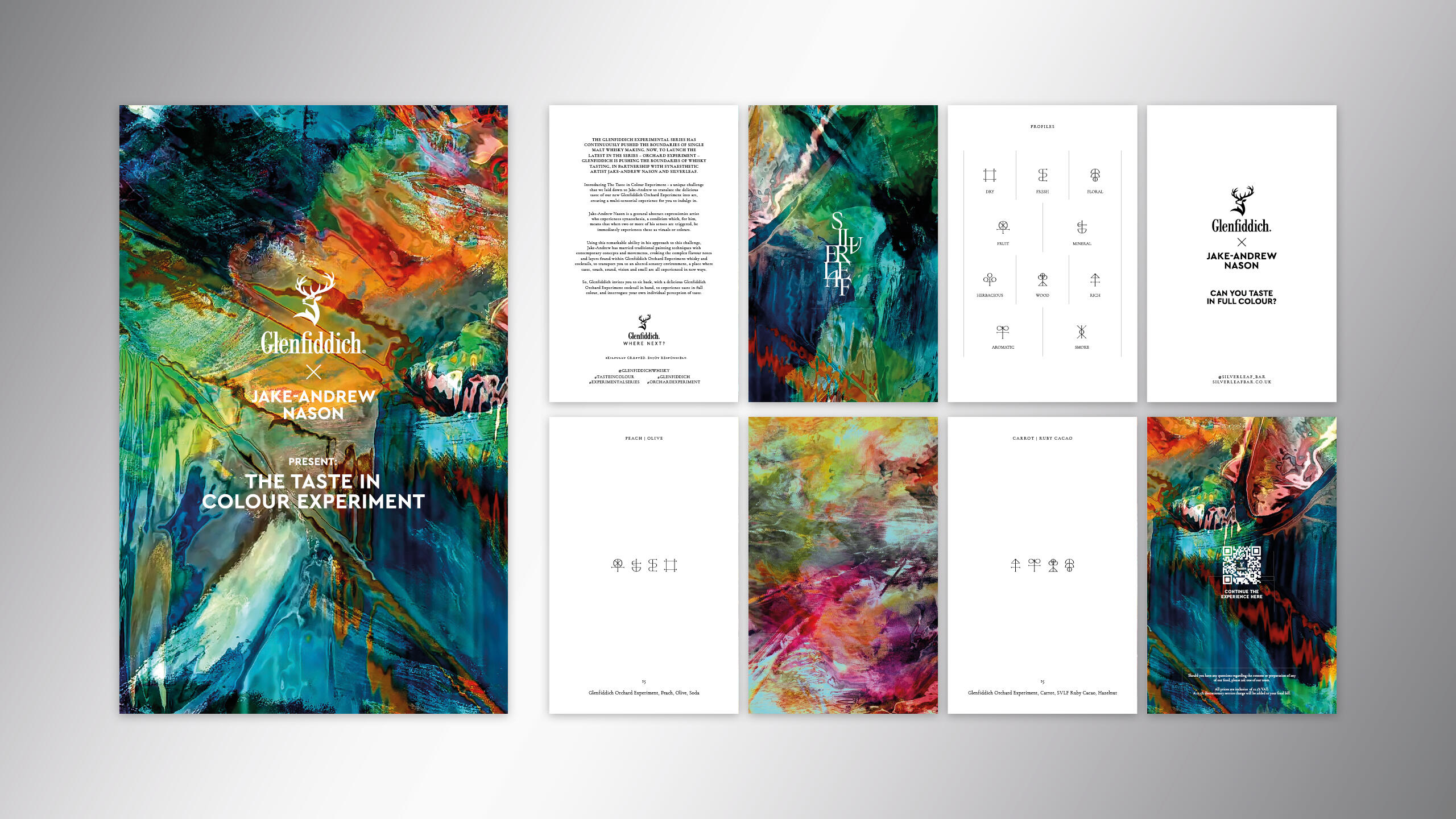
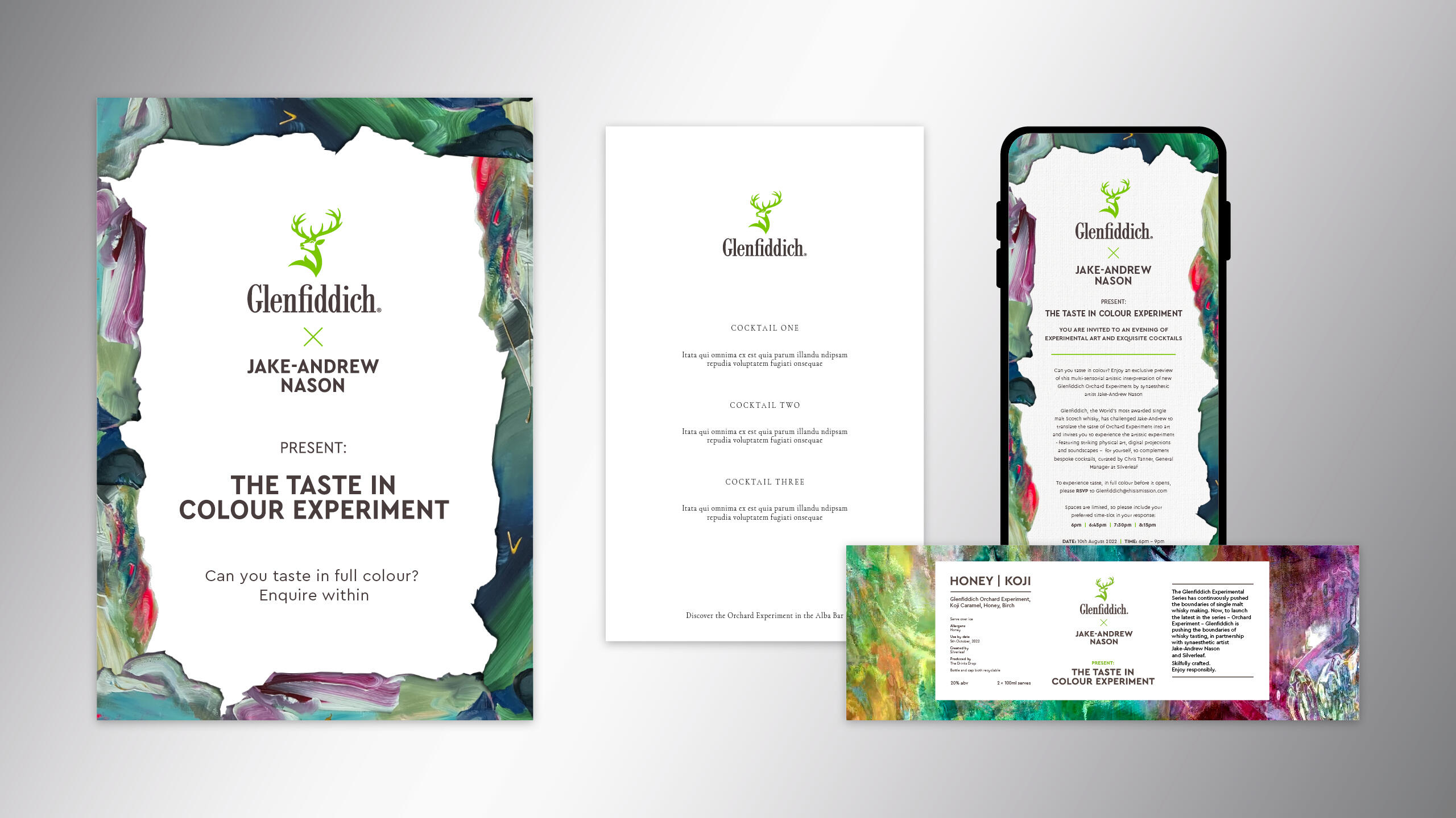
Glenfiddich: Taste in Colour Experiment
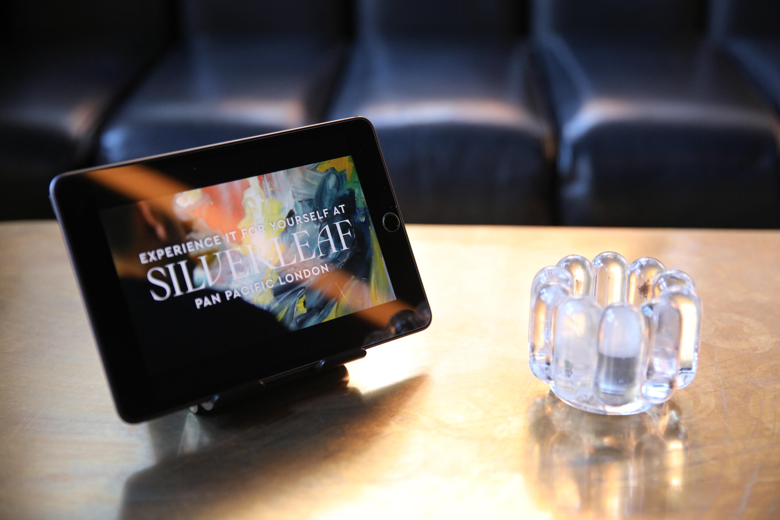
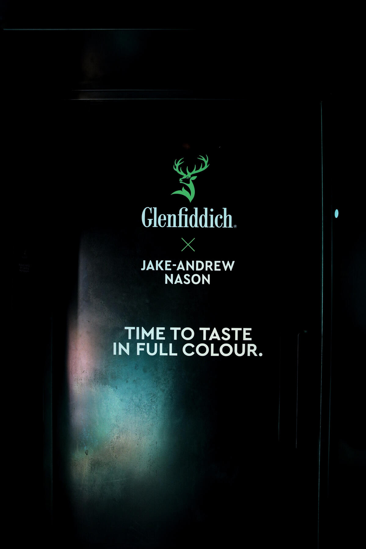
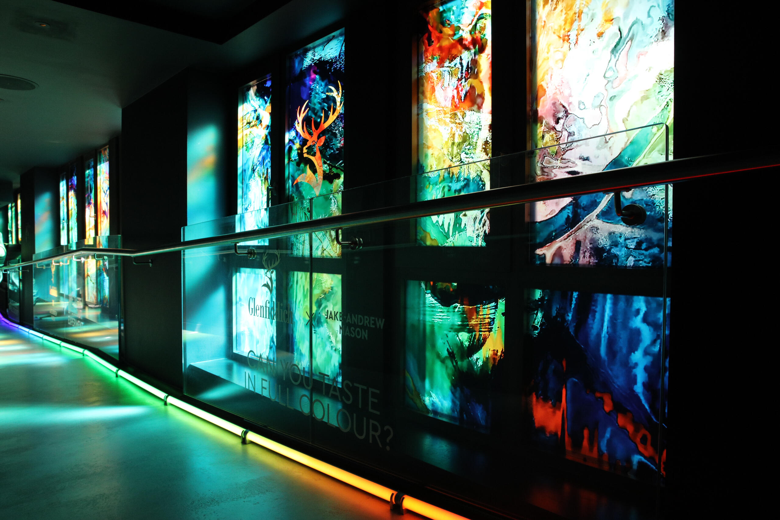
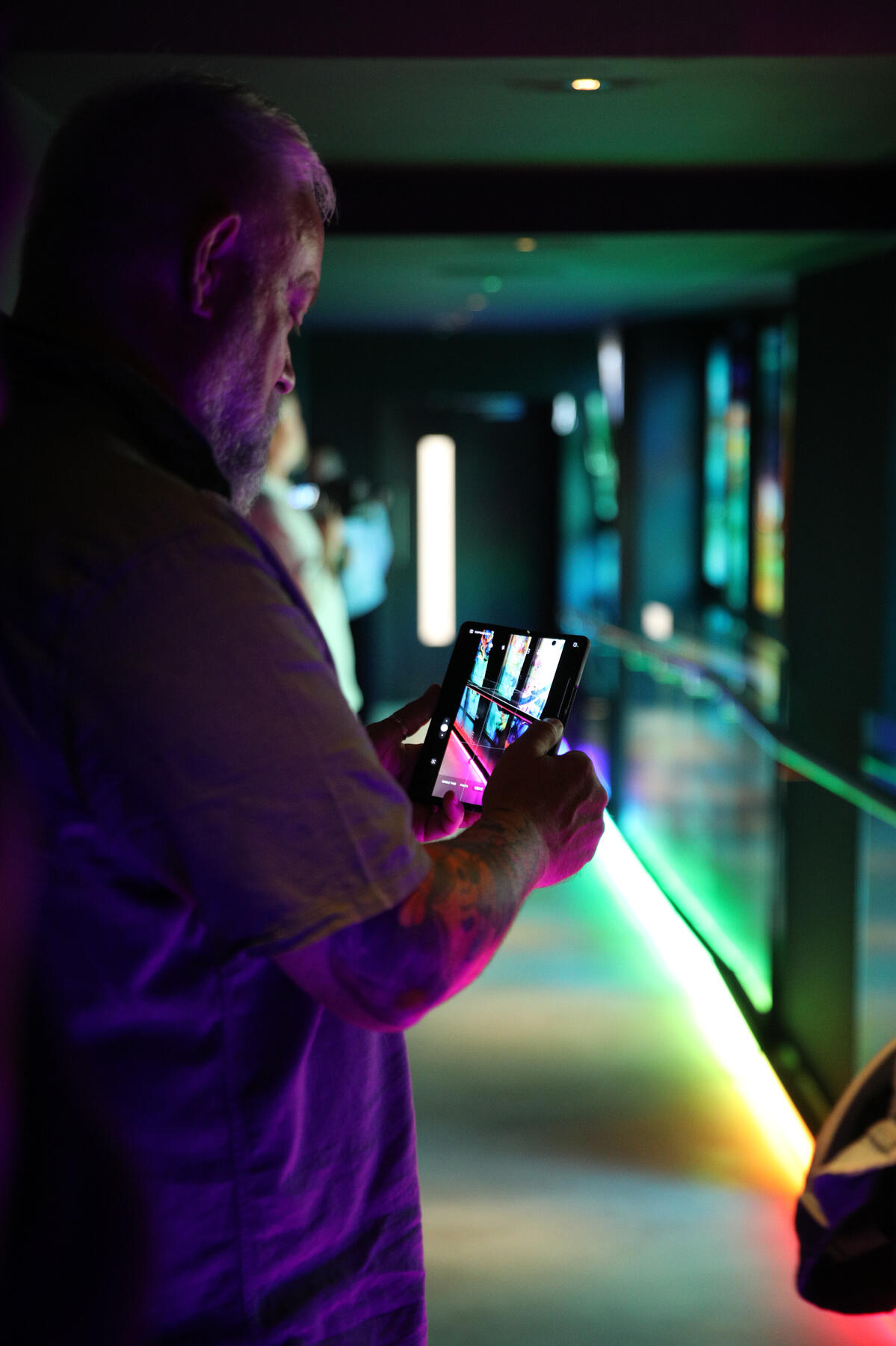
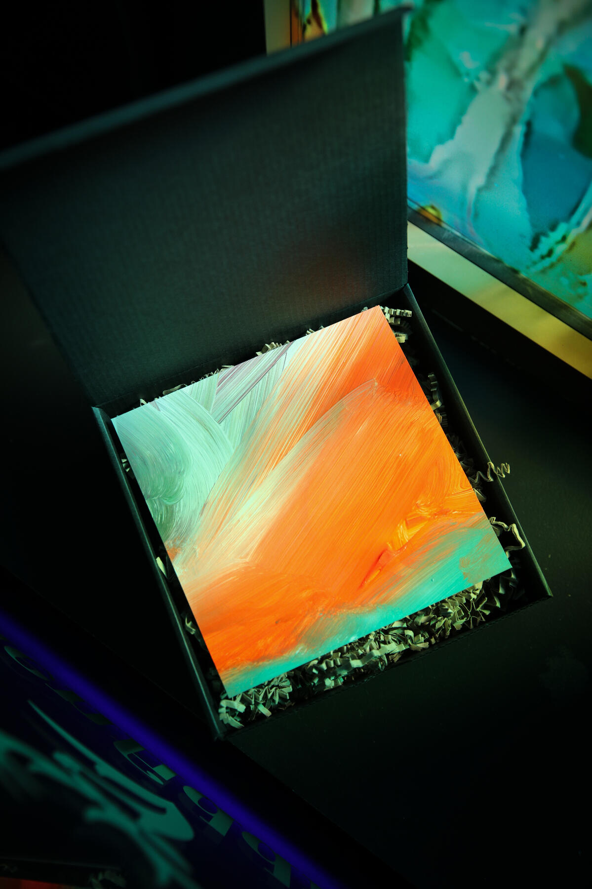
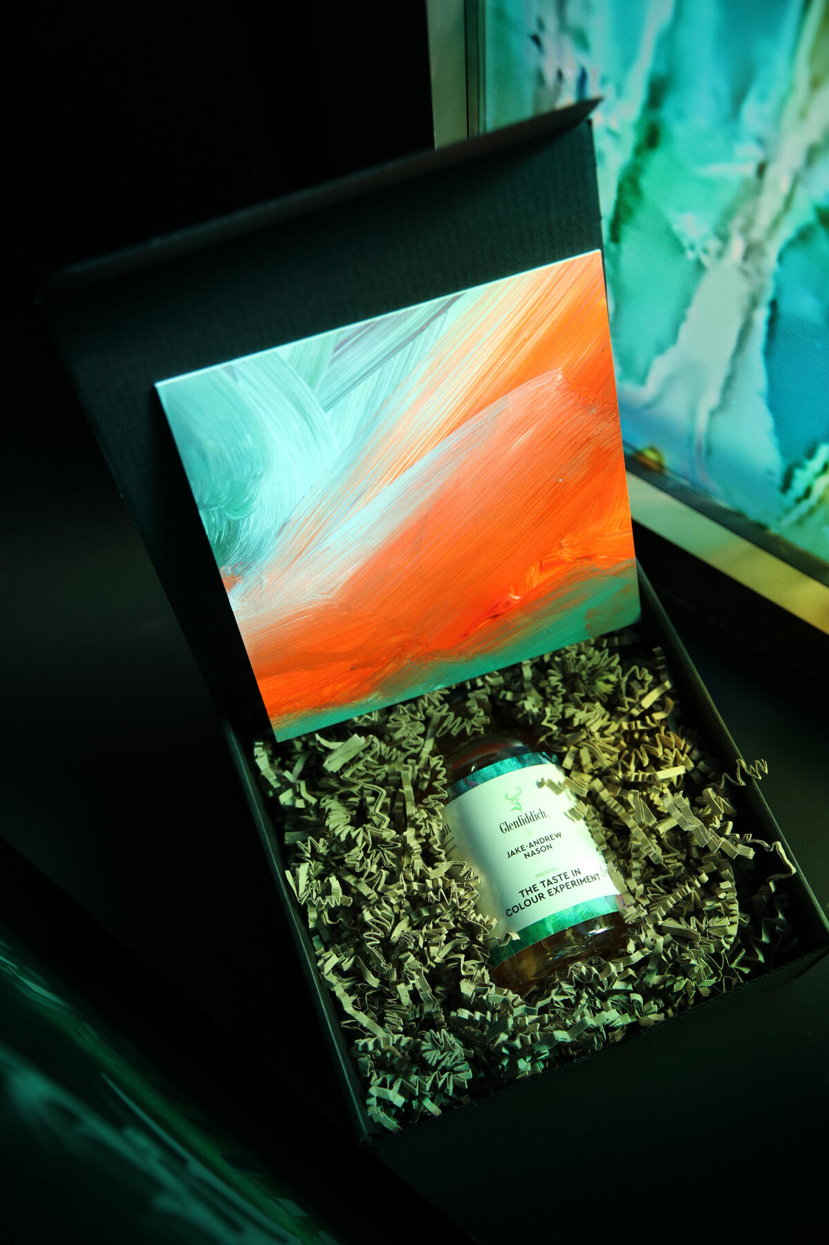
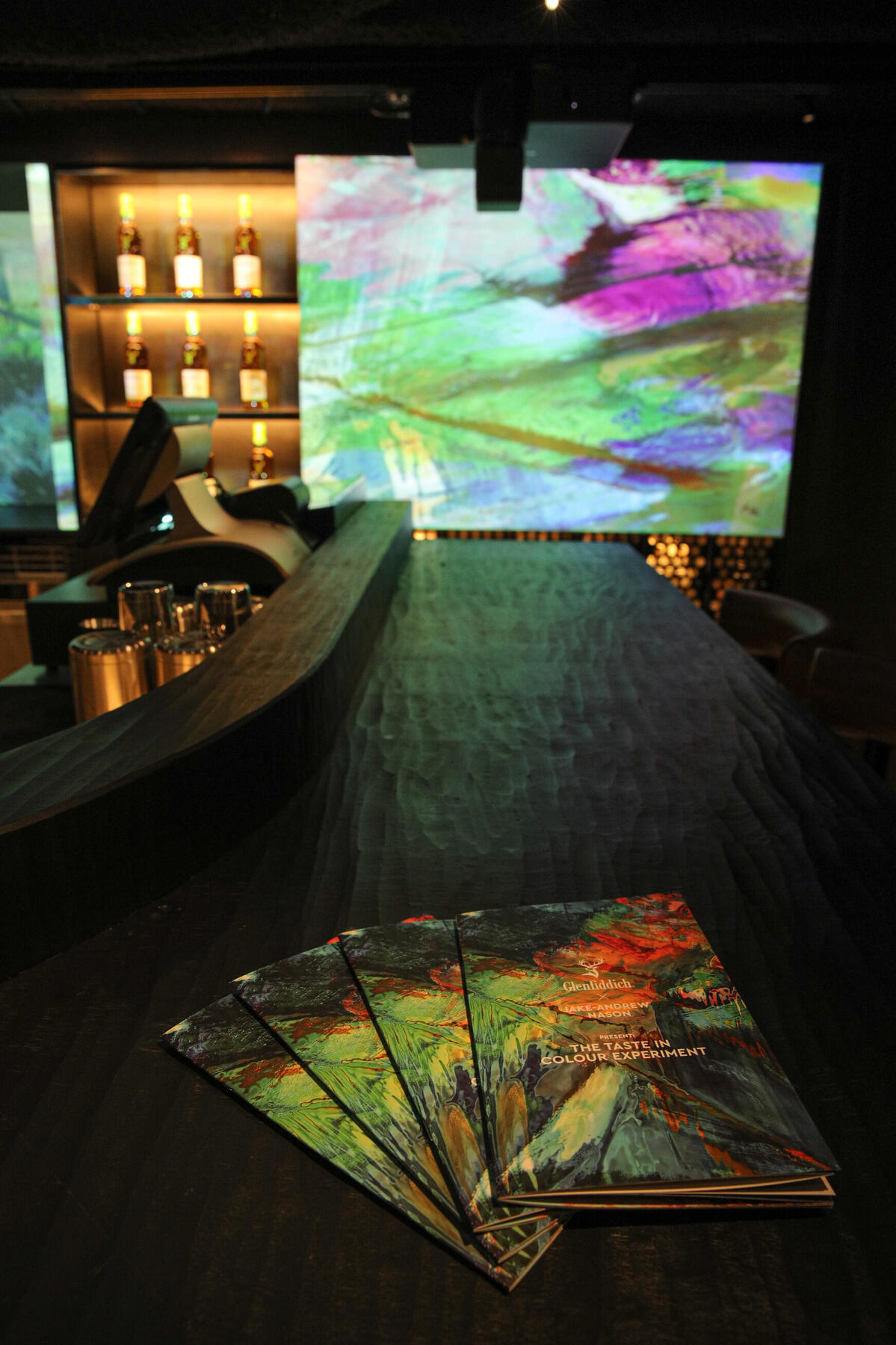
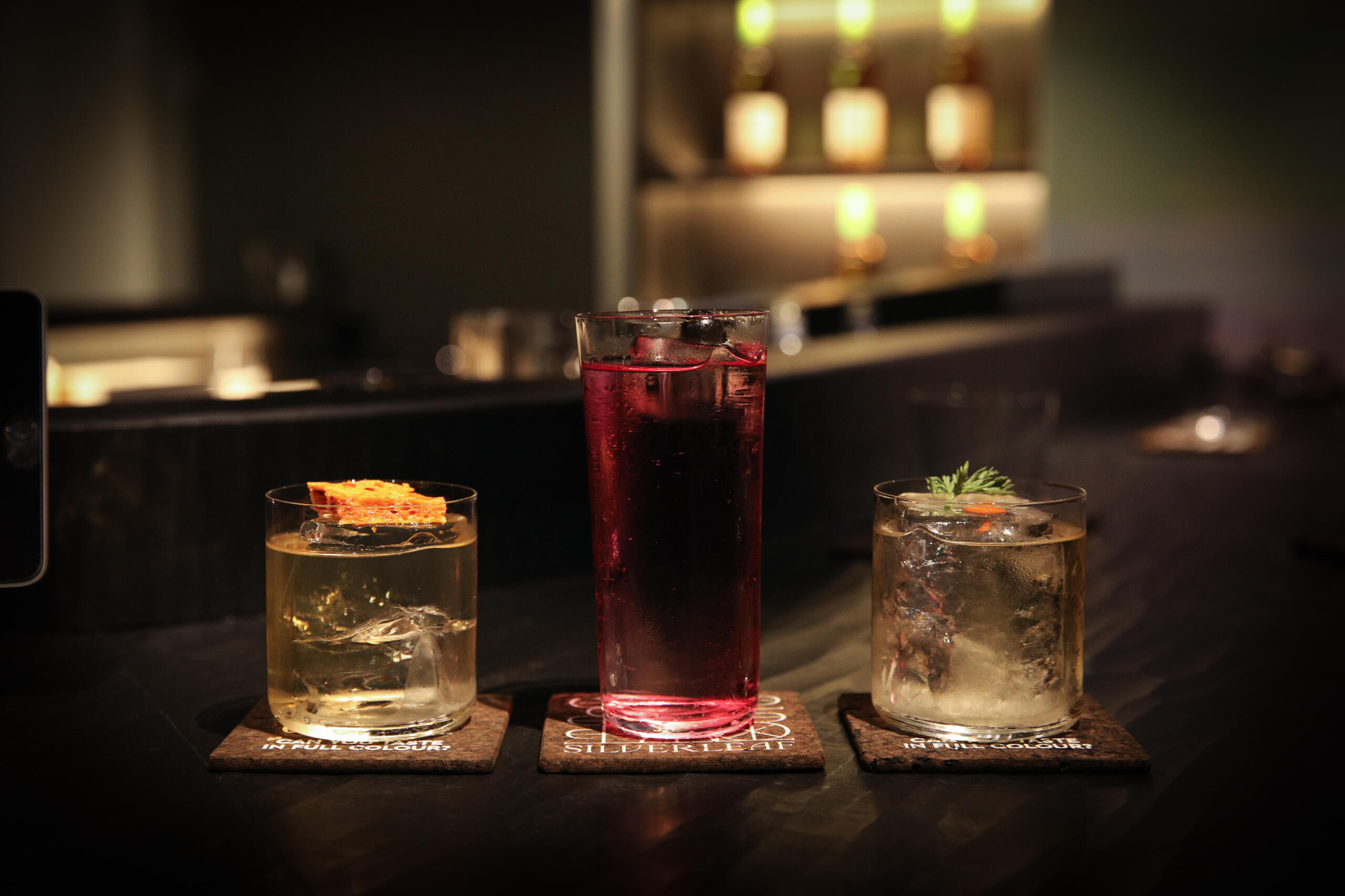
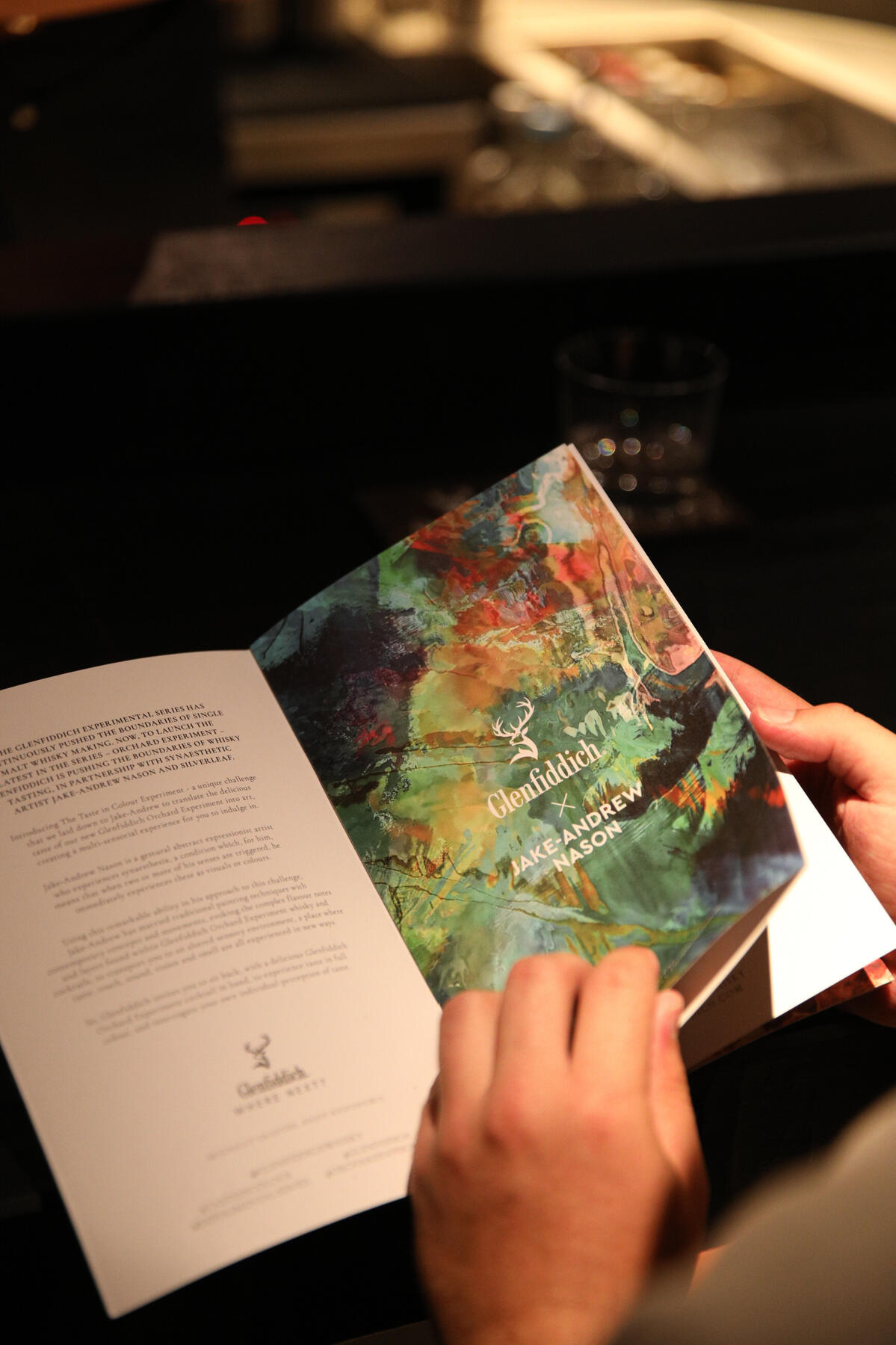
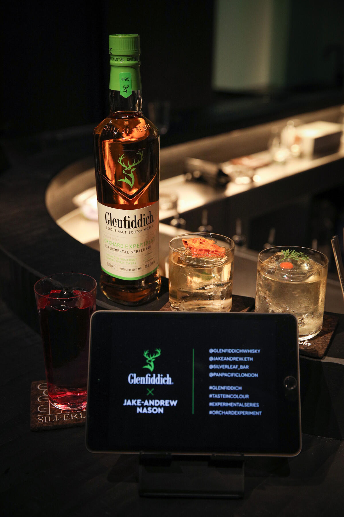
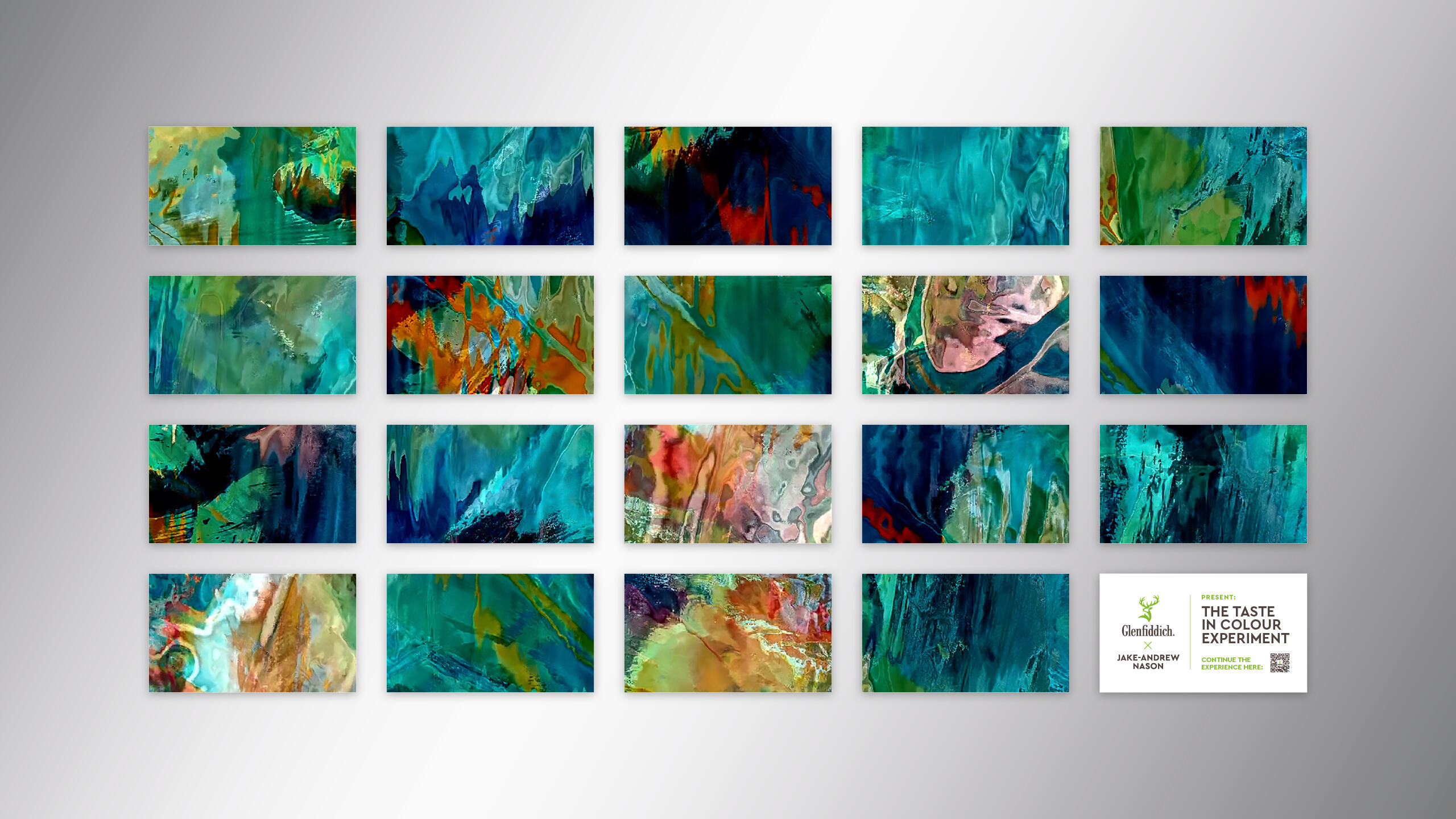
Taste in Colour at Silverleaf, London, curated by synaesthetic artist Jake-Andrew Nason, brings new Glenfiddich Orchard Experiment to life through a unique blend of experimental visual and aural art.
With an Orchard Experiment-inspired cocktail in hand, from a bespoke menu curated by Silverleaf mixologists, Taste in Colour promises to be a truly immersive experience that envelopes guests in this rich and vibrant collaboration.
You may also like:
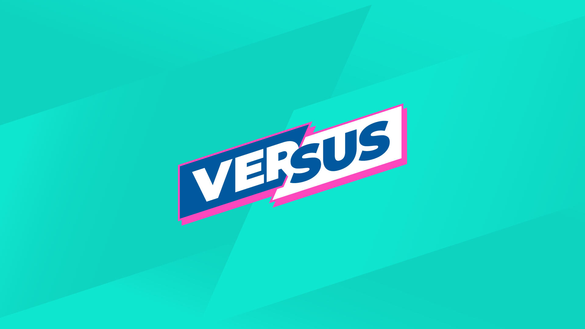
Versus: Online Gameshow
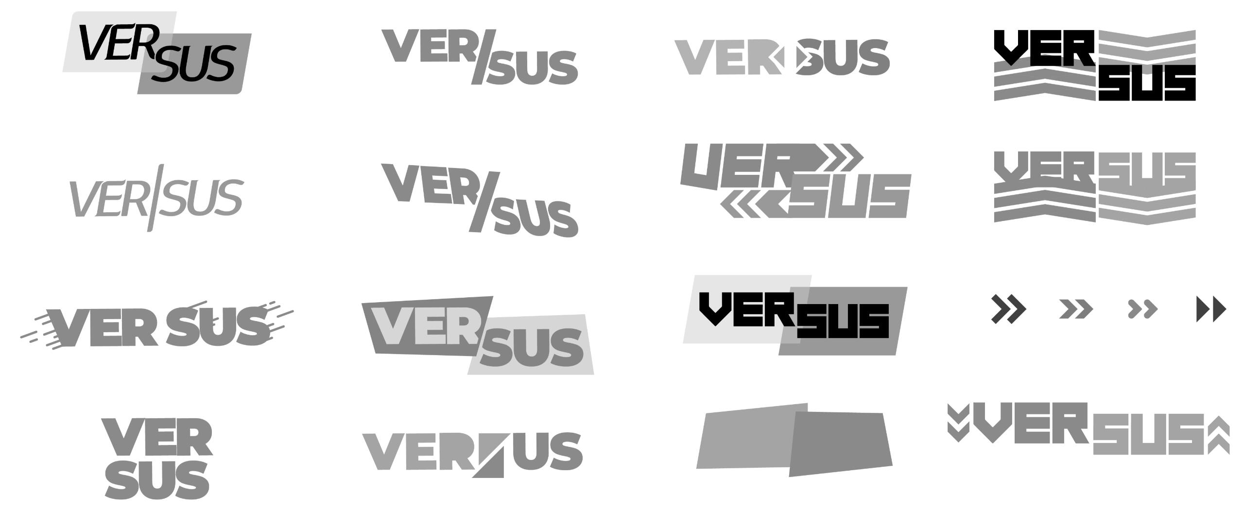
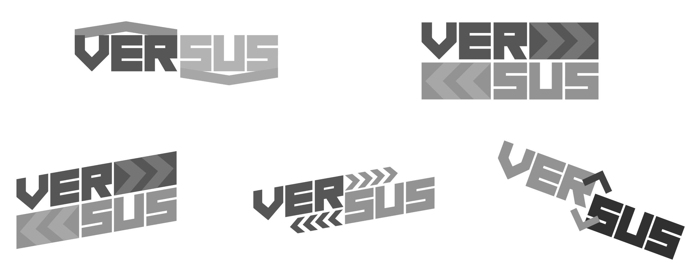
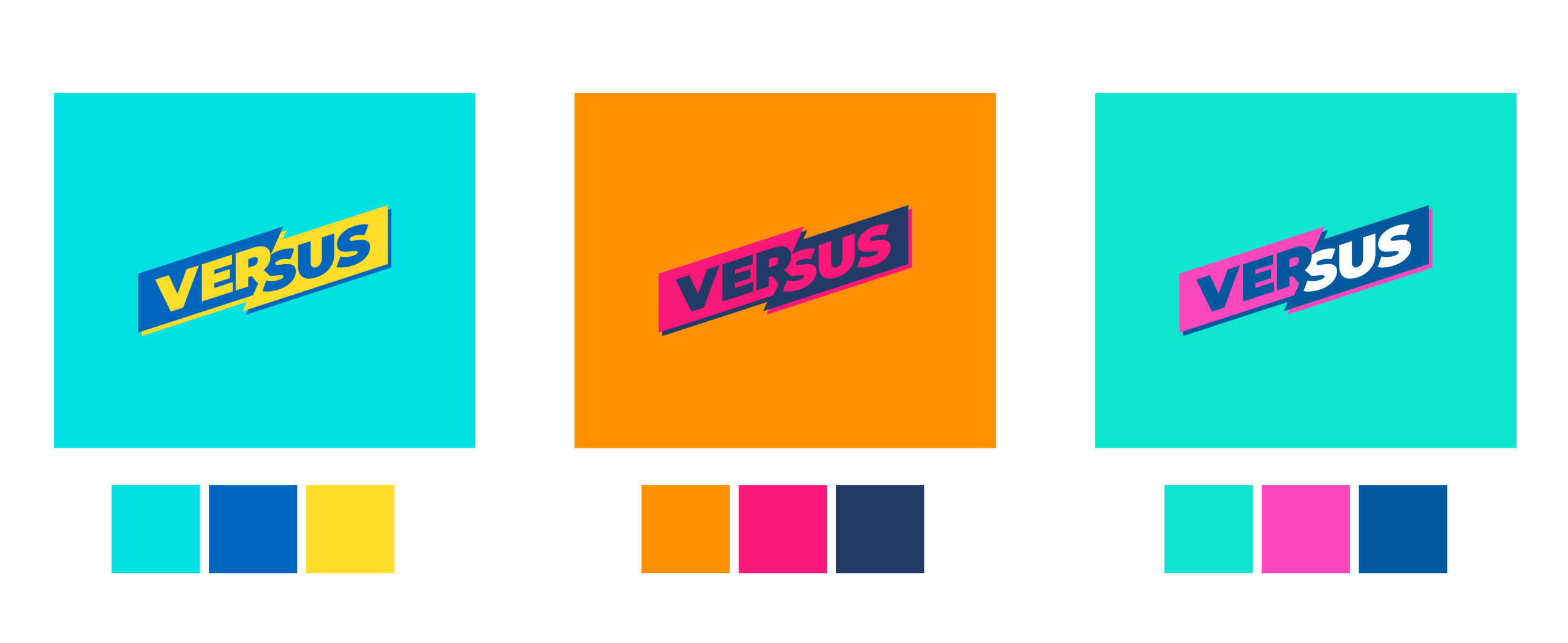
Process: Process: Research > Moodboards > Scamps > Development > Managing Assets
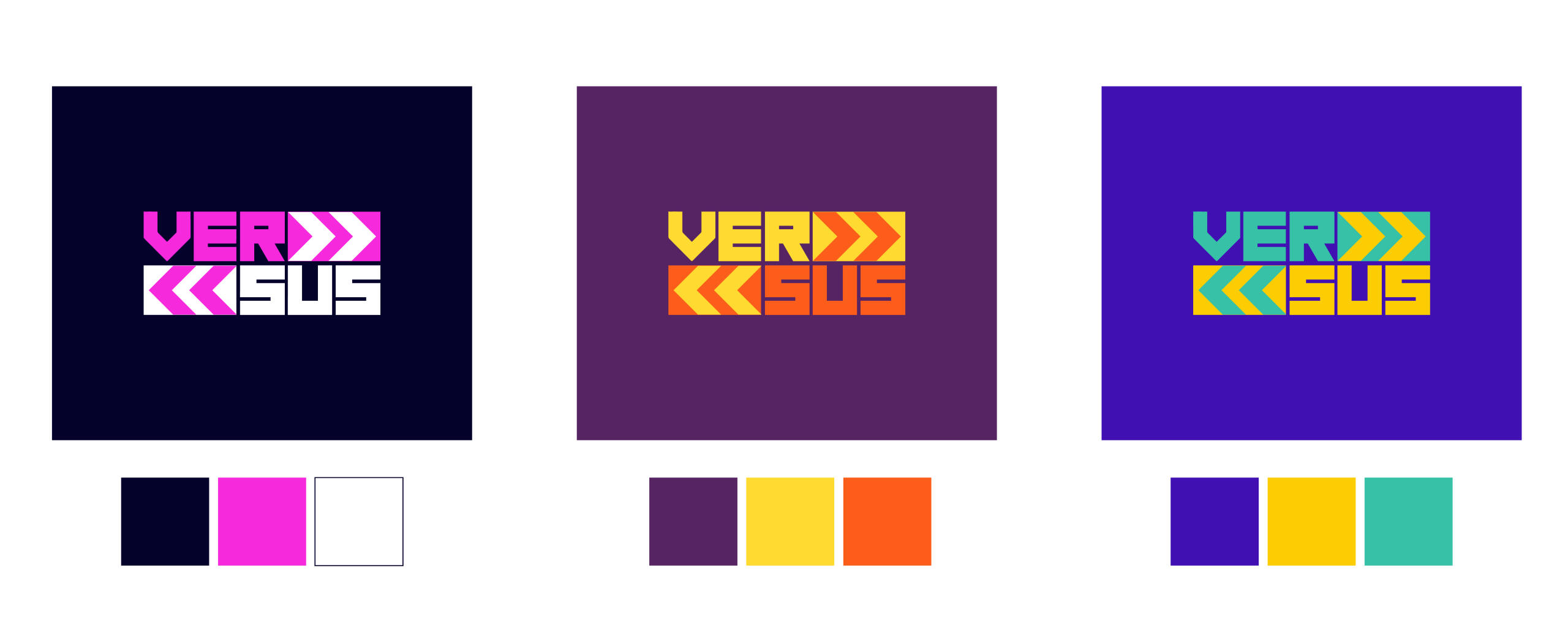
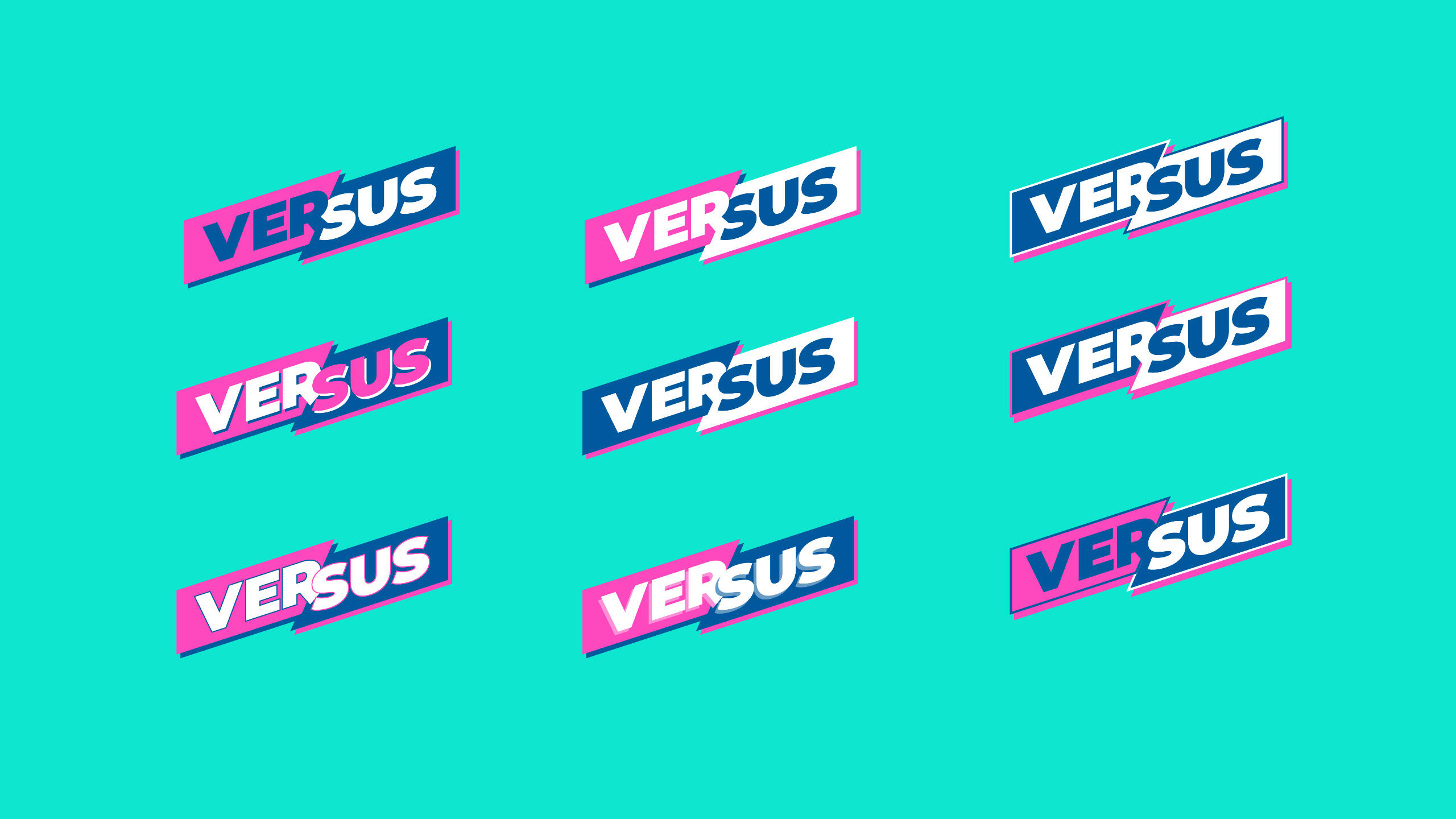
Deliverables: Main Logo, Room Logos, Titles Stings, Game Stings
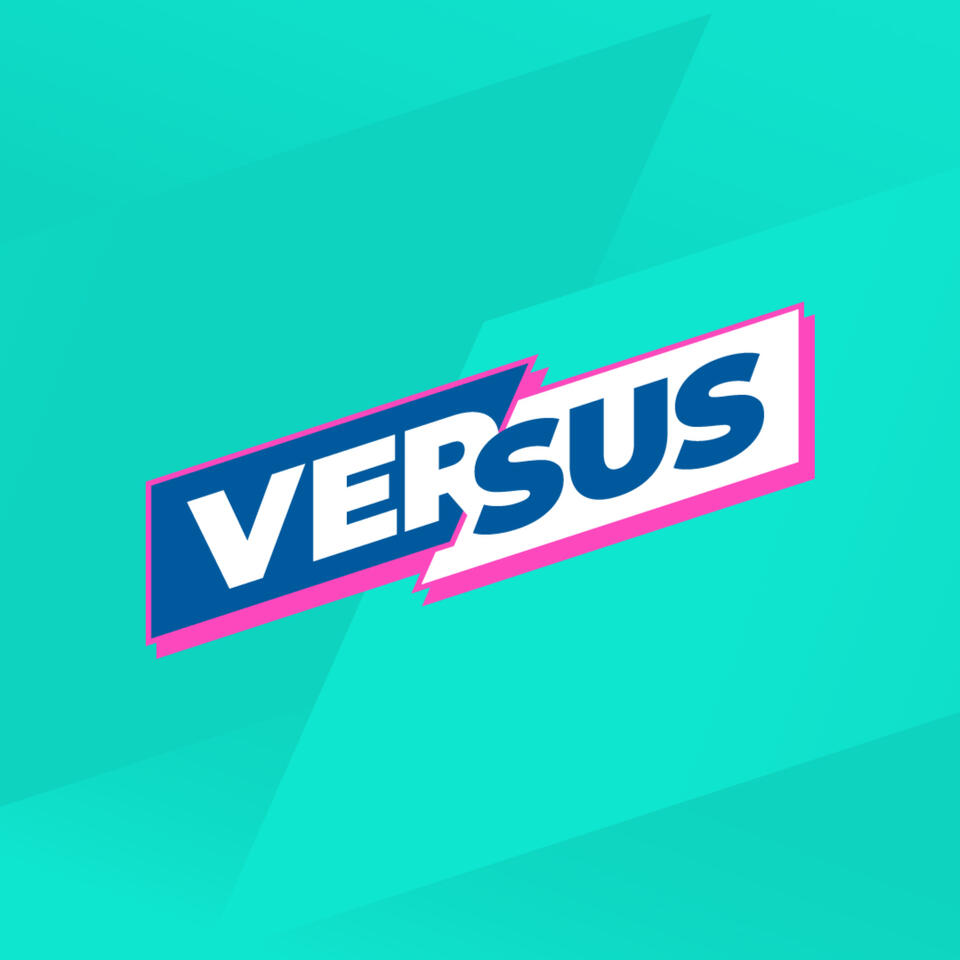
Versus is a room vs room game show that streams via the Chat-o-Vision Network that is owned by Gamesys. The aim was to help with player retention for the launch of Double Bubble Bingo. I was Creative Lead on this project with the oversight of the Head Of Design. I presented my designs, liaised with stakeholders and advised the 3D Animation Team on how the stings should look.


You may also like:
Have a project in mind?
Please don’t hesitate to get in touch. Simply fill out the form to request a quote for a project, enquire about a collaboration, or simply say hello. info@brandonworrell.co.uk
NWD Coaching
Process: Research > Strategy > Concepts > Development > Managing Assets
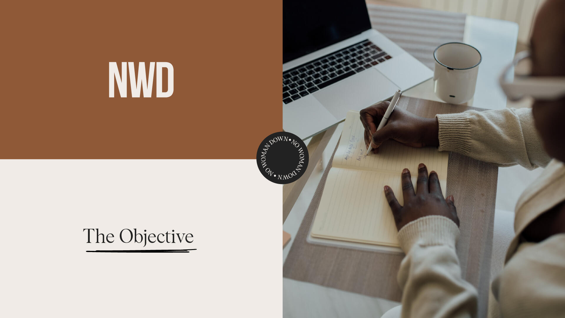
No Women Down Coaching provides personal development programmes and tools professional and entrepreneurial women. I create the brand identity to represent its target audience which was mainly 25-35 year old ethnic minorities women. I felt that during my process of discovery the colours used would be very important in the visual language.

You may also like:

Straight Path Strategies
Process: Research > Strategy > Concepts > Development > Managing Assets
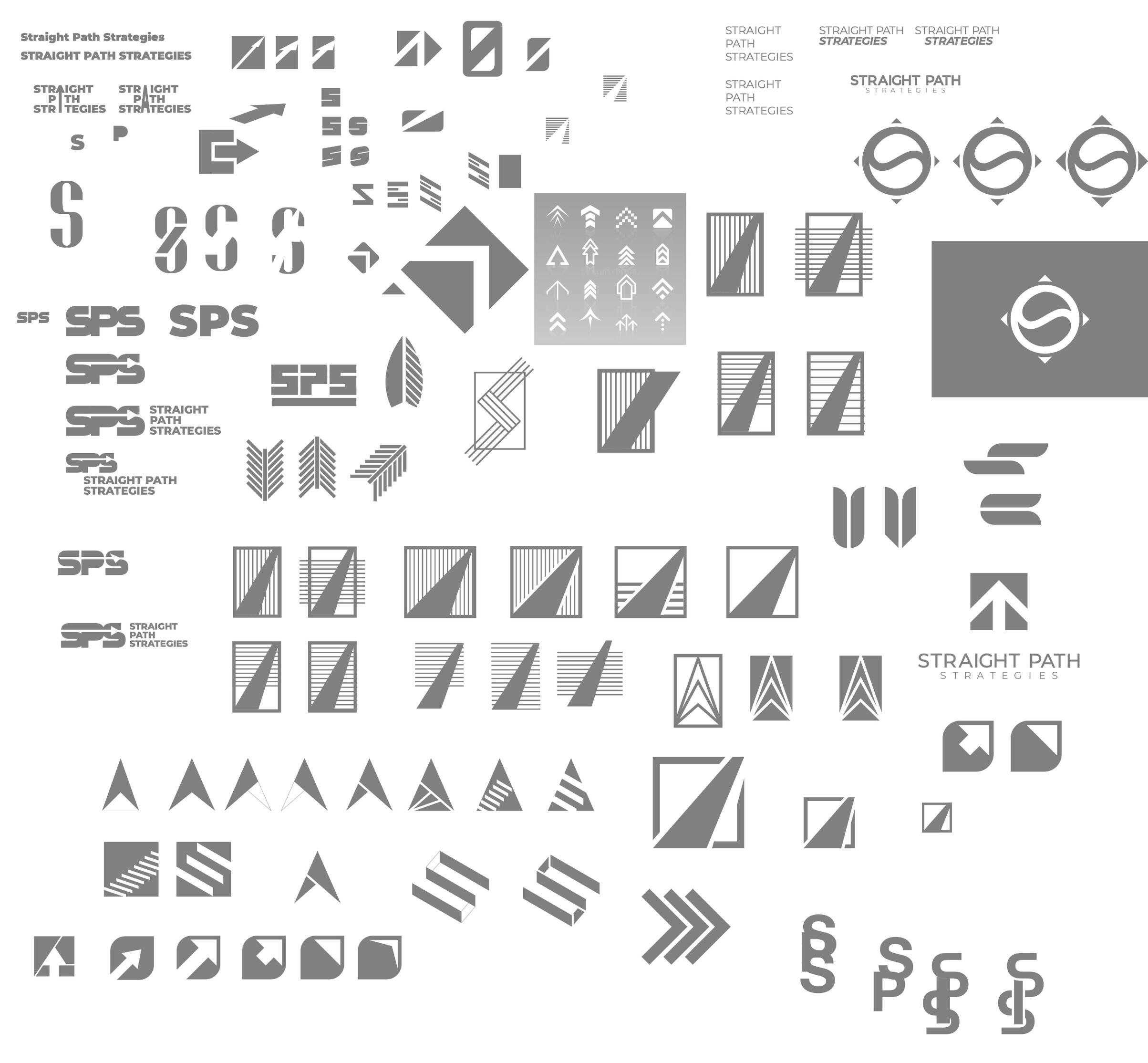
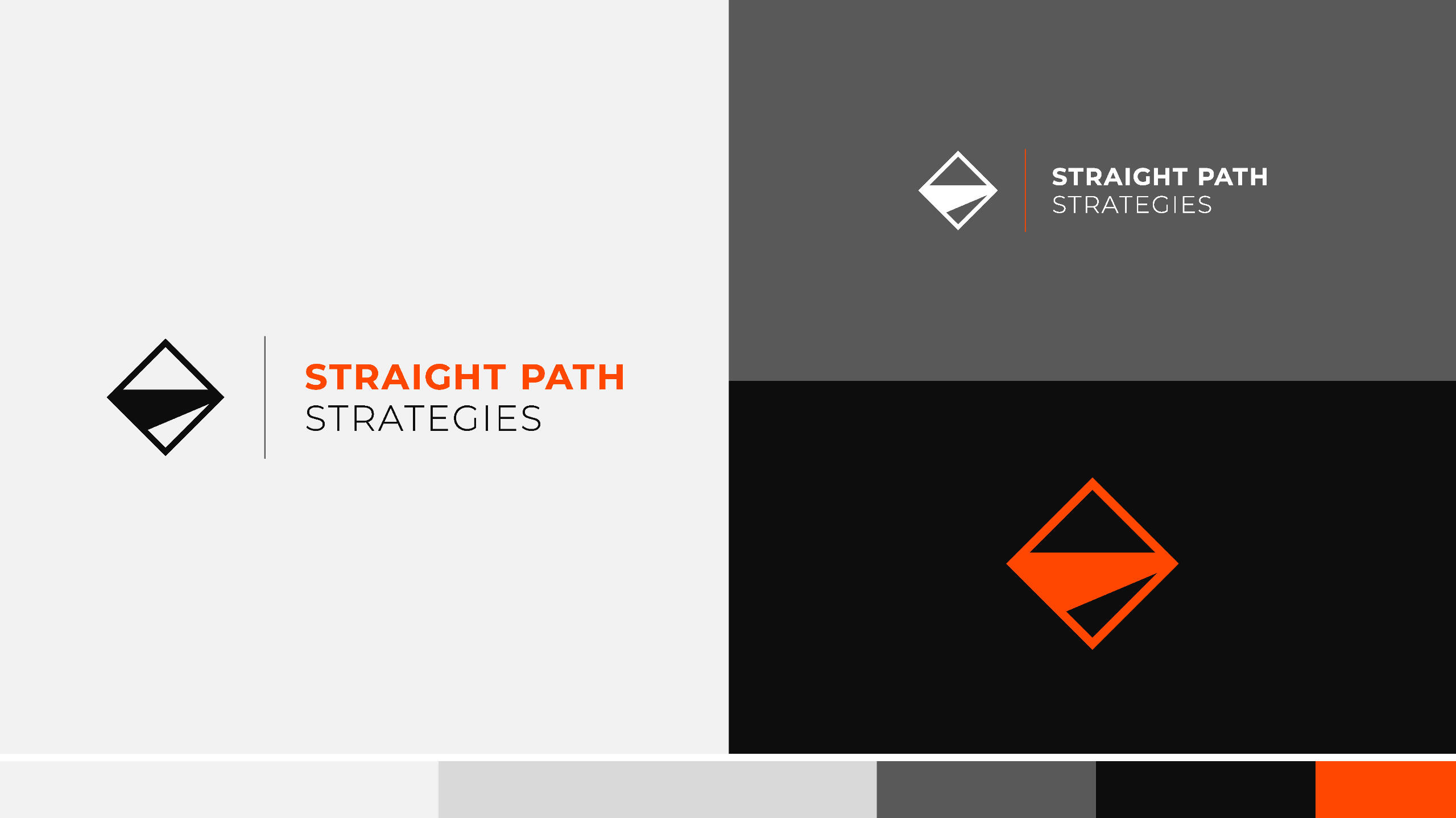
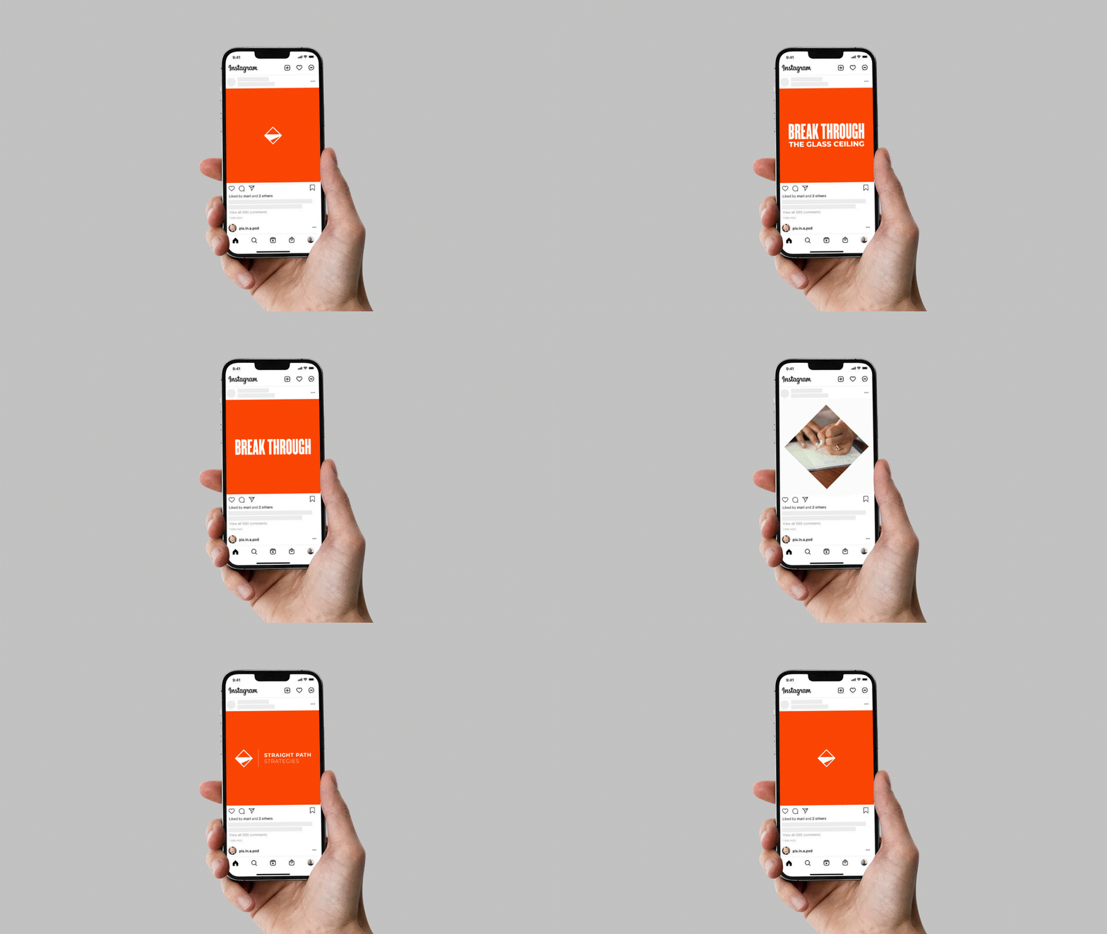
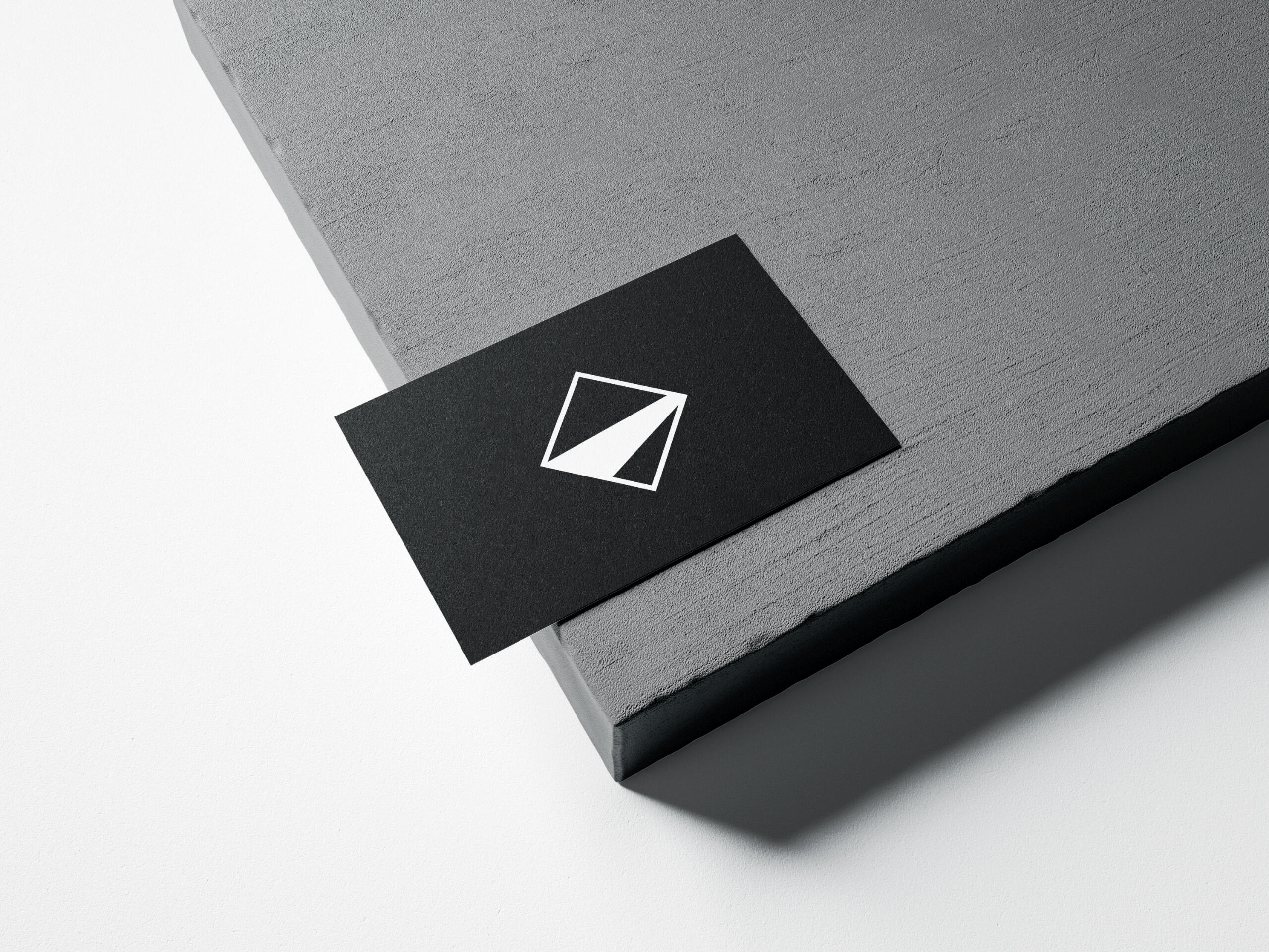
The intention of Straight Path Strategies, LLC is to create a unique approach for fostering career development in early-career academics and helping academic and non-academic institutions implement innovative, actionable steps for realising their goals for diversity, equity, and inclusion.


You may also like:
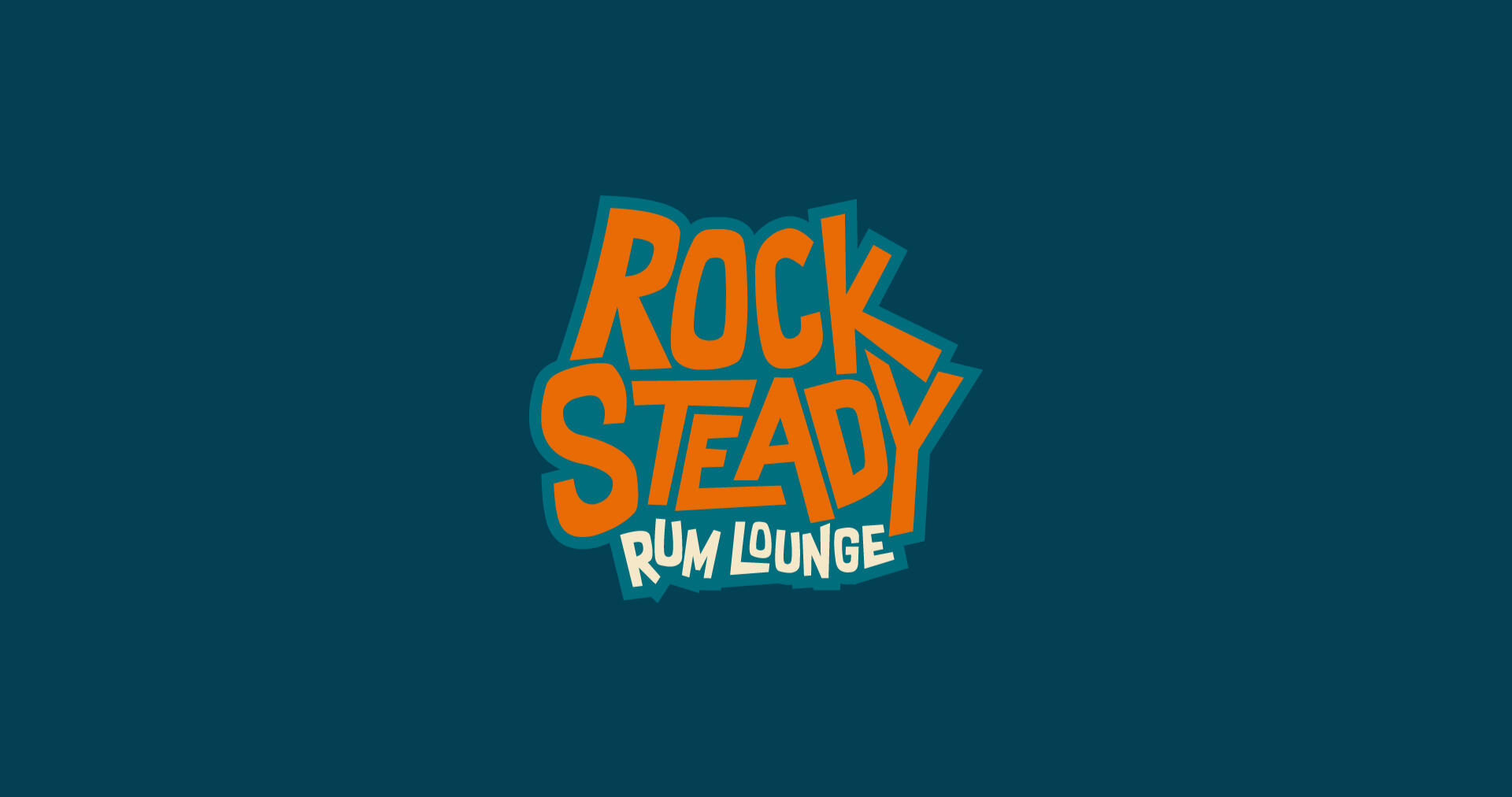
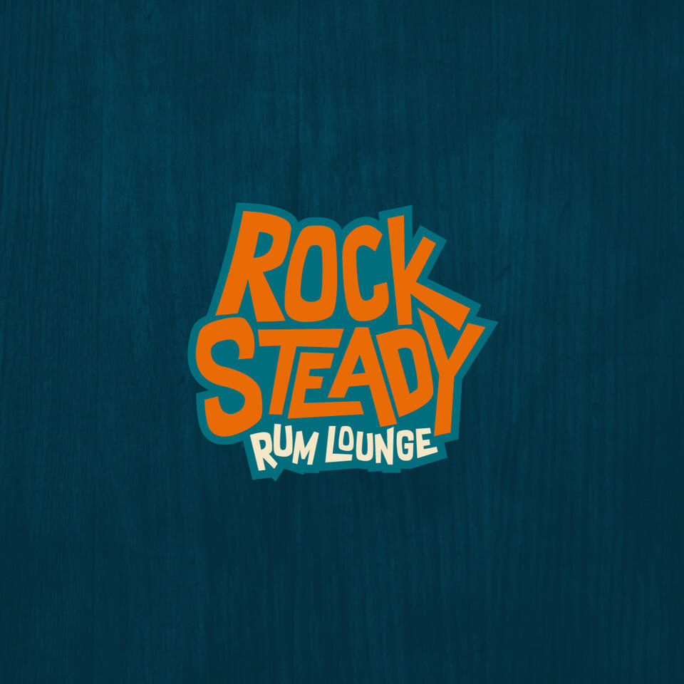
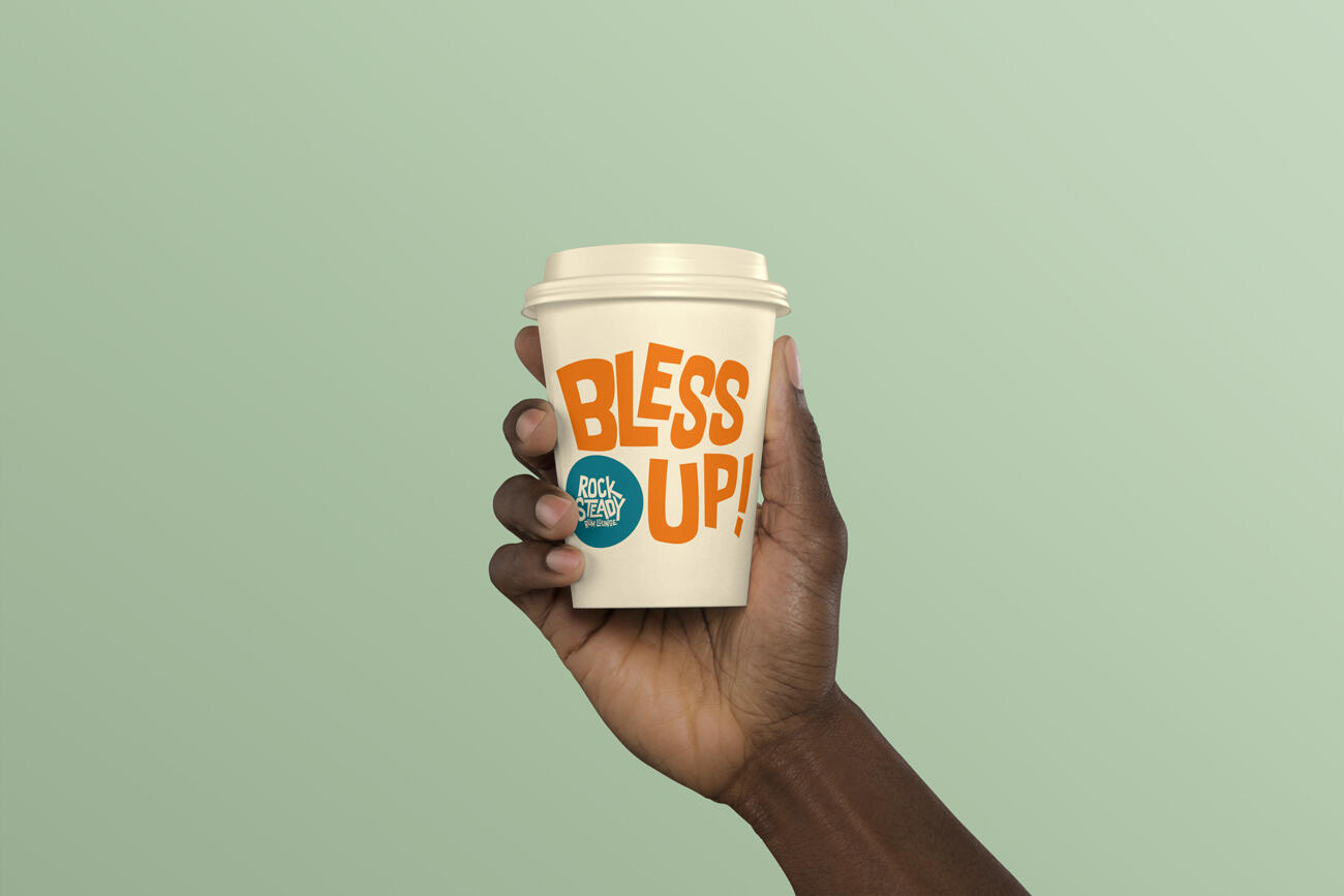
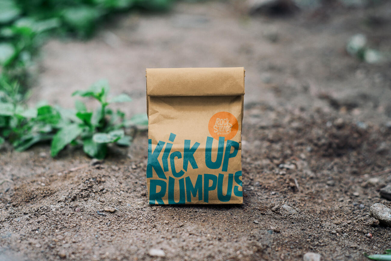
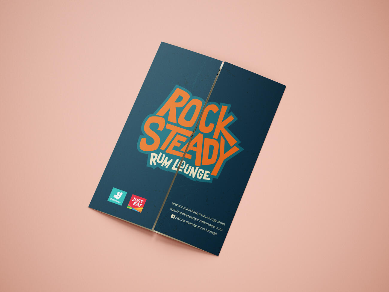
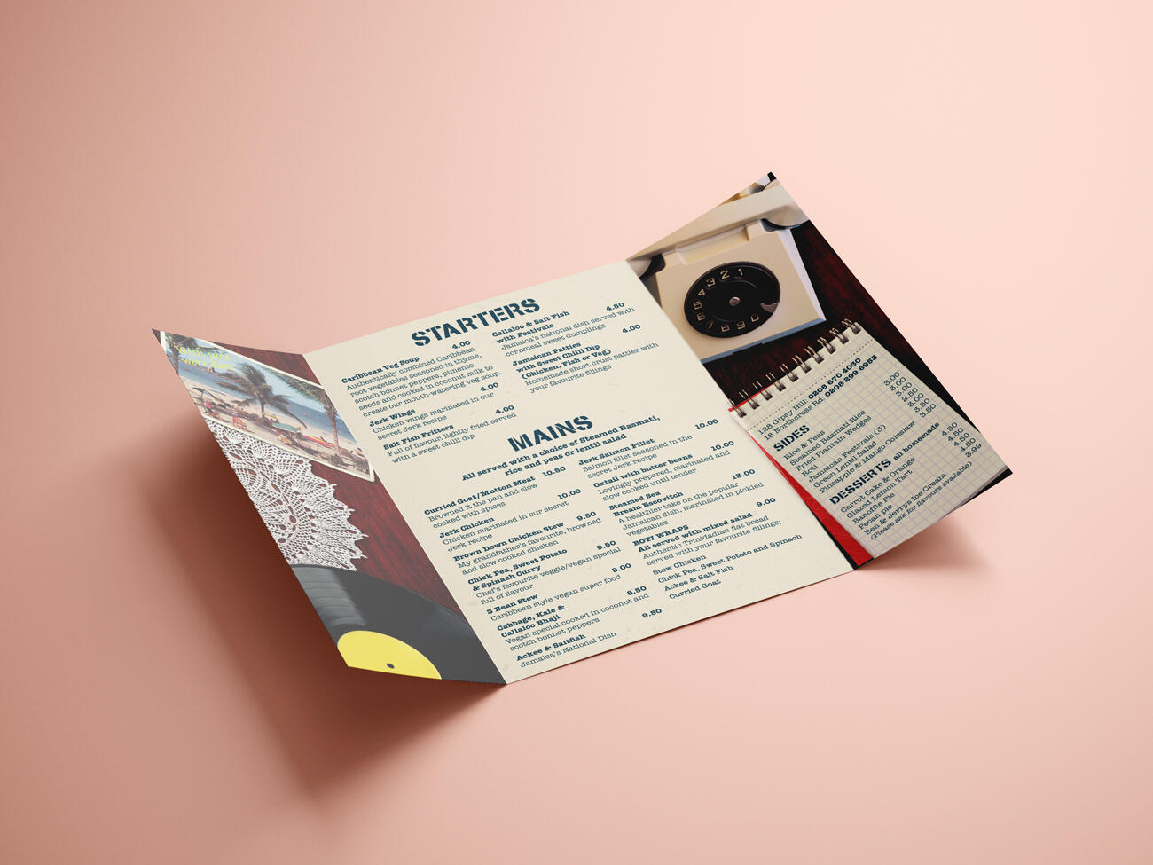
Rock Steady rum lounge
Process: Research > Strategy > Concepts > Development > Managing Assets
Deliverables: Logo, Colour Palette, Custom Pattern, Typography, Menu, Poster, Flyer,
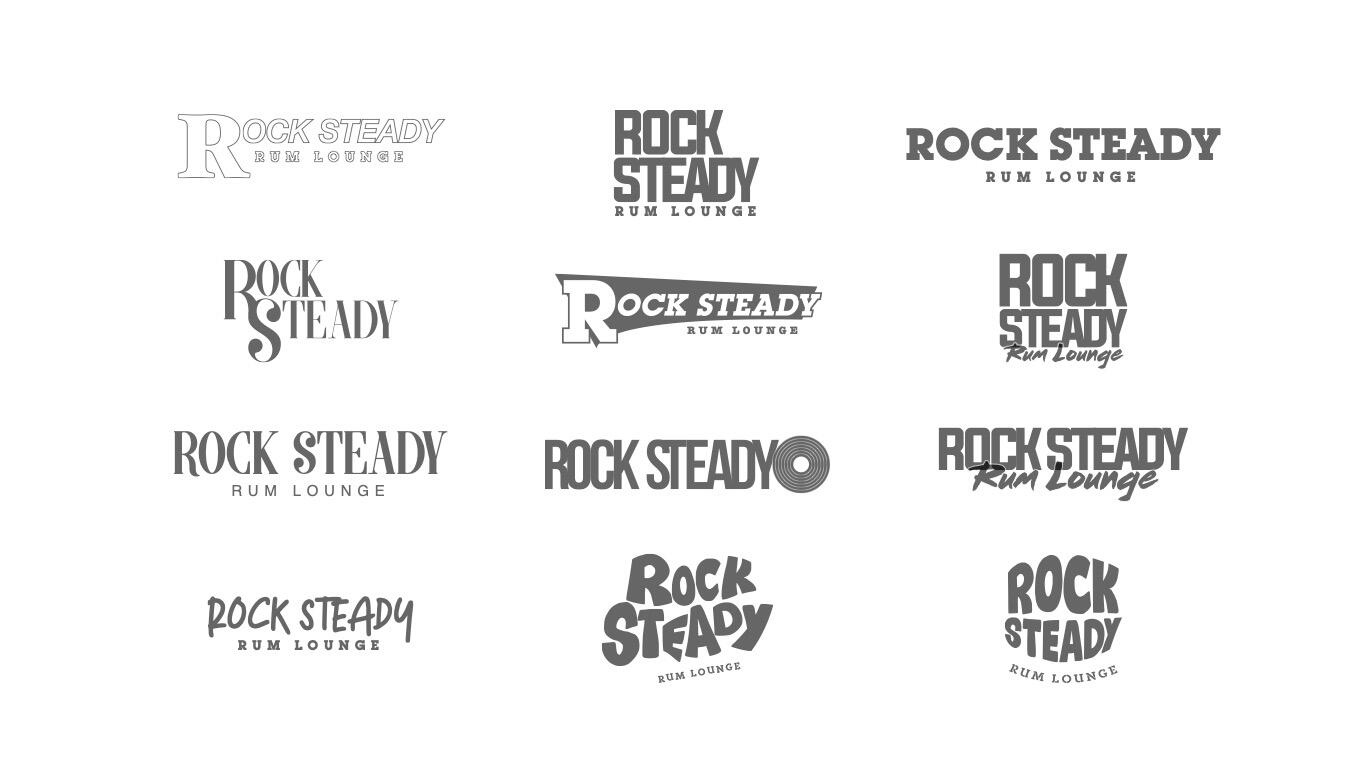
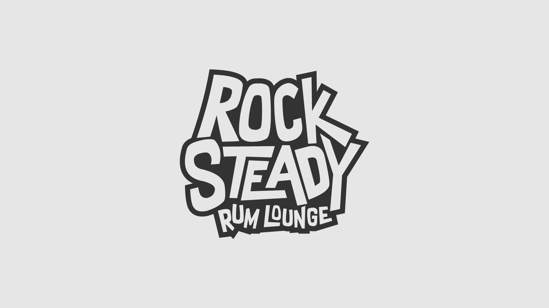
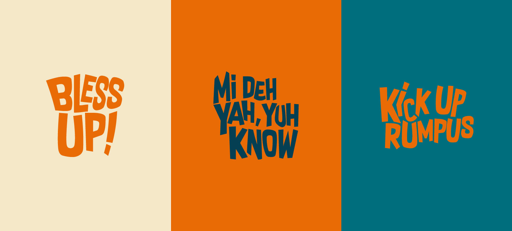
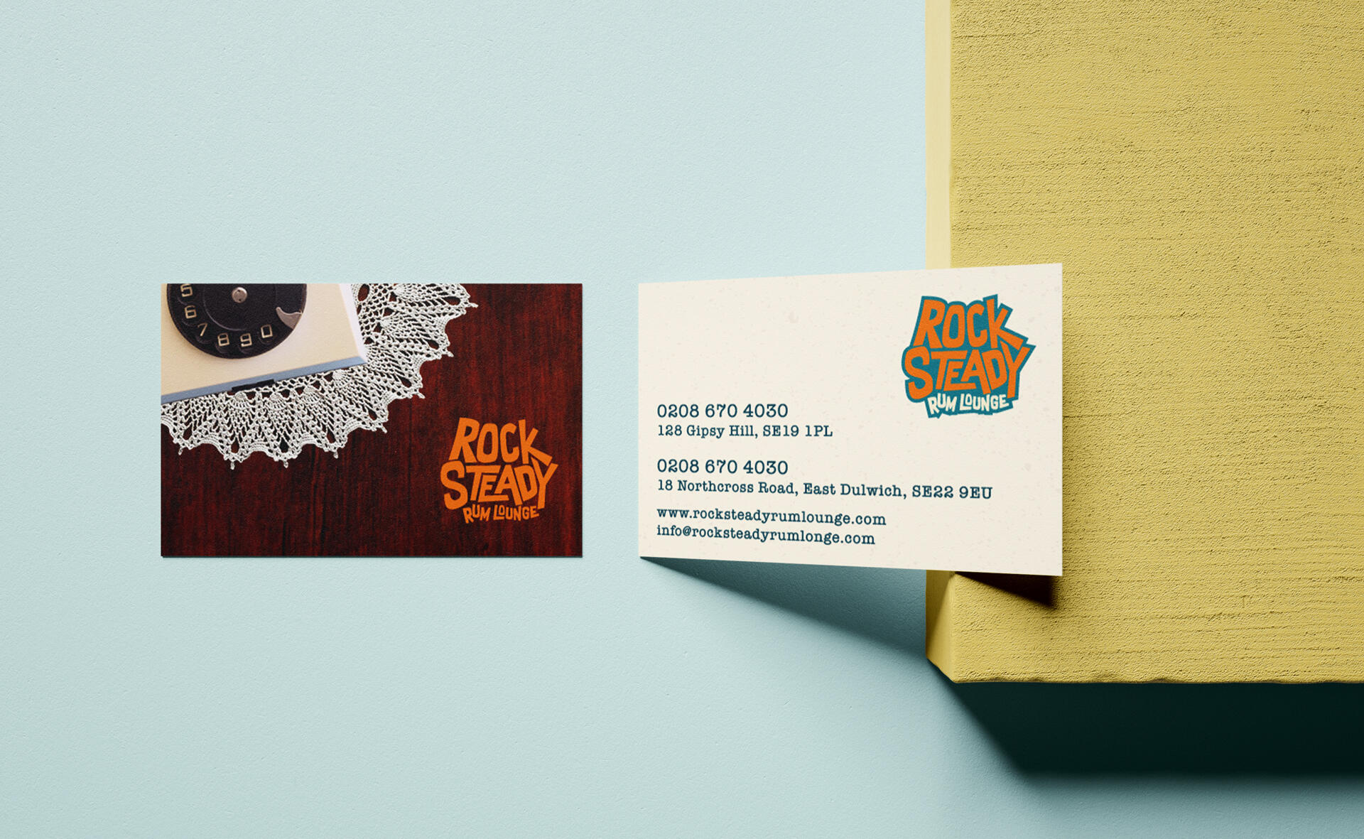
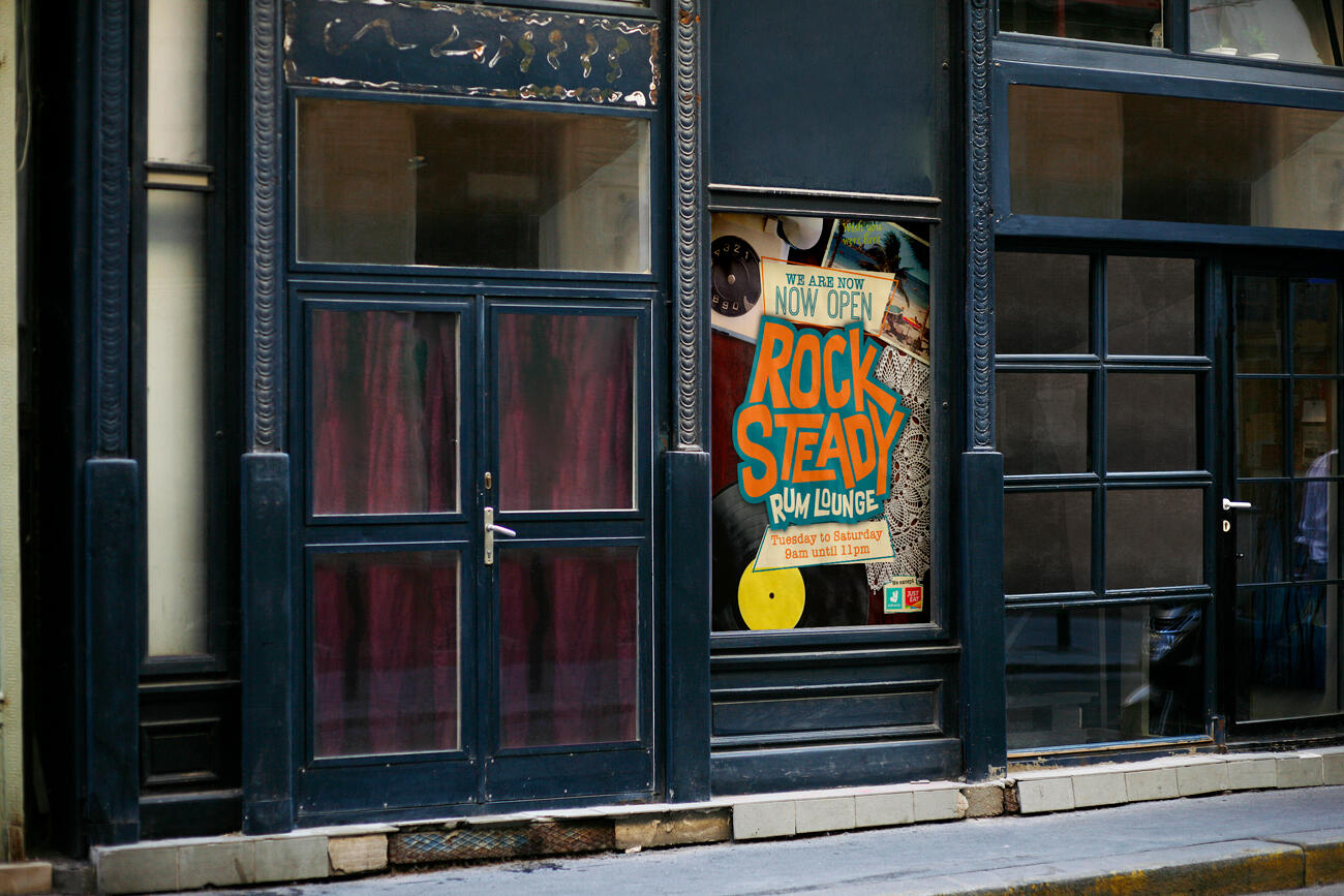
With a huge passion for good food and restaurants, it made sense for me to develop a brand for one of my favourite Caribbean restaurants Rock Steady. The founder came to me with a brief to rebrand their existing brand, Blue Mountain Cafe. We wanted to create a new brand identity that encapsulated the vibrance, movement of the rock steady music scene and reflected the decor of both their restaurants. Mell (founder), is a creative himself so navigating his spectrum of ideas was challenging at times. One of the ways I handled this was by presenting in depth concepts that visually took him on a journey to showcase my thinking behind something.

You may also like:

Monopoly Plus
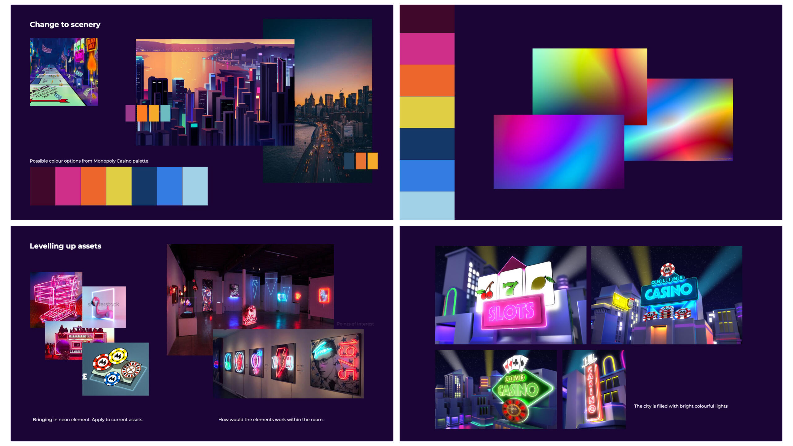
Process: Research > Moodboards > Scamps > Development > Managing Assets
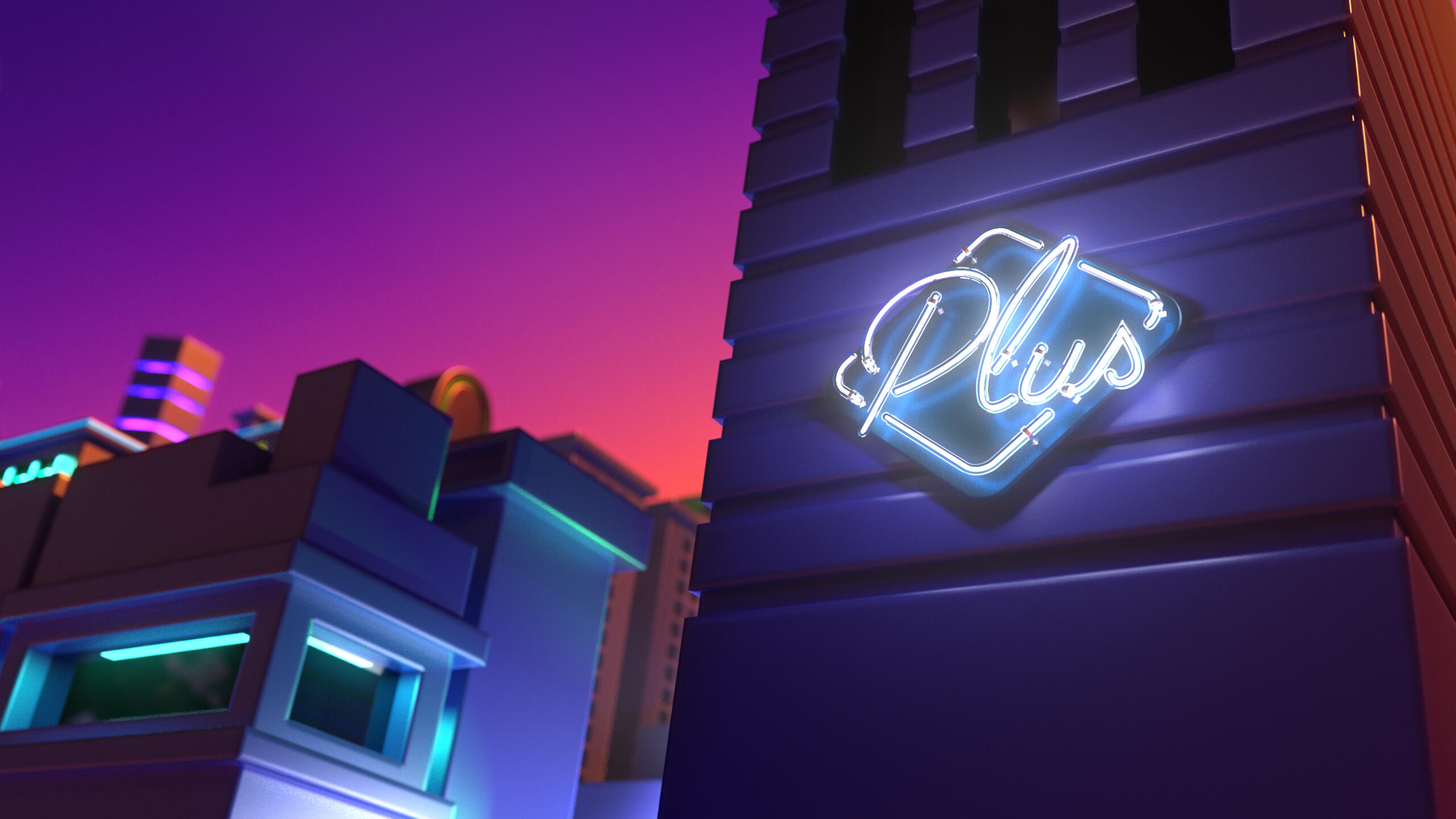
Deliverables: Brand identity, Look and feel, Asset library, Logo, Brand guidelines, Email templates and banners.
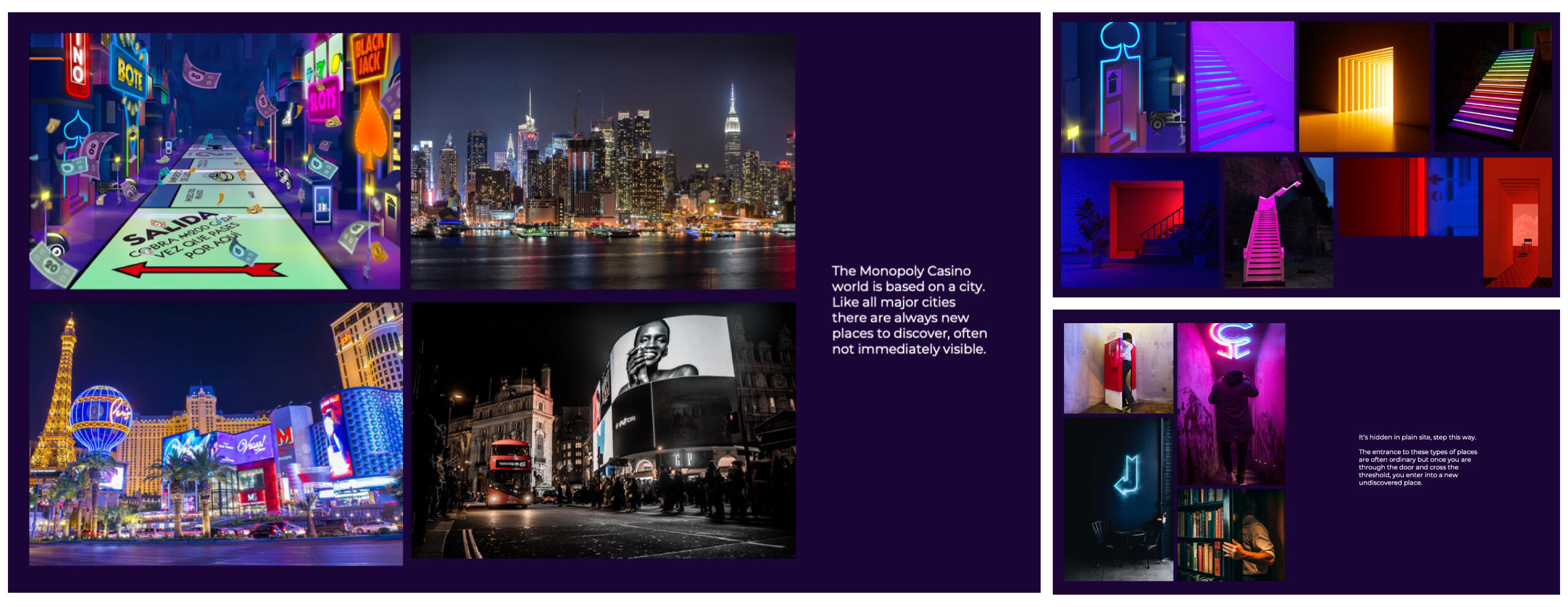
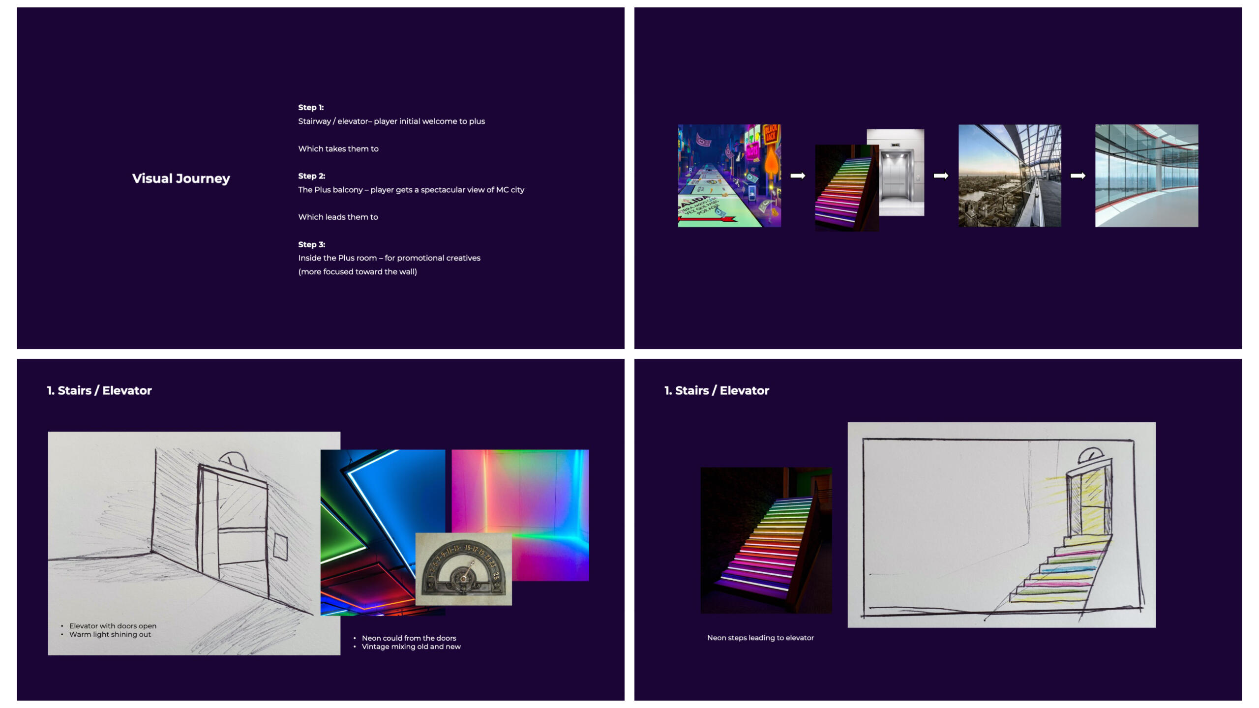
The brief was to create a brand extension of Monopoly Casino by leveraging creative values from the master brand. The proposition was to convey a ‘level-up’ sentiment, positioned toward an inclusive community of loyal and engaged members, rather than big losses. Avoid a luxury, high-end, elitist design by focussing on a softer, attainable narrative to make the player feel valued, rather than being a high-roller.From start to finish the project took just over a month and I was one of two designers working with a Creative Director, Art Director and Delivery Lead.


You may also like:

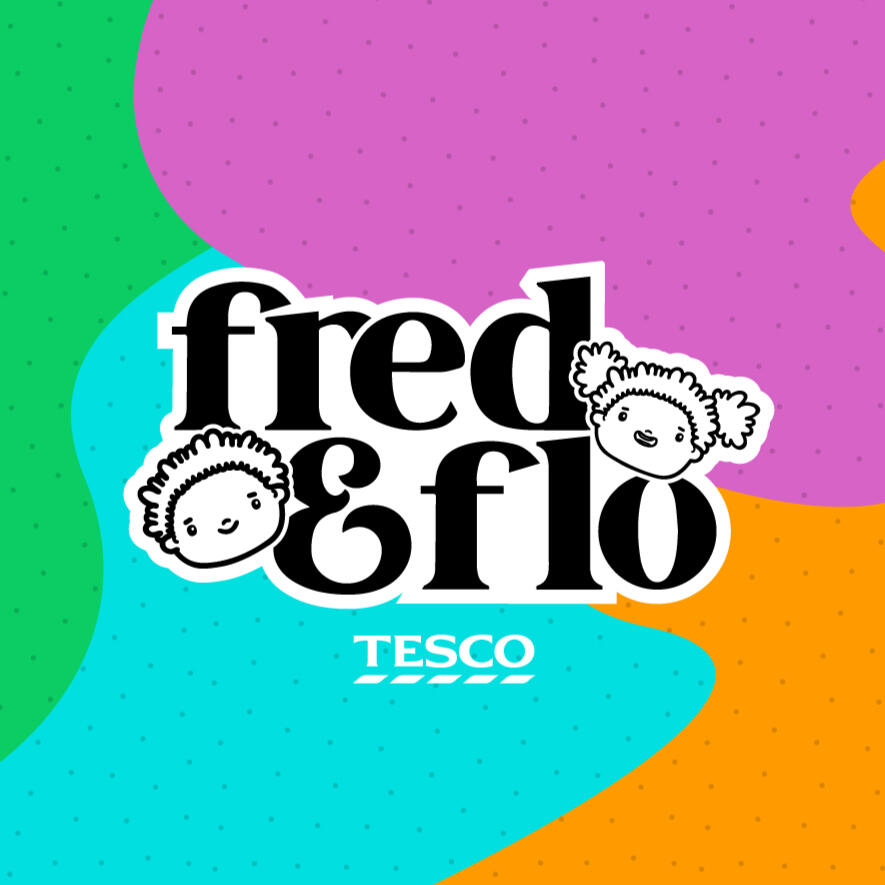
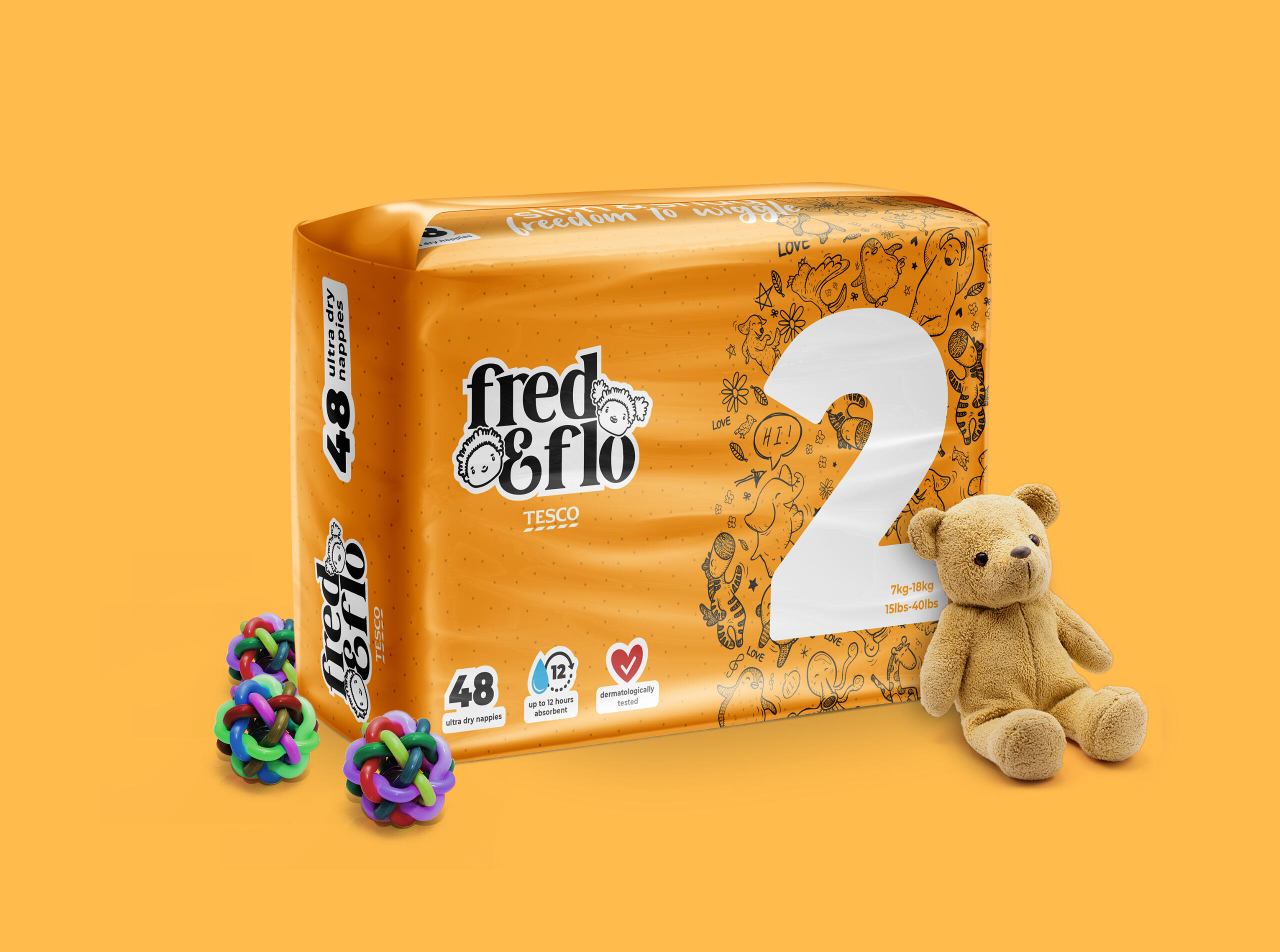
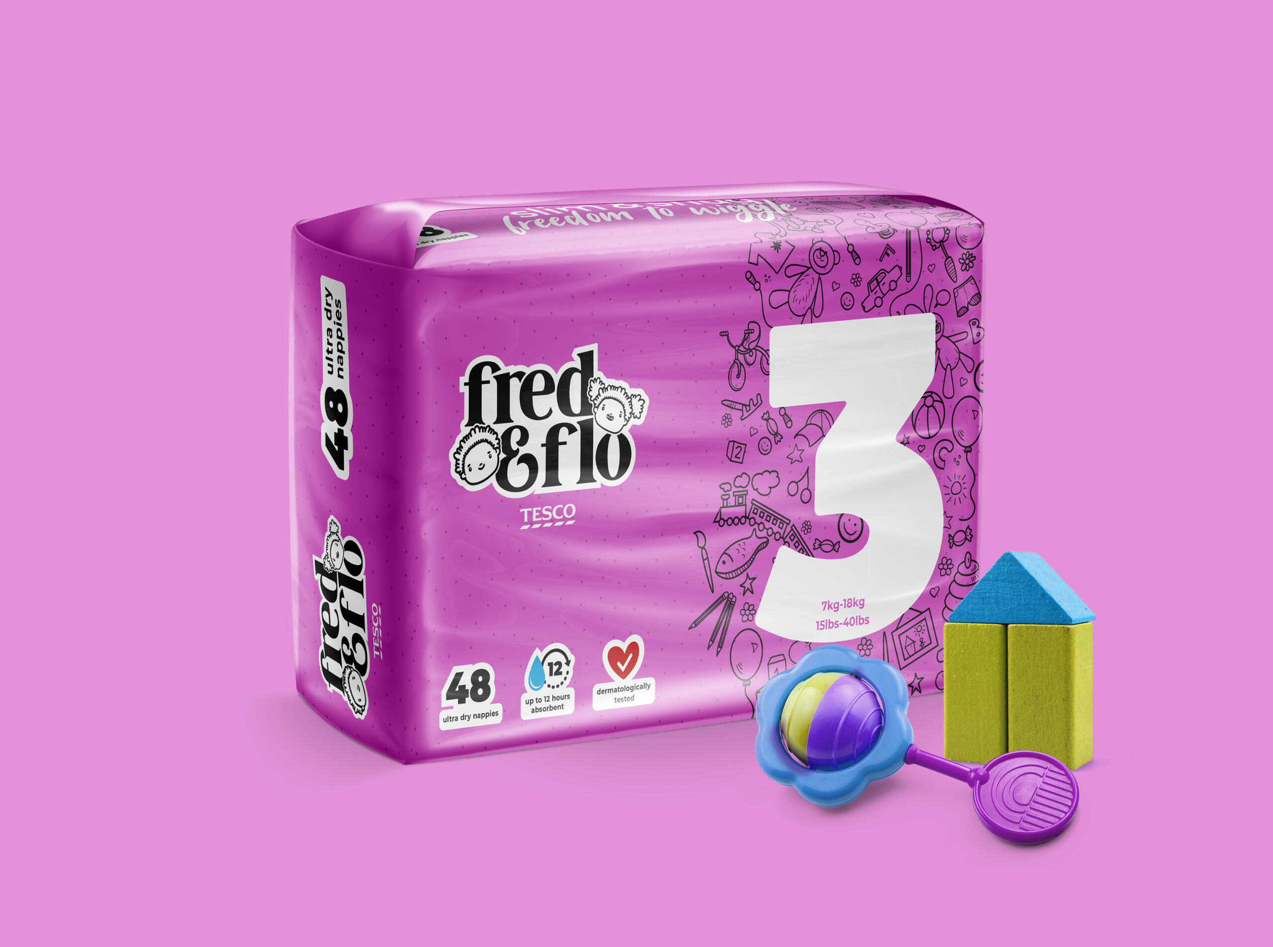
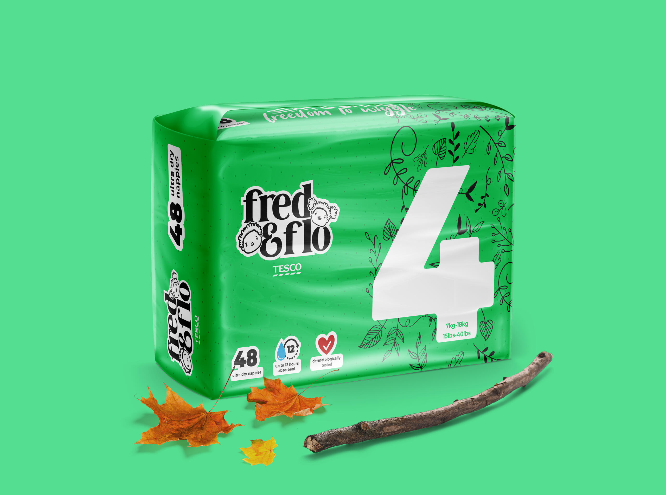
FRED & FLO NAPPIES REBRAND
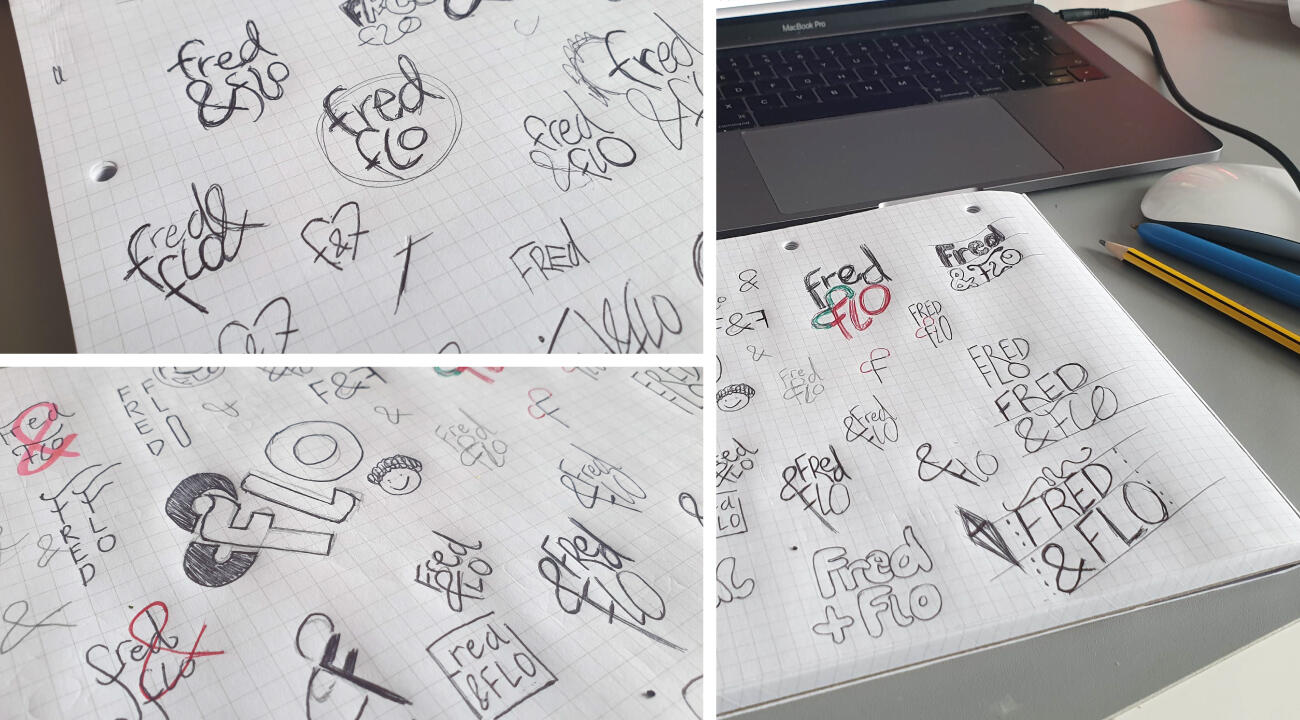
Process: Research > Strategy > Concepts > Development > Managing Assets
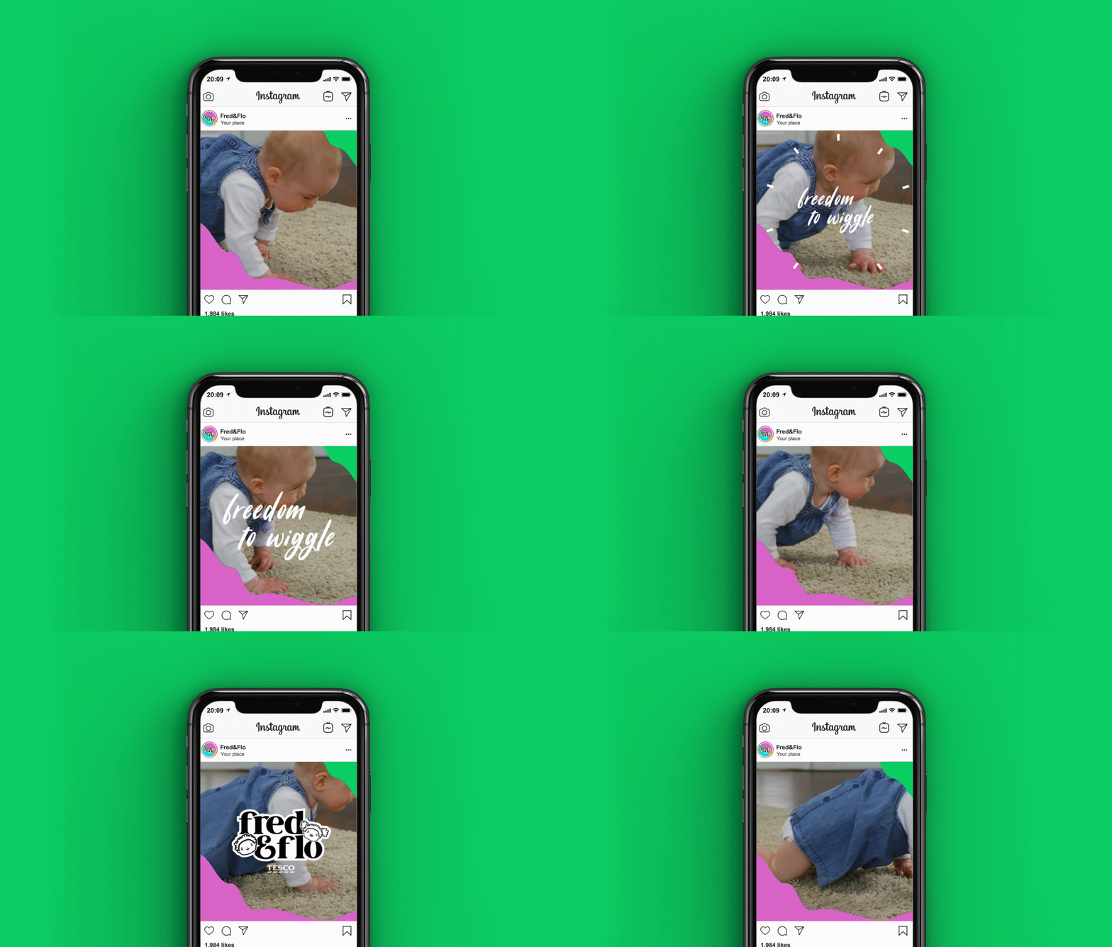
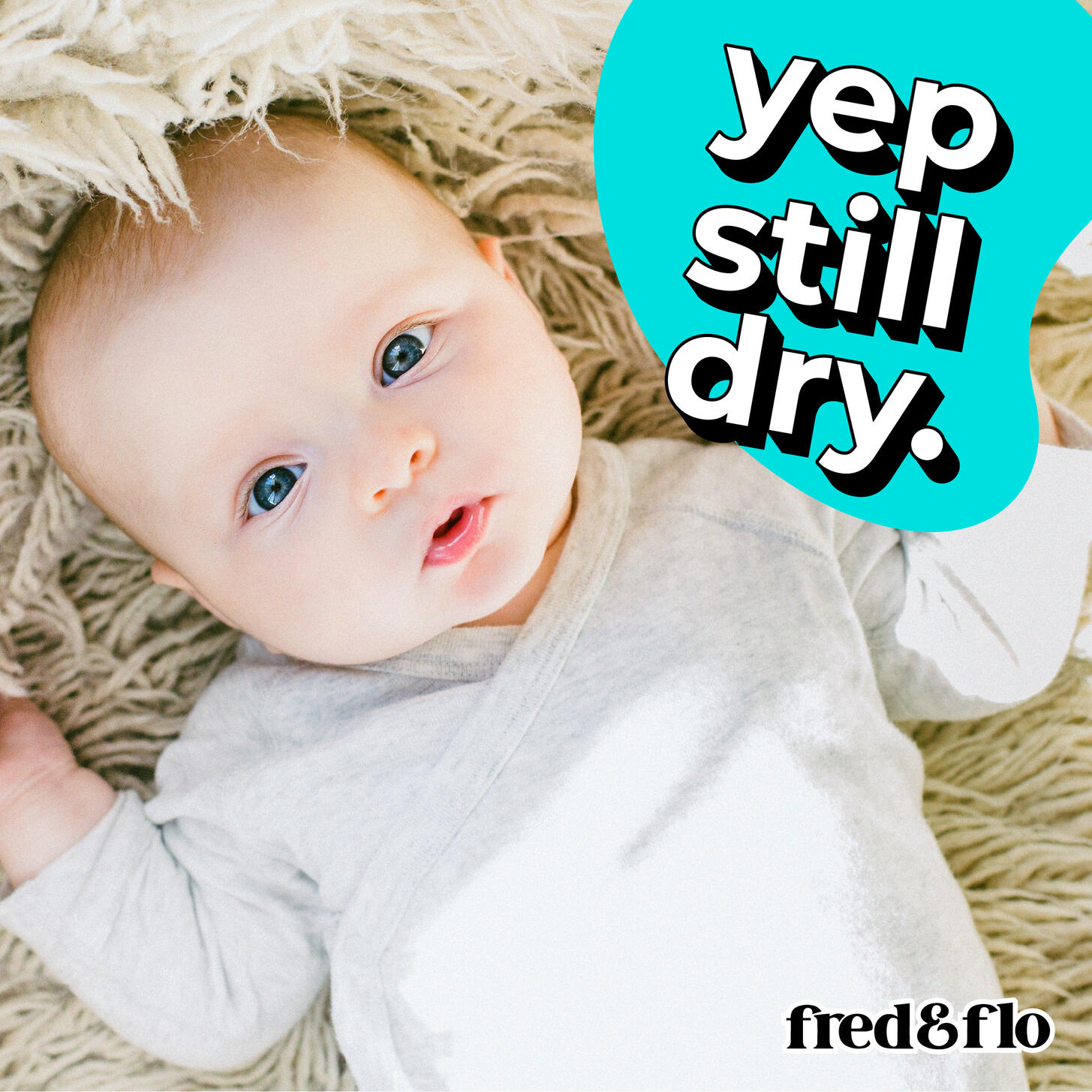
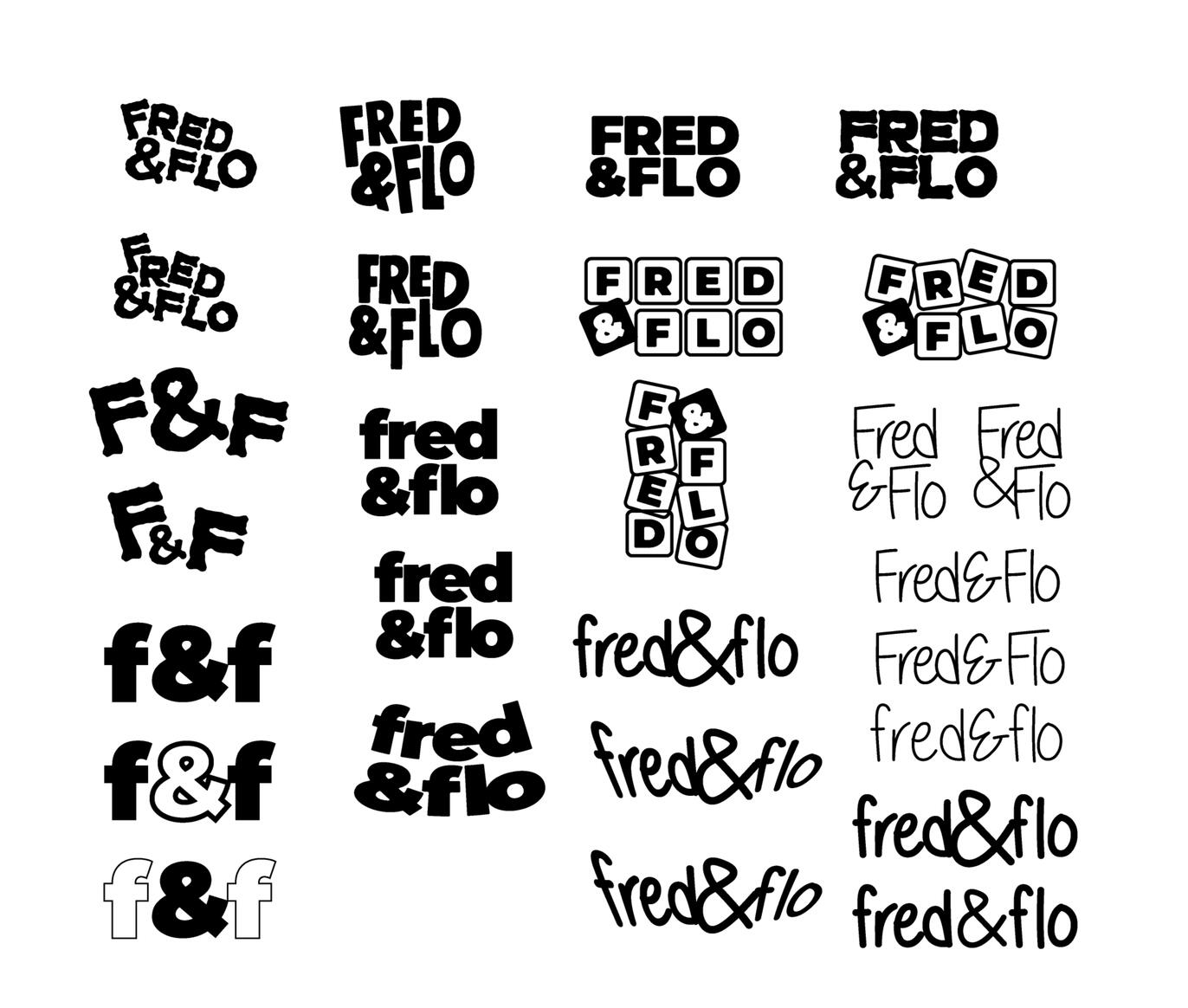
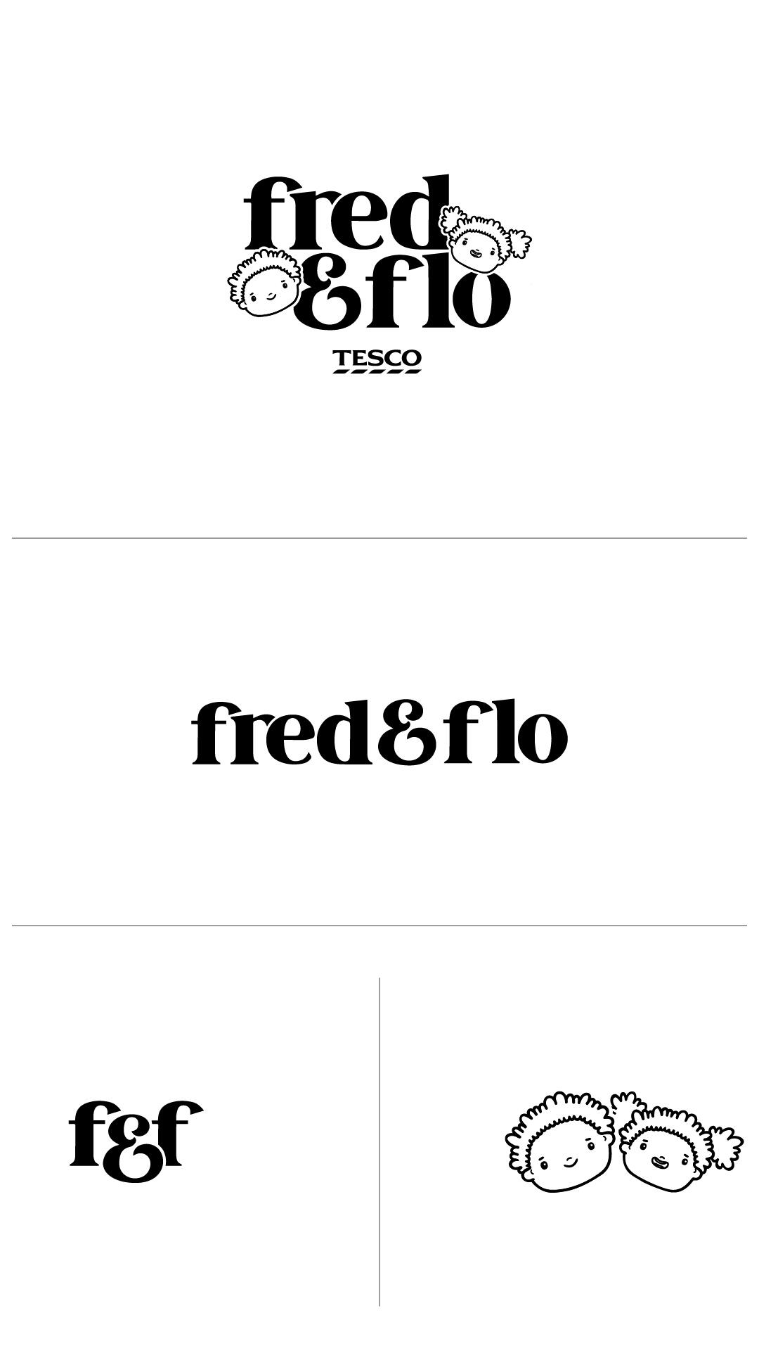
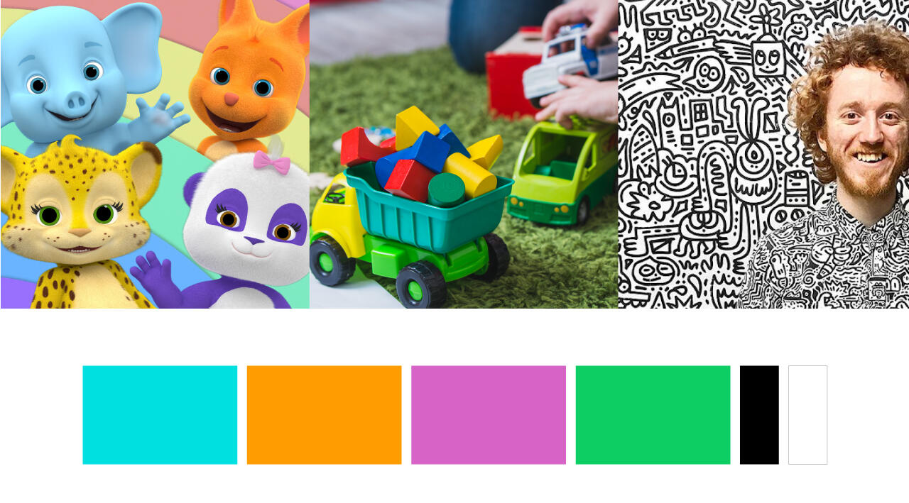
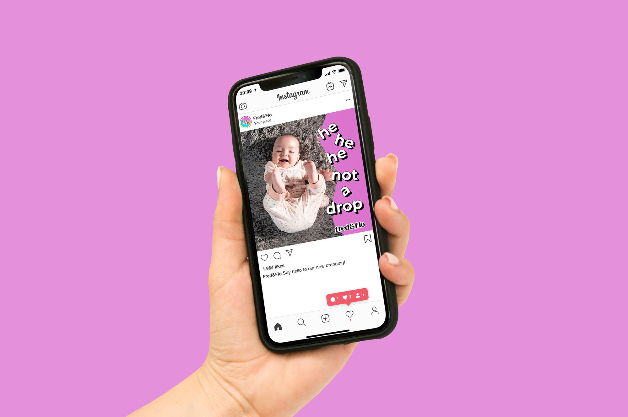
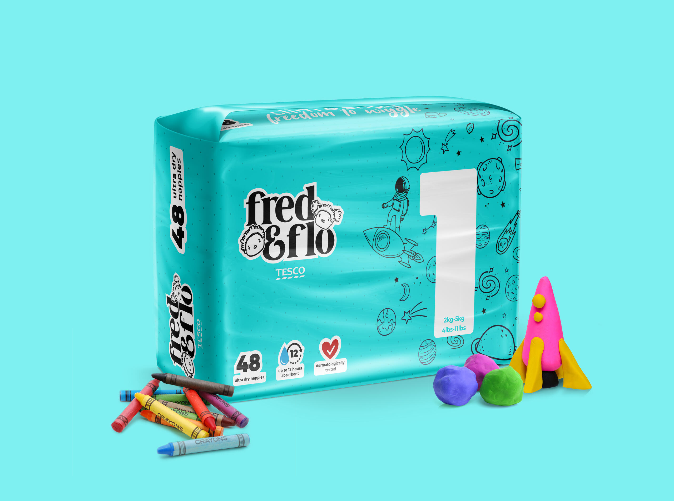
This was a self initiated brief. The task I gave myself was to uplift the existing Fred & Flo brand to set it apart from its competitors and to sort out the bloody awful hierarchy of information that it had. Through my experience of not being able to find the right size nappy I knew that the size had to be prominent. Working in between naps and nappy changes, I researched F&F’s competitors and dissected their existing brand and packaging. Once I had decided on the feel of the rebrand I created the logo, colour palette, sourced the appropriate illustration and mock ups.

You may also like:
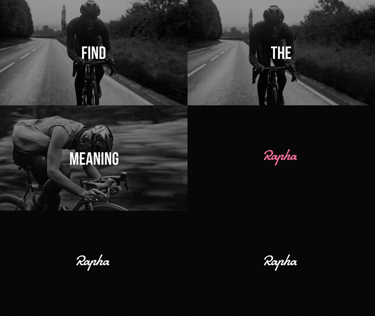
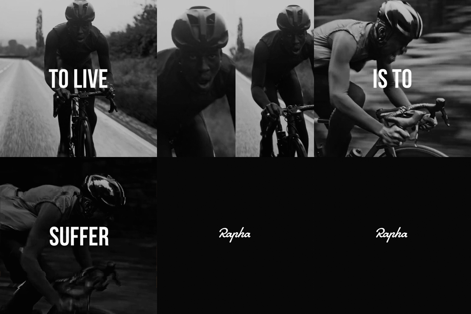
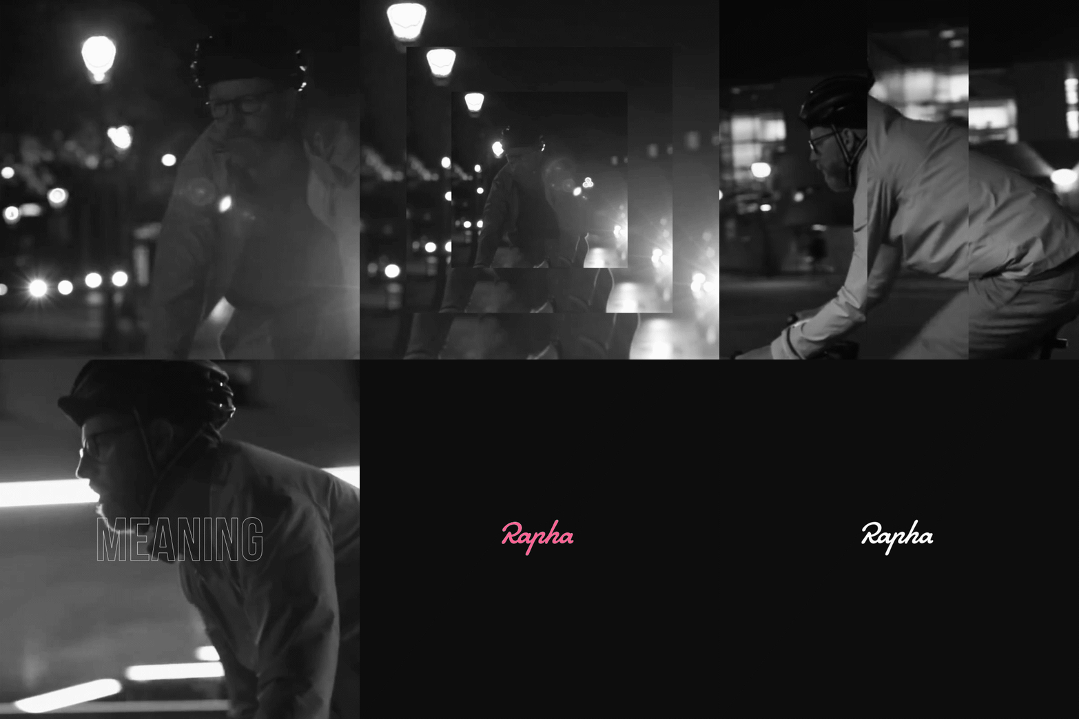
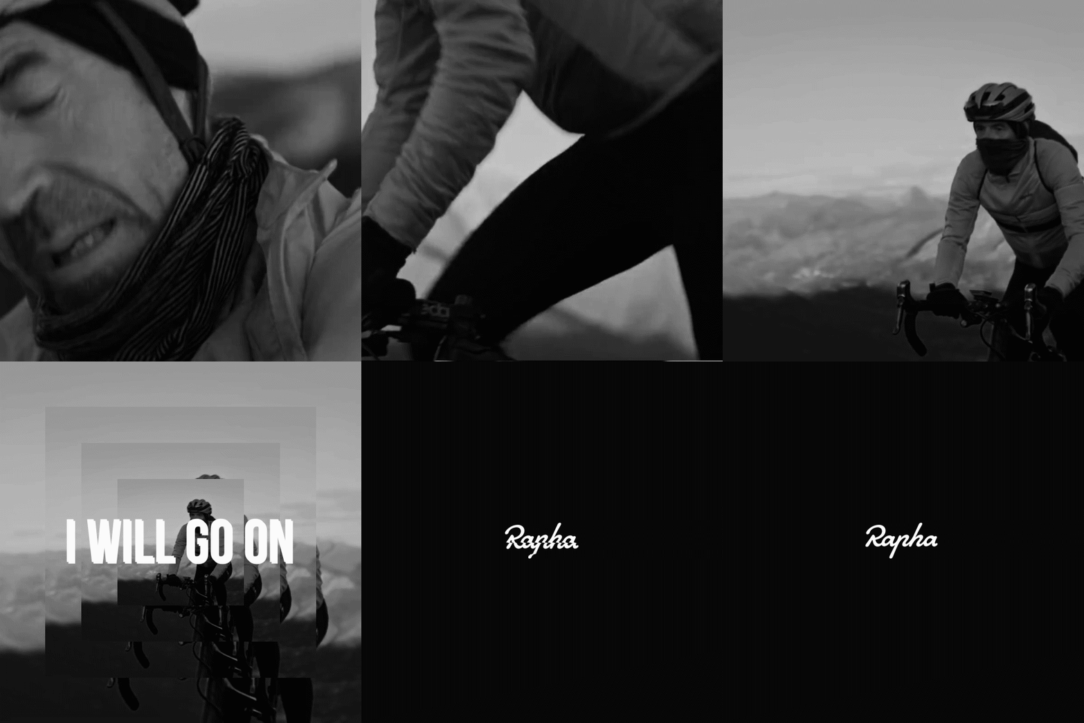
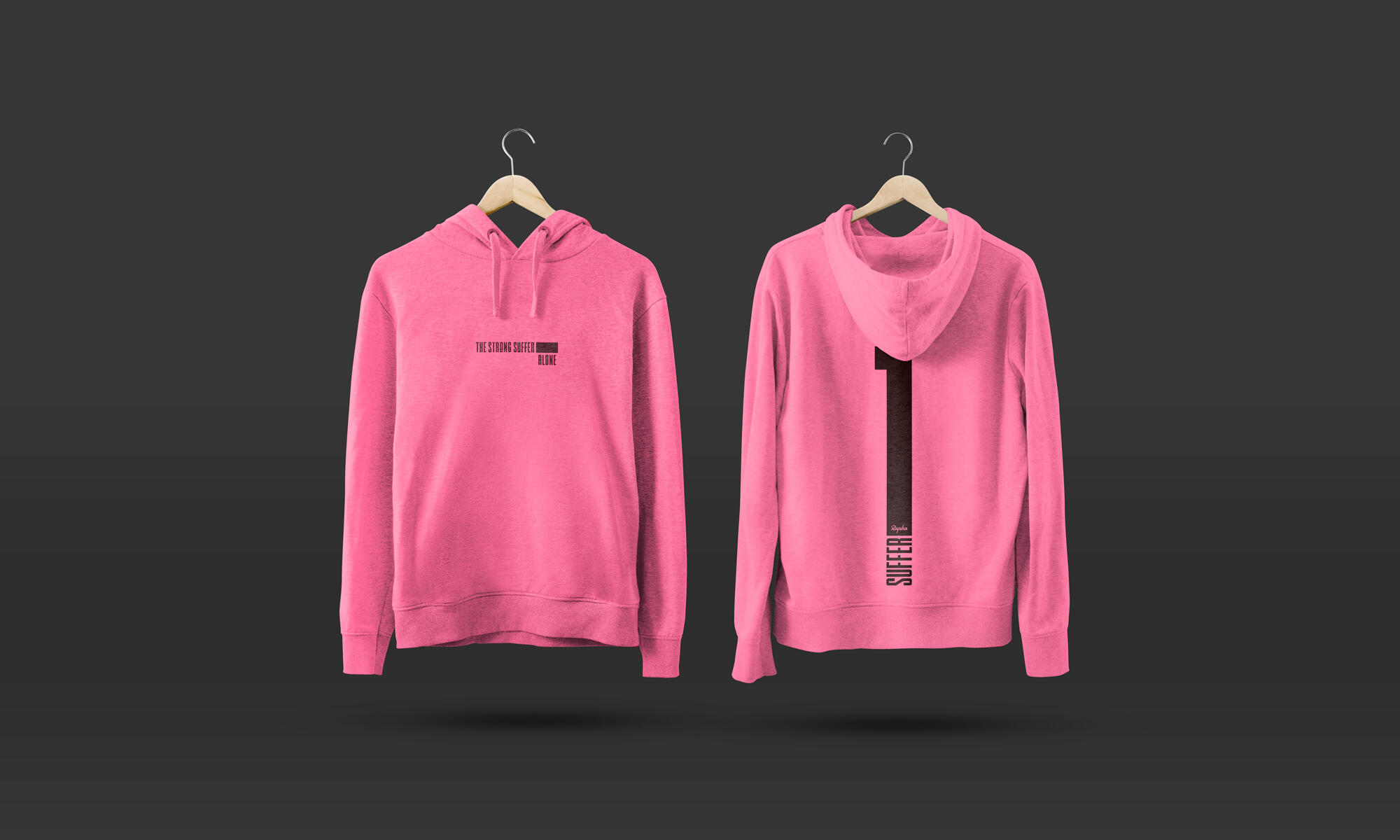
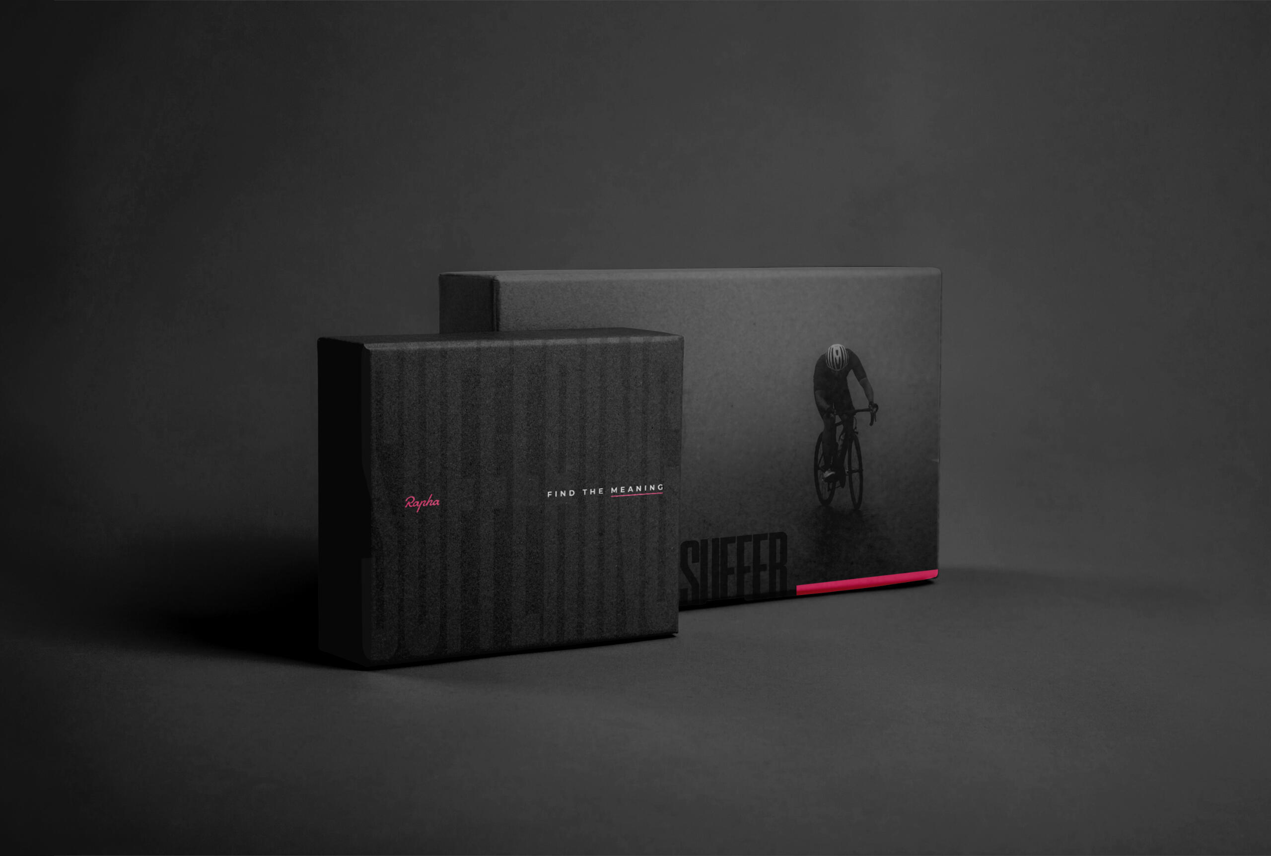
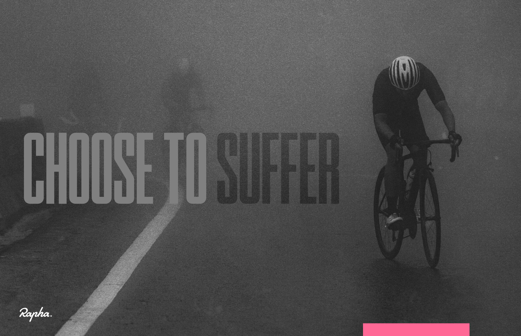
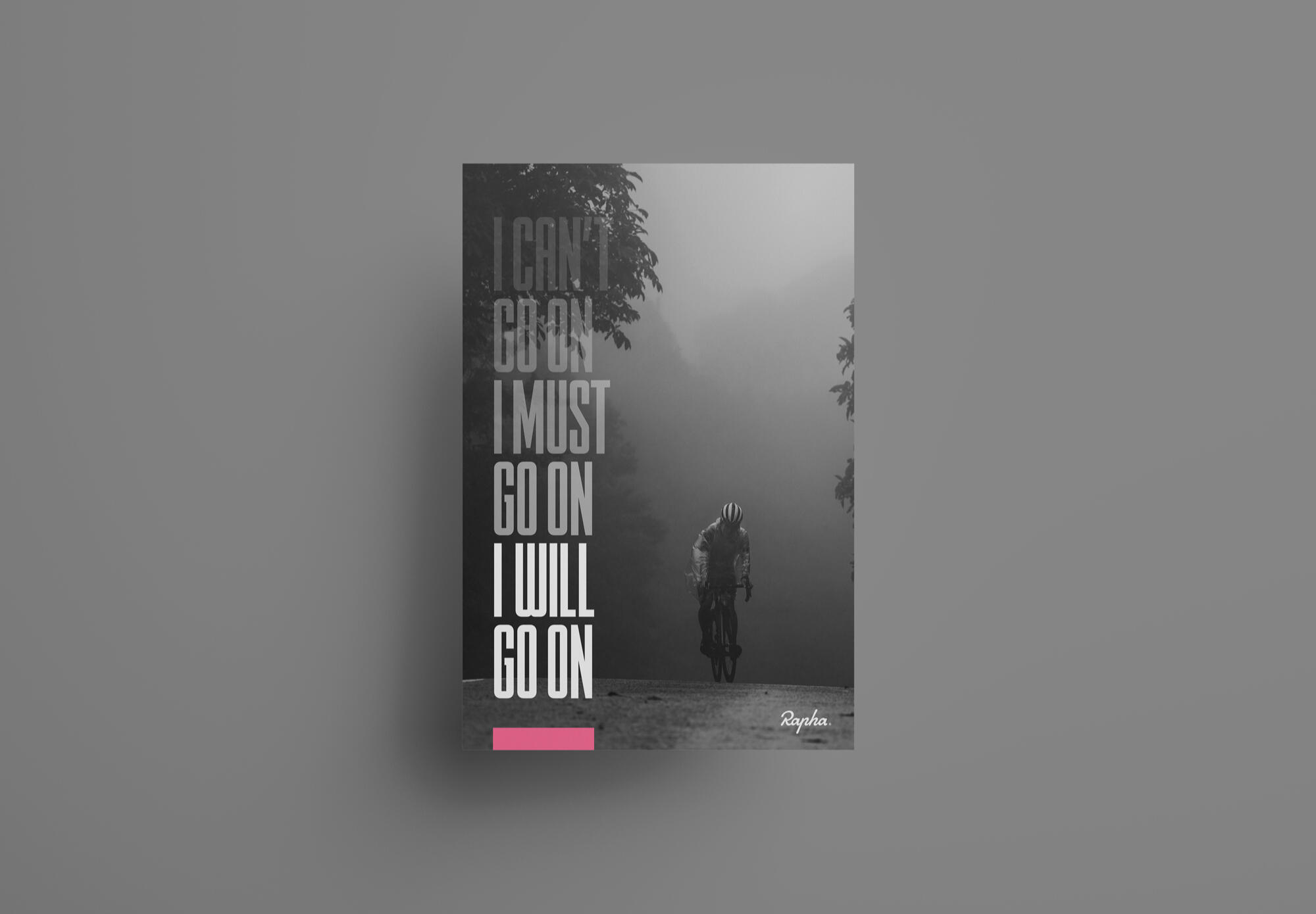
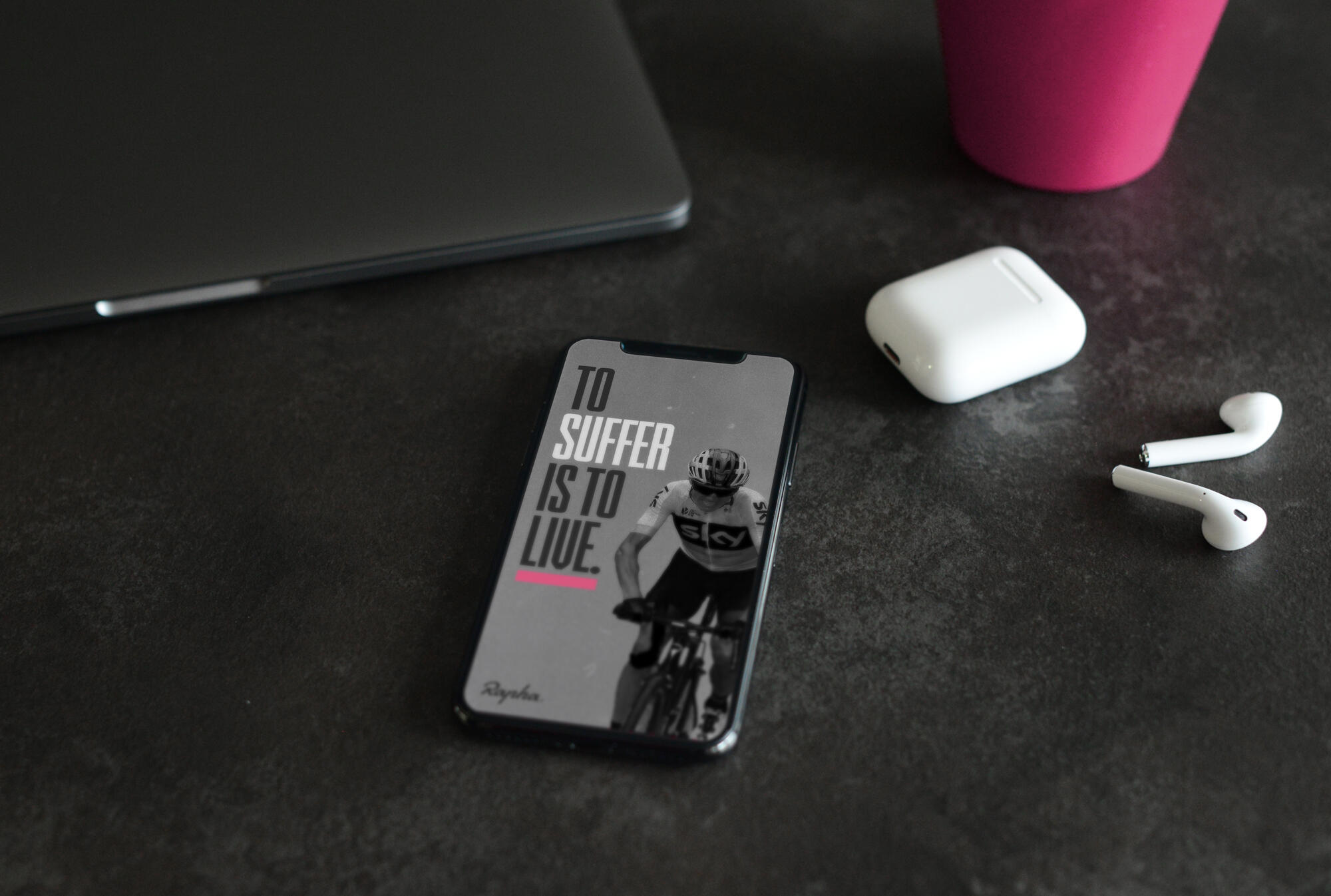
RAPHA: CONCEPT PROJECT
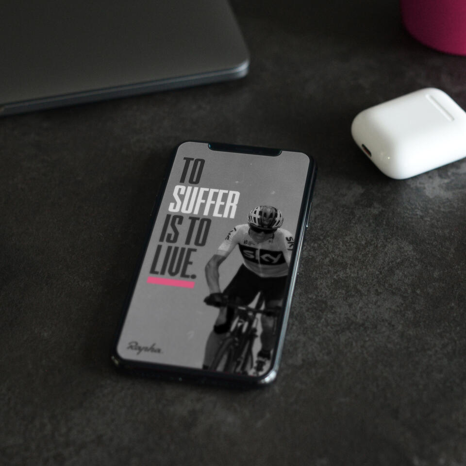
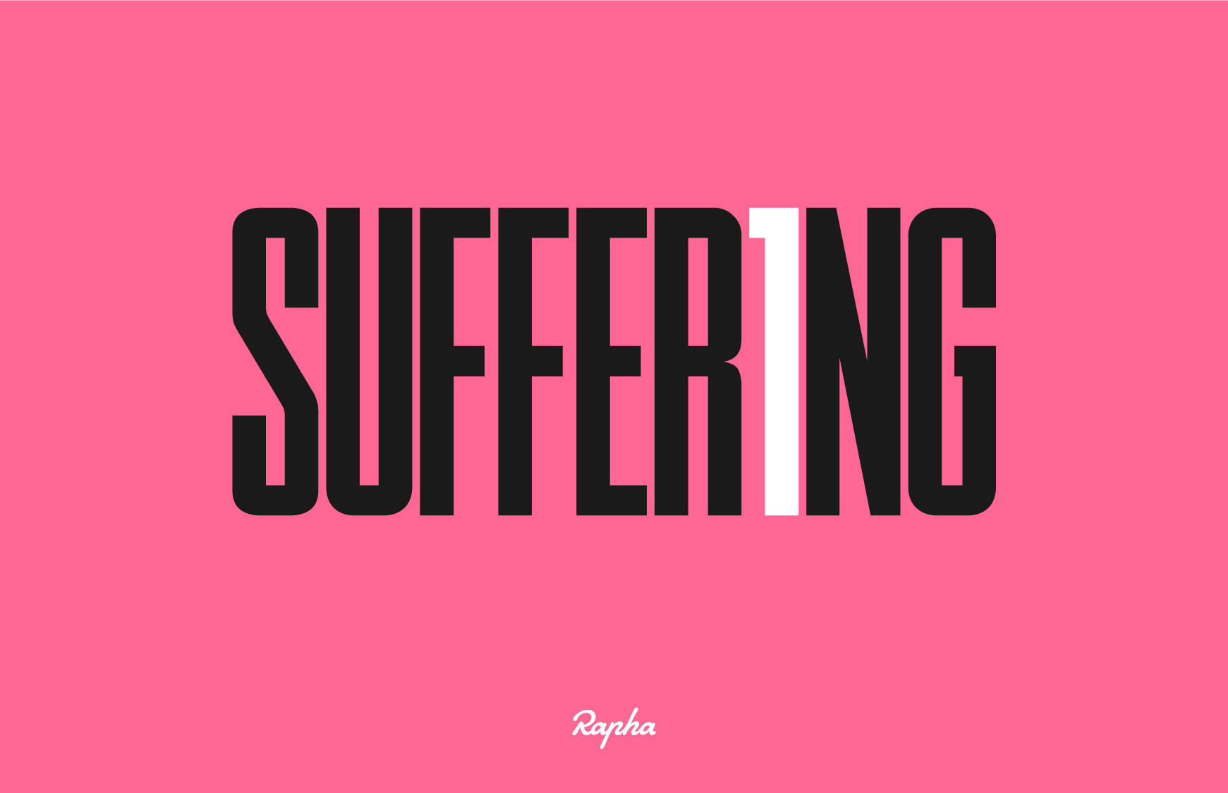
Rapha has always been one of my favourite brands because of their values, but the one in particular really resonates with me most is Suffer. The word has such a negative connotation but if you ask any successful person most of them would agree that on the other side of suffering they found their success. This got me thinking, what if you could change the meaning of suffering.
You may also like:
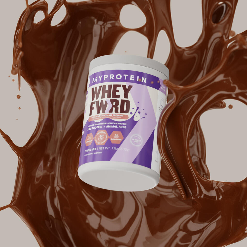
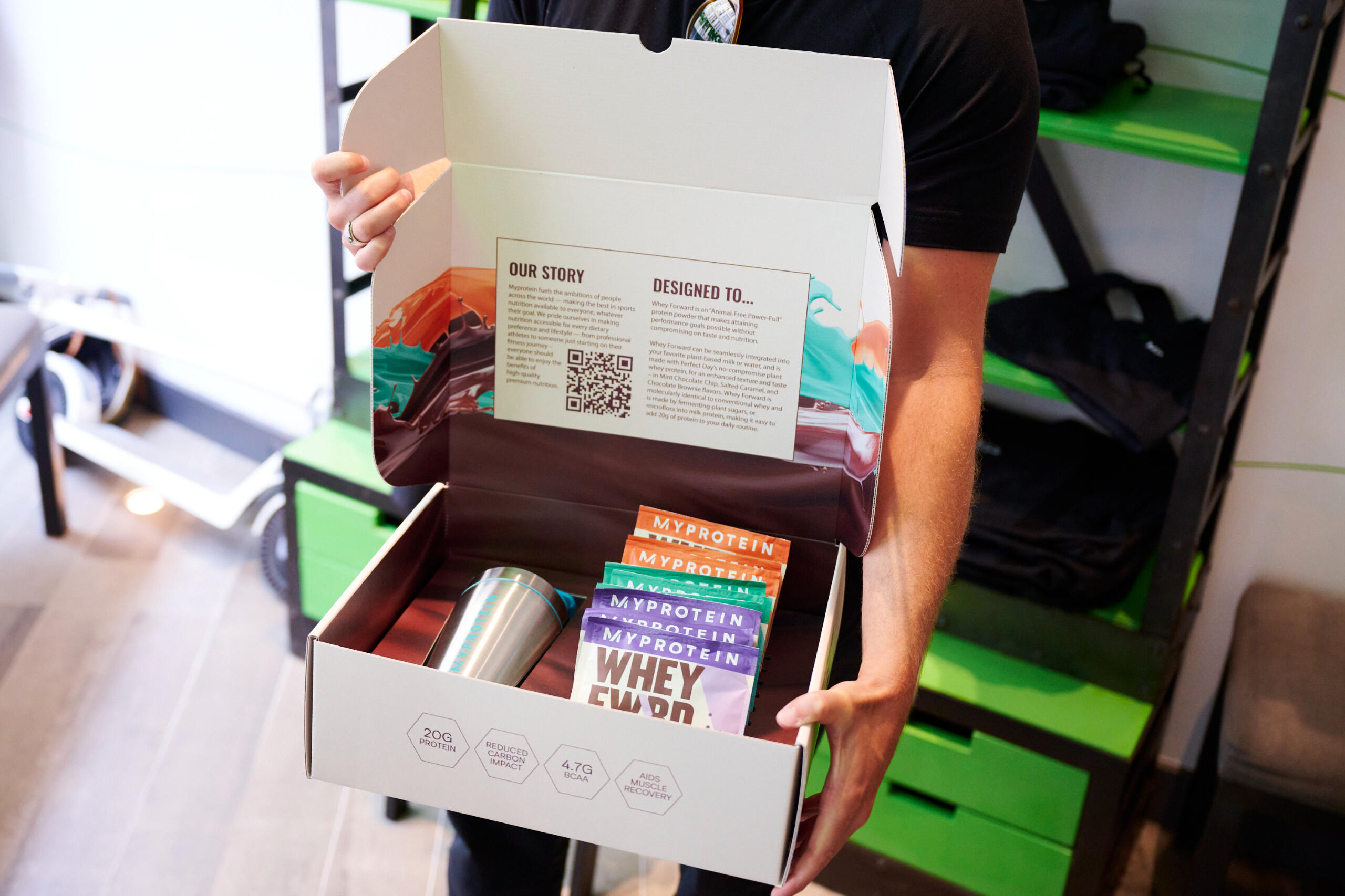
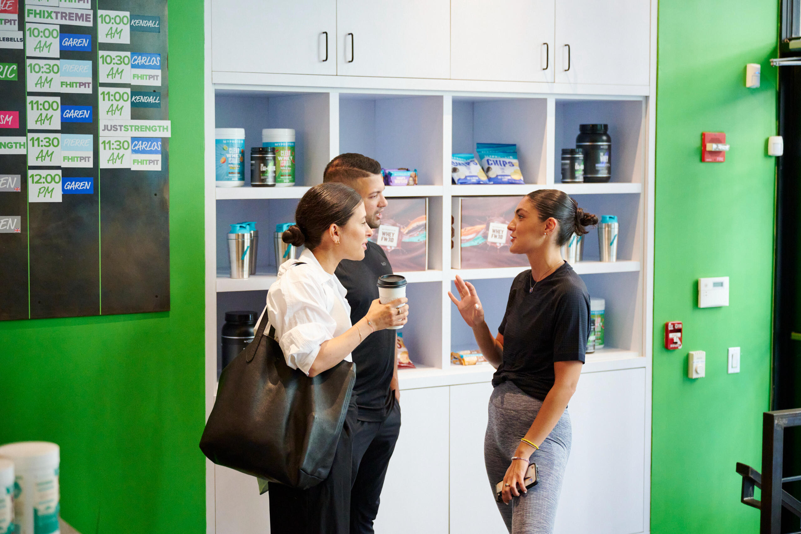
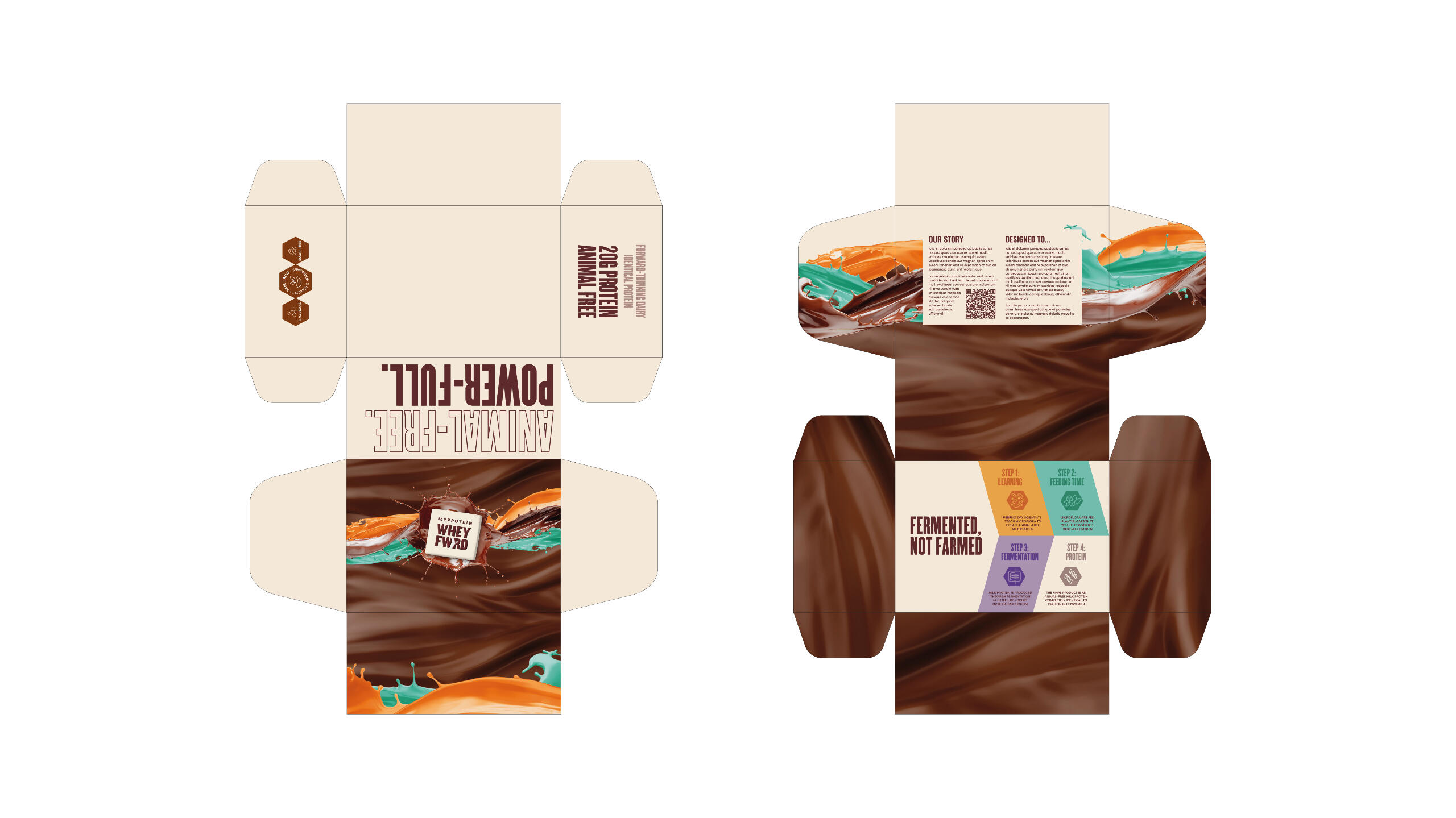
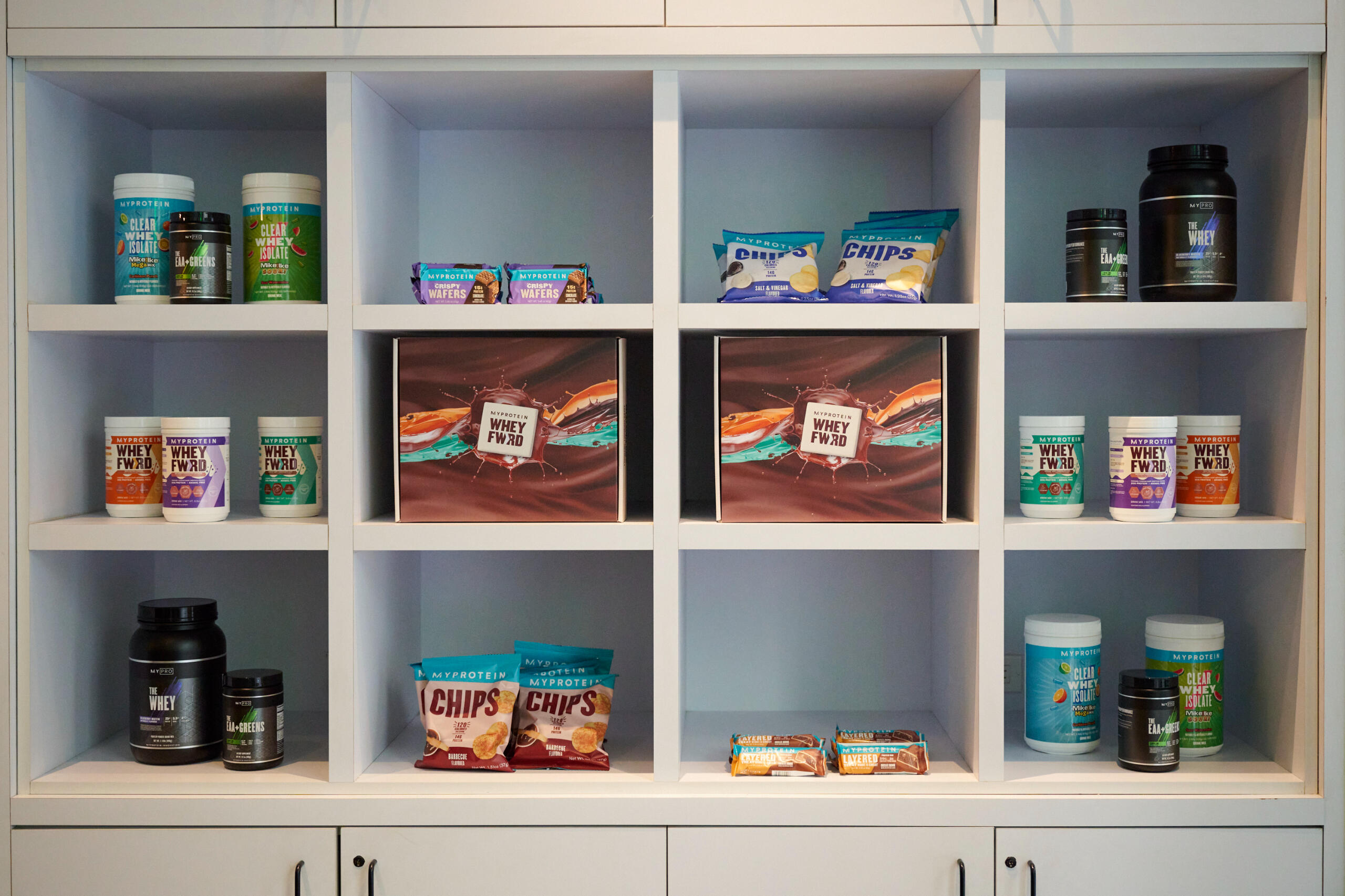
An accomplished Graphic Designer with a over decade of expertise in the creative industries. With an extensive skill set covering conceptualisation, brand identity, print and digital design, packaging, and marketing materials for renowned clients such as Pret, Coca-Cola, Redbull, Myprotein, and Monopoly. Notable for deeply valuing the transformative influence of design in instigating positive change.
You may also like:

